Tuesday, June 25, 2013

Richard Diebenkorn (1953)


Berkeley #3 by Richard Diebenkorn, 1953

I was fortunate to see a preview last week of the new Richard Diebenkorn exhibit being held now through September 29, 2013 at the de Young Museum here in San Francisco. The exhibit focuses on what they term his Berkeley Years, namely 1953 through 1966 when the Portland, Oregon born artist returned to the Bay Area (he had grown up in in San Francisco) when he moved his family from Albuquerque, New Mexico to 2837 Webster Street in Southeast Berkeley, California. It was a period during which he created a remarkable number of works, especially considering the amount of time he spent teaching during much of this era. Additionally, he had almost yearly gallery shows and Life magazine profiled him both in 1954 and 1957.


Berkeley #22 by Richard Diebenkorn, 1954

What I found most remarkable about this show, in addition to the sheer volume of works collected and put on display, were his earlier paintings which represented his reaction to the New York school of abstract expressionism. Diebenkorn is most well known for his figurative work, a style he transitioned to during his years in Berkeley. But a solid third of what is on display could be termed abstract expressionist and most folks would not challenge such a claim.


Berkeley #44 by Richard Diebenkorn, 1955

Diebenkorn certainly was influenced by the 10th Street crowd for sure, particularly Rothko and de Kooning both of whom share a similar color palette with the younger West Coaster - and he had met and befriended Kline some time near the beginning of this period - but a strong argument has long been made by art critics that his greatest influence even at this stage were the landscapes that surrounded him be it in Albuquerque or Berkeley. 


Richard Diebenkorn, c.1952

It is always exciting to see an artist in transition which is a big part of the appeal of what the de Young has put together. There are also other connections for me as well. When I first moved to San Francisco in the 1989, I spent a considerable amount of my first 3 years across the Bay in Berkeley and do feel that the colors of the area had to have some influence on his work. Diebenkorn was also a dyed-in-the-wool jazz fan, albeit of the traditional New Orleans variety that had begun experiencing a revival as the unfortunately named Dixieland, parallel to the ascension of modern jazz. Almost needless to say, I highly recommend a visit to the de Young if you are in the San Francisco Bay Area or plan to be some time in the coming months.

Thursday, June 20, 2013

Harry Babasin & The Jazzpickers (1958)

I thought that I would put up a quick post this afternoon. Truth be told, I have a bit of a backlog of entries at the moment. There are quite a few in the hopper, but I've been sidelined with some minor health issues and I should really be staying away from the computer. But I hate seeing the weeks fly-by without new posts, so here is most of the February 3, 1958 episode of ABC-TV's Stars of Jazz television program hosted by singer, pianist, and songwriter Bobby Troup (yes, he of Route 66 song and Emergency TV fame). Bobby's guests that week included bandleader turned manager Charlie Barnet, vocalist Pat Morrissey, and Harry Babasin. I believe I have mentioned this TV show before, but I will take this opportunity to point the curious reader to this wonderful blog which tackles the show in great detail.

Babasin, an unsung hero of jazz music on the West Coast of California, was initially a bassist who played with everyone from Louis Armstrong to Charlie Parker. He was also one of the first experimenters with the cello in jazz music. Of course my short shrift is not doing Harry justice and for a wealth of excellent information on Babasin and some of his more interesting musical activities of note, I highly recommend this page created by his son Von.

A final note. The guitarist in these clips is another talented obscurity by the name of Dempsey Wright, a fellow whose playing I have only recently been digging into. With 2 LPs of his own to his discographical credit, plus 3 appearances as a sideman, his recorded legacy is certainly less than proportionate to his chops. It's a shame, but thankfully we have these few more minutes of music to enjoy from someone else that may have been forever lost in the cracks of time. A special thank you to Babasin's son, Pierre, for making these clips available.


Tuesday, June 4, 2013

Zenith Radio Corporation Showroom Sculpture (1959)


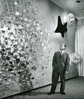
Zenith Radio Coporation Showroom, Chicago, Illinois, c.1959

Recently, I visited the Smithsonian American Art Museum in Washington, DC for the the first time. Now I don't know why, but I had rather low expectations for this particular museum - perhaps I just did not know what to expect. And while I was certainly impressed in general, I was nearly awestruck when I rounded a corner only to find myself face-to-face with Harry Bertoia's massive Zenith Radio Corporation Showroom Sculpture. 


Harry Bertoia and his creation, c.1959 

I have something of an affinity for the artist and designer Harry Bertoia, whom I mentioned almost in passing a few weeks ago. He was the first 20th Century modernist designer that I knew by name, having been introduced to his iconic wire mesh chairs by a good friend and room-mate in my early-twenties. Bertoia was an Italian-American who had come to this country from Northern Italy (via Canada) at a young age, studied alongside some of the legends of modern design, and even spent a few years during the 1940s living in my hometown of San Diego, California. His first gallery show in 1945 was held at the San Francisco Museum of Art. On top of all this, I genuinely enjoy his wide-array of work, from his monotypes to his furniture and of course his sculptures.


sculpture detail, photo by author

The 1950s were a productive time for Harry. He started off the decade by accepting a job with Knoll, a company headed up by Florence Knoll, a former classmate at the Cranbrook Academy of Art. Supposedly Knoll gave him very little directive to start, but within a year Harry had designed is diamond chair, which may be his most well-known work. More gallery shows (including MOMA in New York) and art commissions, both public and private, followed in the subsequent years leading up to the piece in question. These commissions would continue into the late 1970s, although Bertoia would never again return to furniture design and became increasingly interested in his musical experiments that utilized his own sculptural creations.


sculpture detail, photo by author


According to the Smithsonian archives, Bertoia was very specific in what the elements represented in the piece he produced for the late-50s Zenith commission. From left, the largest structure represents the earth, followed by sight, sound, and what he termed electronic control. All were Bertoia's attempt to provide some physical representation of the forces behind the relatively new phenomena of television. Zenith had introduced its first television line in 1948, with color sets following in 1950, so by the end of the decade it was a major player in the ever-growing television market.


sculpture detail, photo by author

The sculpture itself has a sheer presence that photos can barely capture. The slow alternating pulsation of the lights gives the impression of some sort of bio-mechanical organism. Is the wall alive? Is it transmitting a signal from some distant satellite? For a generation immersed in science fiction pulp and soon to embrace Rod Serling's The Twilight Zone, it must have made quite an impression at the time both on the Zenith executives as well as those that were fortunate enough to see the pieces in the original showroom.

As one may expect, the piece spent a significant amount of time neglected in storage. Fortunately, the Smithsonian spent a significant amount of time restoring the work, the story of which is told here.

Tuesday, May 28, 2013

Le Sacre du printemps (1913)


The young girls of Le Sacre, original costumes and stage set, 1913 

Tomorrow, May 29th, 2013 marks the 100th anniversary of the premiere performance of Igor Stravinsky's Le Sacre du printemps, known more commonly by it's English title the Rite of Spring. There has already been much ballyhoo about the centennial and this entry may very well seem like another bit of carpetbagging (not unlike my Gatsby post of a few weeks ago), but the Rite is a fairly significant piece of music to me personally. Like many, I first heard it in a movie theater courtesy of Walt Disney's Fantasia. My Aunt Marianne took myself and my younger cousin Paul to see either the 1977 or 1982 theatrical run at the Cinema 21 in San Diego, California. Now Cinema 21 was not any run of mill movie theater: it was a single-screen 1,000-seat temple to modernity and one of the reasons I can't take today's multiplexes seriously. At the time of it's 1963 construction by Statewide Theaters it was the only movie house in the country set up to screen films in 35mm, 70mm, Cinerama, AND Cinema-scope. No small achievement. Even 15 years after it's opening it made an impression - certainly to a young boy such as myself. The experience obviously has stayed with me, reinforced over the years by countless visits to Disneyland capped off with what we called the dinosaur train: the Primeval World attraction.


Promotional postcard, Cinema 21, San Diego, California, 1963

The Rite of Spring sequence in Fantasia was of course set to visuals of the origins of the earth and the prehistoric days of the dinosaurs. And what 6 or 11-year-old boy doesn't like dinosaurs? I didn't care about the dissonance in Stravinsky's music, to my young mind it was just what the cogs of creation sounded like as fascinating creatures rose from the primordial ooze. I was captivated and I can recall the experience with some clarity to this day. I have revisited the film in recent years and am well aware that Stravinsky disowned the film upon it's 1940 release (although he cashed the check) not only for the truncated version of the score (due to time limits of the original theatrical release) but to the visual interpretation of the music. Yes it is flawed, but it served a purpose not only for my life but for so many other young ears across the United States that may have never been exposed to the savage beauty of Igor's music. Later through my development as a musician and as my interest in 20th Century modern jazz deepened, I approached Stravinsky's music from a different angle inspired at least in part by Charlie Parker's noted appreciation and admiration for the composer.


Walt Disney and Igor Stravinsky, Los Angeles, California, 1939

The performance that now intrigues me most is the Joffrey Ballet's painstaking 1987 recreation of the original 1913 Paris production. It was not only the music that ushered in the modern era of ballet, it was the angular, primitive choreography of the legendary Vaslav Nijinski and the earthy sets and costumes of Russian folklorist Nicholas Roerich combined with Stravinsky's brilliant music that made for such a revolutionary production at Sergei Diaghilev's Ballets Russes. For years, it was thought that everything buy the score was lost. After only a dozen or so performances in Paris and London, the ballet was not performed for 7 years by which time the choreography had already been forgotten by all of the principals. It's something of a modern miracle that the '80s reconstruction happened at all. But what the Joffrey most effectively did is help revive the exciting, primal nature of the piece: as Leonard Bernstein once famously exclaimed, 'it's about sex!'. And surely the Russian folk elements of the story which culminate in a virgin sacrifice thinly veils this strong subtext. But as the sacrifice of virginity can also be viewed as the creation of new life and rebirth, perhaps ol' Walt Disney wasn't so far off the mark after all!


Tuesday, May 21, 2013

Sir Pendleton (1956)


1956 print ad

Four years after Pendleton Woolen Mills introduced their iconic Sport Shirt to the American male, the Sir Pendleton made it's debut. And while lesser known, it is an important part of the clothier's canon. Like it's predecessor it was made of virgin wool, but new addition was of an extremely lightweight worsted variety intended for yearlong use.


1959 print ad

The expansion of the garment line had deep roots. In 1912, the Pendleton company acquired additional woolen mills in Washougal, Washington nearly 200 miles West of it's Pendleton, Oregon location. Washougal sits on the Columbia River, just a few miles and across the border from Portland. The facilities allowed production of lighter-weight woolens, such as those used in men's suiting. Worsted wool, while stretching back several hundred years, made tremendous advances in the late-1800s due to industrialization in both England and the United States. By the early 20th Century it had started to gain the upper hand in men's suiting.


1961 print ad

Much like the Sport Shirt, the Sir Pendleton had a distinctive style that changed very little for quite a few years perhaps most notably it's classic open collar with a loop for the top button and a single breast pocket with a button rather than a flap. And like the Sport Shirt it was available in a variety of colors and plaids.


By the early-1960s the Sir Pendleton shirt gave way to an expanded Sir Pendleton full line which included everything from button-down collar shirts to blazers and jackets. And again like the Sport Shirt (nee Board Shirt), it has a presence in the current Pendleton clothing line. And the Washougal mill? It recently celebrated 100 years of operations and can be visited most days of the week.

Tuesday, May 7, 2013

Bill Hughes (1954)


Tal Farlow Quartet, Blue Note 5042, 1954, photo by Francis Wolff, design by Bill Hughes

In previous entries on this weblog, I have detailed the early contributions of both John Hermansader and Gil Mellé to the design canon of Blue Note Records. Both preceded the deservedly legendary Reid Miles and were featured prominently during the 10-inch long playing record era. Our subject today is another name from that same time period, one that crops up only on a very rare few discs and one whose story remains open-ended. The name Hughes first caught my eye as a credit on Tal Farlow's stylistically striking debut disc sleeve from 1954. Contrasting a Francis Wolff session photo of one of the most remarkable bop electric guitarist to emerge from that era, is a pair of geometric images not to far off from the Bass/Whitney opening sequence to Alfred Hitchcock's Vertigo (although that was to come a few more years down the road). 


Julius Watkins Sextet, Blue Note 5053, 1954

The The Farlow sleeve is the first of only 3 Blue Note LPs whose design credit is given to Hughes...Bill Hughes to be correct. All 3 are 10-inchers and share a certainly level of minimalism that provide a contrast to the other design ideas utilized by Alfred Lion during his label's adolescence. The discs in question were all released within the same calendar year, which of course begs more questions. Unfortunately in this case, there are not a lot of answers.


The Gil Mellé Quartet featuring Lou Mecca, Blue Note 5054, 1954

Another clue lies in the third disc design credited to Hughes. Thanks to the subsequent anothology of Mellé's Blue Note output, we have learned that Hughes was also (or perhaps primarily?) a photographer and that he was responsible for taking the photo that graces BN 5054's sleeve. Shot in the same year of 1954 at a Town Hall concert, it remains one of the few photos of Mellé much more so one of few photos of him performing live. 


Miles Davis, Vol. 3, Blue Note 5040, 1954

But I propose that perhaps Hughes contributions to the label did not end there. There are a few releases around this time that lack contemporaneous credits of any sort. The first example is third 10-inch volume by Miles Davis, cut and released near the beginning of his first "rebirth" of sorts. Only 2 releases earlier than the Farlow disc, it bears some notable similarities to the latter - particularly with the Wolff session photo contrasted to a geometric-based background. I suspect (and this is pure speculation, of course) that Hughes was responsible for the design in this case as well.


 Elmo Hope quintet with Frank Foster and Freeman Lee, Blue Note 5044, 1954

Another Hughes-design candidate comes a couple issues after the Farlow disc in the catalog. New York-born pianist Elmo Hope's second Blue Note LP features another stark, minimalistic design not too far off from Hughes second and third credited contributions to the label. It's a further stretch than the Davis disc, but should at least be a suspect in this case. Regardless, Blue Note Records was clearly a growing enterprise at this stage. Not only were they experimenting with their roster of musicians and where the music was recorded, but they were working from an impressive pool of graphic designers. All of this contributed to an exciting flash in time. While perhaps less stylistically unified as the "classic" late-'50 through mid-'60s time span that many (if not most) think of when they hear the phrase Blue Note, this time period showed a high degree of experimentation both aurally and visually.


Jumpin' at the Woodside, A Buck Clayton Jam Session, CL 701, 1955, photo by Bill Hughes

But the Hughes story ends there for the most part. Unfortunately, in this overly-informed age the Hughes story seems to have slipped through the cracks...for now, at least. His name does crop back up a year later on a sleeve photo credit for Columbia Records, but there is very little evidence elsewhere that gives much plot to the Bill Hughes graphic designer and  photographer story. It is my sincere hope that today's entry changes that and I look forward to reader contributions that pick up this thread.

Tuesday, April 30, 2013

The MIT Chapel (1955)


The MIT Chapel, design by Eero Saarinen 1953-1956, photo by editor 2013

When one speaks of mid-century modern, I suppose one could not get any more mid than the year 1950. And it was in that year that the Massachusetts Institute of Technology (MIT), engaged Finnish-Amerian architect and industrial designer Eero Saarinen to design a chapel and auditorium on the grounds its campus located in Cambridge just across the Charles River from Boston. The Boston area is rarely thought of as a haven for modernism in the design sense: it is a North American city with deep and significant historical roots stretching back long before the American Revolution and much of the urban renewal that brought about New Boston occurred long-after the modernist ideal had been supplanted by later notions. But MIT was progressive in this sense, the legacy of which can still be seen  on its campus today.


Eero Saarinen, 1950

Saarinen at mid-century had a string of notable achievements and was a known quantity within the design community. His collaboration with Charles Eames resulted in recognition by the MOMA in New York City as well as their participation in the Case Study House program in California (Number 9 to be exact). Eero had spent a good portion of the 1940s working in his father's architecture firm but after the death of the elder Saarinen in July of 1950, the younger launched a shop of his own. At just 85 years old in that same year, MIT was something of a young university - particular compared to its many esteemed and much longer in the tooth neighbors. In some ways, it lacked the traditions that a school such as Harvard had by that time, which may account for it's more forward-thinking artistic engagements.


Interior, The MIT Chapel, photo by editor 2013

The Saarinen MIT commission spanned a period of approximately 6 years. After his selection by the university, Eero shifted his focus on a similar commission for Brandeis University in neighboring Waltham. The Saarinen chapel at Brandeis was eventually scrapped by the planning board as they could not come to an agreement on some of the basic details with the architect. Their loss was certainly MIT's gain, as Eero infused his next project with many of the more interesting and innovation design ideas that he had proposed for the larger structure at Brandeis. He also drew upon his travels in the mid-1930s through the ancient world, particularly Greece and specifically Sparta, which directly influenced his skylight design. Construction began in 1953 and was for the most part completed by 1955, although the roof sculpture was not added until the following year.


Podium sculpture, Harry Bertoia, The MIT Chapel, photo by editor 2013

The resulting building remains as stunning today as I expect it was on it's dedication day. Saarinen created a haven: a place of remarkable peace and tranquility. The brick, wood, and marble evokes the  pre-Christian world refashioned into something modern yet timeless. His use of light - both natural and artificial - is masterful.  The final touches are both contributions from other artists. Harry Bertoia, who like Eames had first met Eero at Cranbrook University, provided the metal sculpture which descends from the ceiling to the base of the podium/altar. Other writers have focused on the speculative literal meaning of the piece, but it is simply a beautiful accent that deflects the incoming light in a hundred different direction. Interpret it as you wish. Theodore Roszak designed the abstract bell tower or spire which was added to the building in 1956.

The MIT Chapel is a singular structure: devoid of any denomination, yet vibrantly spiritual and a shrine to solace. I would expect - if not hope - that its chairs have been full these past couple of weeks.