Showing posts with label chicago. Show all posts

Wednesday, August 12, 2015

860-880 Lake Shore Drive Apartments (1951)


Photos by Nick Rossi

860-880 Lake Shore Drive, Chicago, Illinois. Ludwig Mies van der Rohe, architect. Private, residential apartments. Project started in 1948 and completed in 1951. At the onset Mies was 61 and had been living in Chicago for just around 10 years. Individual unit redecoration aside, the buildings remain remarkably intact and stand as testaments to the man's art and genius.

Recommended reading:
1950 Sales Brochure (PDF)
1987 article about living inside the building
The Mies van der Rohe Society page about the buildings
Official Website

Wednesday, November 19, 2014

Reid Miles (1956)


Patterns in Jazz by Gil Melle, Blue Note 12" LP 1517, 1956, cover design by Reid Miles

I know. I can hear it now. The last thing the internet needs is another blog post singing the praises of Reid Miles and his 12-year stint (1955 through 1967) as the principle LP artwork designer for Blue Note Records! Right? Well, of course one cannot laud Miles enough: his work for the New York jazz label was a masterful high-water mark of mid-century modernist design. But there was certainly more to  this well-known figure whose full story has remained remarkably illusive.


Mobley's Message by Hank Mobley, Prestige 12" LP 7061, 1956, cover design by Reid Miles

Born in Chicago on the 4th of July in 1927, Miles actually grew up on the West Coast of California. After the stock market crash of '29, his family moved out west as so many other families did during the Great Depression and ended up in Long Beach. A marital split left Miles in the care of his mother who supported he and his younger sister by working in a cannery in San Pedro. Most of his youth is undocumented, although it is known that Miles joined the U.S. Navy near the end of the Second World War, serving as a chauffeur. Upon his discharge he returned to Los Angeles and, according to Wayne Adams who would later assist Miles in the 1980s, chased after a girl and wound up enrolled in the Chouinard Art Institute. Chouinard was then located in MacArthur Park and would merge with the LA Conservatory of Music to form CalArts in 1961. Other Chouinard alumni, whose names will be familiar to regular readers of this blog, include graphic designer S. Neil Fujita and pop artist Ed Ruscha. Rushca and Miles almost certainly never crossed paths that the school as the former did not enroll until the mid-1950s. However, it is very likely that Fujita and Miles met at Chouinard as both attended the school around the same time - a very interesting idea considering how Fujita would later find him on the East Coast designing LP covers for Columbia Records a few years after studying in LA.


Herbie Nichols Trio by Herbie Nichols, Blue Note 12" LP 1519, 1956, cover design by Reid Miles

The person at Chouinard with whom Miles most definitely came into contact was the eventual head of the basic design program, Bill Moore. Moore is something of a West Coast design/art/animation legend who influenced generations of students over the course of nearly 40 years at Chouinard and CalArts. He is the thread the ties together such disparate names as Reid Miles, Ed Ruscha, Tim Burton, and Brad Bird - all of whom studied with Moore. Miles apparently had very little influences in his design life, but Moore was one of them and an early one at that.


Olio by Thad Jones, Prestige 12" LP 7084, 1956, cover design by Reid Miles

Leaving Chouinard before completing the courses required for graduation, Reid Miles made a bee line for New York City, scoring a job with designer John Hermansader. The timing was certainly right as Hermansader, through his friend and fellow designer Paul Bacon, began working with Blue Note Records in 1953 not too long after Miles arrived on the scene. Here is where the story gets a little hazy. While it is known that Miles worked on the Blue Note account, it is not known how much of the early (1953-1955) work was done by Hermansader, how much was done by Miles, and how much was a collaboration. May we indulge in some speculation? Based on the collective body of work Hermansader provided for Blue Note, he quite feasibly could have been another big influence on Miles.
Blue Note historians tend to downplay Hermansader's contributions, but his other surviving examples of visual art clearly indicate a notable talent. The raw materials are there in the work which Miles would develop into an art by the end of the decade, but the question remains just how much input Miles had into the Blue Note designs early on. Unfortunately, neither man is alive today to discuss and the period is poorly documented. At any rate, Miles - who would develop a history of transience - left Hermansader in 1955 for a job with Esquire magazine doing the layout and paste-up work. However, whatever his contributions were to Hermansader's Blue Note account, they were significant enough to catch the attention of the label's owners Alfred Lion and Francis Wolff who asked him to take a lead role in the design of 12-inch Long Playing records, the format that by mid-decade had emerged as the preferred format of most jazz releases industry-wide. Esquire was apparently well-aware of this arrangement and allowed Miles to moonlight - which usually meant working on 3 or so Blue Note LP covers on his Saturday off from the magazine, being paid $50 a job/cover. Later interviews would reveal Miles to be would could be termed a workaholic, in that to him his work was his life and the absence of former made the latter unbearable at times.


J.R. Monterose, Blue Note 12" LP 1536, 1956, cover design by Reid Miles

Contributing to an even more hazy story is the fact that a year after this transition and for a time space of nearly 2 years, Miles was also contributing 12" LP jacket designs to Blue Note's de facto, if not friendly rival Prestige Records. From 1956 until 1957, his name graced the jackets of nearly a dozen discs. Interestingly, this work is seldom cited by design aficionados, although there are some excellent covers that easily rival his contemporaneous work for Blue Note. There are definitely some similarities between the covers and one can see his style developing which each subsequent release. So here is one artist, simultaneously providing the visuals for some of the important modern jazz music recorded of its time (or any time for that matter). And, of course, Miles was famously not a fan of jazz, preferring classical. But this period is interesting, mainly as it is of such high quality and yet overlooked by most design fans.


Quadrama by the Gil Melle Quartet, Prestige 12" LP 7097, 1956, cover design by Reid Miles

A third influence should be mentioned at this time. After Moore and possibly Hermansader, Miles other major influence of the time was known to be Saul Bass. Bass needs no significant introduction to readers of this weblog, but it is perhaps helpful to put him into historical perspective. At the time that Miles was accepting a job with Esquire and getting down to business in earnest with Blue Note and Prestige, Bass was gaining widespread notoriety first for his work on the posters and titles for Carmen Jones (1954) and even more so for The Man With The Golden Arm (1955). His greatest innovation was perhaps the liberation of type from the galley, finding new ways to communicate the written word that flew (sometimes, literally) in the face of convention. Of course, in the design world Bass is a true legend and this history books have been kind to the legacy he has left behind.


6 Pieces of Silver by the Horace Silver Quintet, Blue Note 12" LP 1539, 1956, cover design by Reid Miles

Reid Miles perhaps enjoyed his most lucrative years well after his run with Blue Note. Some time in the early-1960s he started focusing on photography. By mid-decade it was his main focus. Miles returned to Los Angeles in 1971 and within a few years established a style and clientele that made him quite successful by anyone's terms - although he retained a drive and passion for his work which lasted until his death in 1993. Miles occasionally returned to album covers during the second act of his career, but his style by then had changed so significantly that few people made the connection. Fortunately, his mid-'50s experiments are well documented and, hopefully, well preserved for the ages.

Wednesday, January 22, 2014

Nicholas Ray (1932)

A full two decades before film director Nicholas Ray was in his celluloid ascent - reaching a peak with 1955's Rebel Without a Cause - and long before Jean-Luc Godard declared that Ray indeed was cinema, the latter-day legend was just embarking on an artistic journey that eventually would lead him to the modern medium of film. This journey had some unlikely twists and turns, not the least of which was a year spent as an apprentice to famed architect Frank Lloyd Wright.


James Dean and Nicholas Ray, Los Angeles, California, 1955

Ray, later known as Nick to most of his West Coast friends and acquaintances, was born on August 7, 1911 in Galesville, Wisconsin with the given name of Raymond Nicholas Kienzle. 3 months earlier in Spring Green, 100 miles southwest of Ray's birthplace, the maestro Frank Lloyd Wright began work on his own personal residence and workplace. This came to be known as Taliesin, a Welsh word which in rough translation means shining brow and refers to Wright placing the structure on the top or brow of a hill. Wright was in transition, having recently returned from nearly a year in Europe which had marked the end of what was later called his Prairie Period.

Frank Lloyd Wright, 1930, around the time he first met Ray, photo by Price Studios

As a youth, Ray was an uneven student seemingly distracted by the big city delights of Chicago, where he spent much of his formative years. He returned to Wisconsin for his senior year in high school and showed a strong affinity for and ability in public speaking, English, and drama. Two years in a state college was followed by a tumultuous semester at the University of Chicago in the fall of 1931, after which he left for New York City to study theater. However the connections made in Chicago precipitated Ray joining the inaugural fellowship of Frank Lloyd Wright at Taliesin in 1932, some time after the two crossed paths again during an event at Columbia University.

Design Sketch, Capital Journal Building, Salem, Oregon by Frank Lloyd Wright, 1931-1932

Contrary to many claims and by his own account, Ray spent a year under Wright's tutelage. The concept of the Fellowship was that Wright felt only by living and working with apprentices around the clock could the understand his concepts and ideas. As a social experiment, it was quite interesting. Members of the Fellowship not only actively executed ideas on Taliesin itself (the buildings there in a state of constant change), but worked as draughtsmen, farmhands, and domestics on the property. Living was for the most part communal. One suspects that the strict rigors of life at Taliesin did not sit well with the restless Ray, but many have commented that a political rift between Wright, a strong believer in the power of democracy, and his more radical-leaning protege was the cause of the latter's return to New York, which would eventually lead him to Hollywood and the world of film-making.

Nicholas Ray, Hollywood, c.1945

However, the year spent with Frank Lloyd Wright would prove to have a tremendous impact on the artistic eye of Nicholas Ray. 34 years after his death, Ray's widow Susan stressed the importance of the period in an interview, citing the nature of the Fellowship as shaping Ray's ideal work methods, as well as the very idea that architecture (and film in Ray's) provided a framework for the arts. Ray himself professed that his love of what he called the vertical line was due to his time with Wright and attributed his fondness for Cinescope to an extension of that love.

Storyboard, Rebel Without a Cause, Nicholas Ray, 1955

An interesting footnote: the 2003 DVD release of Ray's masterful In a Lonely Place, made for Humphrey Bogart's Santana Productions, features a short film extra in which director Curtis Hanson sings Ray's praises and calls out some of the architectural elements in the film - citing the Frank Lloyd Wright period. Hanson, of course, directed 1997's L.A. Confidential a neo-noir film based on James Ellroy's novel. One of the buildings prominently featured in the film is the Lovell House designed around 1927 by Richard Neutra. Neutra had only recently moved the United States and one of his first employers before moving to California was Frank Lloyd Wright. The Lovell House is just 2 miles down the hill from the Griffith Park Observatory which is perhaps the most well-know location used in Ray's Rebel Without a Cause.

Tuesday, June 4, 2013

Zenith Radio Corporation Showroom Sculpture (1959)


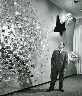
Zenith Radio Coporation Showroom, Chicago, Illinois, c.1959

Recently, I visited the Smithsonian American Art Museum in Washington, DC for the the first time. Now I don't know why, but I had rather low expectations for this particular museum - perhaps I just did not know what to expect. And while I was certainly impressed in general, I was nearly awestruck when I rounded a corner only to find myself face-to-face with Harry Bertoia's massive Zenith Radio Corporation Showroom Sculpture


Harry Bertoia and his creation, c.1959 

I have something of an affinity for the artist and designer Harry Bertoia, whom I mentioned almost in passing a few weeks ago. He was the first 20th Century modernist designer that I knew by name, having been introduced to his iconic wire mesh chairs by a good friend and room-mate in my early-twenties. Bertoia was an Italian-American who had come to this country from Northern Italy (via Canada) at a young age, studied alongside some of the legends of modern design, and even spent a few years during the 1940s living in my hometown of San Diego, California. His first gallery show in 1945 was held at the San Francisco Museum of Art. On top of all this, I genuinely enjoy his wide-array of work, from his monotypes to his furniture and of course his sculptures.


sculpture detail, photo by author

The 1950s were a productive time for Harry. He started off the decade by accepting a job with Knoll, a company headed up by Florence Knoll, a former classmate at the Cranbrook Academy of Art. Supposedly Knoll gave him very little directive to start, but within a year Harry had designed is diamond chair, which may be his most well-known work. More gallery shows (including MOMA in New York) and art commissions, both public and private, followed in the subsequent years leading up to the piece in question. These commissions would continue into the late 1970s, although Bertoia would never again return to furniture design and became increasingly interested in his musical experiments that utilized his own sculptural creations.


sculpture detail, photo by author


According to the Smithsonian archives, Bertoia was very specific in what the elements represented in the piece he produced for the late-50s Zenith commission. From left, the largest structure represents the earth, followed by sight, sound, and what he termed electronic control. All were Bertoia's attempt to provide some physical representation of the forces behind the relatively new phenomena of television. Zenith had introduced its first television line in 1948, with color sets following in 1950, so by the end of the decade it was a major player in the ever-growing television market.


sculpture detail, photo by author

The sculpture itself has a sheer presence that photos can barely capture. The slow alternating pulsation of the lights gives the impression of some sort of bio-mechanical organism. Is the wall alive? Is it transmitting a signal from some distant satellite? For a generation immersed in science fiction pulp and soon to embrace Rod Serling's The Twilight Zone, it must have made quite an impression at the time both on the Zenith executives as well as those that were fortunate enough to see the pieces in the original showroom.

As one may expect, the piece spent a significant amount of time neglected in storage. Fortunately, the Smithsonian spent a significant amount of time restoring the work, the story of which is told here.

Tuesday, November 20, 2012

Vertigo (1958)

The legacy of Alfred Hitchcock's Vertigo looms over the city of San Francisco - particularly for those of us with an interest in cinema, the 20th Century, and popular culture. For example just the other day this article ran in our local daily And, as you can see, there is no shortage of controversy over a seemingly simple matter - a facade that was preserved on celluloid for a mere few seconds. And yet, it manages to rile emotions to rival any other issue at hand. So what with that and Sascha Gervasi's Hitchcock opening in select theaters this Friday, I thought I would take another look at Hitch. More specifically, let's take another look at the opening title sequence credited to the great modern designer Saul Bass.


It's an impressive piece of film. Here is the sequence in stills, courtesy of Christian Annyas. The visual brilliance of Bass is married perfectly to the musical brilliance of Bernard Hermann.


Vertigo title sequence still, designed by Saul Bass, 1958

Or at least it is credited to Saul Bass.

One rabbit hole I recently went down led me to the Vortex concerts that took place here in San Francisco in 1957. While the concerts certainly deserve an entry of their own, in short the concerts took place at the Morrison Planetarium in Golden Gate Park, sponsored by KPFA and the California Academy of Sciences. The concerts were put together by Henry Jacobs, who I know of through his side-splittingly hip disc, The Wide Weird World of Shorty Petterstein on World Pacific Records (1958). I had re-listened to the disc on the way to a gig recently, when my interest in Jacobs was rekindled and I spent some time following what online leads there were on him.


A Chicago-native, Jacobs moved to SF in 1953. He was part sound collagist, part comic, and all hipster (in the best sense of the word). His "spoken word" recordings really deserve repeat listenings as they truly get funnier and funnier. His musique concrete works are admittedly over my head a bit, but still of interest. It is with the latter that he collaborated with visual artist Jordan Belson on the Vortex concerts. Jacobs was intrigued by the Planetarium's surround-sound which consisted of 38 speakers positioned throughout the auditorium. He saw the potential in such a system for musical performance and the visual aspect was a natural partnership. It was a successful happening and performances continued throughout 1959 (including a 1958 appearance at the World's Fair in Brussels). Folkways Records released a compilation of some of the music and remains in print. By all accounts, the performances were innovative precursors to the sound and light shows rock music would adopt in the late-1960s (not to mention "laserium" shows decades later).


Highlights of Vortex, Folkways LP, 1959

During the run of the Vortex series, Jacobs and Belson drew from the talents of several additional artists. On the musical side this included Bill Loughborough, whose shortlist of accomplishments included co-writing "Better Than Anything" (popularized by the great Bob Dorough) with room-mate and Kingston Trio bass player David "Buck" Wheat and playing percussion for Chet Baker's combo for several years in the mid-1950s. The group of contributing visual artists included two Southern California-born brothers named John and James Whitney.

John and James Whitney, c.1955

Both brothers were experimental film-makers whose abstract visual collaborations stretched back to 1939. John was born in Pasadena, California and went to college at the nearby Pomona College in Claremont (which among other things is where I wasted away a good portion of my high school years over copious amounts of Earl Grey tea!). Upon graduation he spent a year in Paris studying music with René Leibowitz. Liebowitz in turn had studied with both Maurice Ravel and Arnold Schoenberg and instructed Whitney in the latter's 12-tone system of music. But upon his return to California, Whitney shifted his focus to the visual arts often in partnership with his brother.


Variations on a Circle, John & James Whitney, 1941-1942

The imagery was linked back to music, certainly in the artists minds, but later more explicitly in the soundtracks the brothers selected for each. Early films were analogue in a true sense of the word, with the images being manipulated by hand for the camera. In this, the brothers were very successful. They continued using this method for just over a dozen years and just about as many films. Both worked on their own projects in addition to their collaborations. John even did 3 films for UPA. But some time in the early-to-mid-1950's the brothers hit upon a notion of how to use machinery to better articulate their goals. Using surplus military parts, John constructed their first "computers" which they used to make their animated features. Several years later, John explained for a documentary team:


Computers: Challenging Man's Supremacy, 1976

By now, I am pretty sure you can see where I am going. Well it turns out that one of John Whitney's side projects was a full-blown collaboration with the design firm of Saul Bass. The result of this collaboration? Why the title sequence to Vertigo of course! Several reliable sources confirm that the two produced the piece together, although Bass solely received the credit onscreen. What is perhaps most interesting when one takes another look at the sequence after ploughing through this weblog entry is how closely tied the titles are to the other work of the Whitneys. In fact, add Hermann's strikingly modern score and it is not a world away from what one may have experienced at the Morrison Planetarium in 1957 or 1958 at one of the Vortex concerts. And considering that Hitchcock was in San Francisco filming at that very time...well, let's just leave it there for now. A little suspense never hurt anyone and something tells me this is not the end of this story!


Catalog, John Whitney, 1961

Saturday, September 10, 2011

John Hermansader for Blue Note (1953-1955)


Graphic artist John Hermansader provides a direct link between early European modernist thought and a later mid-century icon of American modernism. Hermansader was born in 1916 near Reading, Pennsylvania. 3 years later Walter Gropius founded the Bauhaus in Weimar, Germany. Hermansader, probably in his late-teens or early-20s, went to Memphis to study design (possibly at the Memphis Academy of Arts). The Bauhaus moved to Dessau in 1925 and then to Berlin in 1932 before being closed due to political pressure from the German National Socialist Party. Hermansader continued his design studies at the New Bauhaus in Chicago, which was founded by ex-Bauhaus instructor László Moholy-Nagy in 1937 and existed for just a year before being reopened by Moholy-Nagy as the Chicago School of Design and eventually being incorporated as part of the Illinois Institute of Technology


After his studies, Hermansader returned to the East Coast by the end of the 1930s. He established his own design firm in New York City sometime in the 1940s and continued fostering his interest in contemporary jazz music which had reached back for some time. Through his friend and fellow designer Paul Bacon, he was introduced to the fold of the burgeoning Blue Note Records outfit. With the introduction of the 10-inch vinyl LP in 1948 and the accompanying need for sleeve design, Blue Note was faced with the challenge of how to present their catalog of music in a competitive and original manner. The first Blue Note microgroove 10-inch LPs were released in 1951 with striking, extremely modern covers by Bacon. Hermansader contributed his first designs to the "modern jazz series" in 1953 and was associated with the record label for the next 2 years.


Blue Note shifted focus to 12-inch LP releases in 1955. By this time, a young designer named Reid Miles had taken a position with Hermansader's firm as the latter's assistant. While it is quite possible that Miles contributed to some of the 10-inch LP designs credited to Hermansader (a fairly common practice in the design world), he almost certainly had a significant contribution to the first 12-inch LP designs that bore Hermansader's credit. 


With these last designs, Hermansader ended his association with Blue Note and passed the torch to his Miles, who was hired directly by Alfred Lion at the label. Although Hermansader reportedly designed some LP covers for Riverside Records, his work in this field quickly tapered off. By most reports he lived an interesting a full life before passing away at the age of 89 on July 4, 2009.

More, please? Be sure to read my entry on musician and visual artist Gil Melle for more early Blue Note LP images.