Showing posts with label design. Show all posts

Wednesday, November 19, 2014

Reid Miles (1956)


Patterns in Jazz by Gil Melle, Blue Note 12" LP 1517, 1956, cover design by Reid Miles

I know. I can hear it now. The last thing the internet needs is another blog post singing the praises of Reid Miles and his 12-year stint (1955 through 1967) as the principle LP artwork designer for Blue Note Records! Right? Well, of course one cannot laud Miles enough: his work for the New York jazz label was a masterful high-water mark of mid-century modernist design. But there was certainly more to  this well-known figure whose full story has remained remarkably illusive.


Mobley's Message by Hank Mobley, Prestige 12" LP 7061, 1956, cover design by Reid Miles

Born in Chicago on the 4th of July in 1927, Miles actually grew up on the West Coast of California. After the stock market crash of '29, his family moved out west as so many other families did during the Great Depression and ended up in Long Beach. A marital split left Miles in the care of his mother who supported he and his younger sister by working in a cannery in San Pedro. Most of his youth is undocumented, although it is known that Miles joined the U.S. Navy near the end of the Second World War, serving as a chauffeur. Upon his discharge he returned to Los Angeles and, according to Wayne Adams who would later assist Miles in the 1980s, chased after a girl and wound up enrolled in the Chouinard Art Institute. Chouinard was then located in MacArthur Park and would merge with the LA Conservatory of Music to form CalArts in 1961. Other Chouinard alumni, whose names will be familiar to regular readers of this blog, include graphic designer S. Neil Fujita and pop artist Ed Ruscha. Rushca and Miles almost certainly never crossed paths that the school as the former did not enroll until the mid-1950s. However, it is very likely that Fujita and Miles met at Chouinard as both attended the school around the same time - a very interesting idea considering how Fujita would later find him on the East Coast designing LP covers for Columbia Records a few years after studying in LA.


Herbie Nichols Trio by Herbie Nichols, Blue Note 12" LP 1519, 1956, cover design by Reid Miles

The person at Chouinard with whom Miles most definitely came into contact was the eventual head of the basic design program, Bill Moore. Moore is something of a West Coast design/art/animation legend who influenced generations of students over the course of nearly 40 years at Chouinard and CalArts. He is the thread the ties together such disparate names as Reid Miles, Ed Ruscha, Tim Burton, and Brad Bird - all of whom studied with Moore. Miles apparently had very little influences in his design life, but Moore was one of them and an early one at that.


Olio by Thad Jones, Prestige 12" LP 7084, 1956, cover design by Reid Miles

Leaving Chouinard before completing the courses required for graduation, Reid Miles made a bee line for New York City, scoring a job with designer John Hermansader. The timing was certainly right as Hermansader, through his friend and fellow designer Paul Bacon, began working with Blue Note Records in 1953 not too long after Miles arrived on the scene. Here is where the story gets a little hazy. While it is known that Miles worked on the Blue Note account, it is not known how much of the early (1953-1955) work was done by Hermansader, how much was done by Miles, and how much was a collaboration. May we indulge in some speculation? Based on the collective body of work Hermansader provided for Blue Note, he quite feasibly could have been another big influence on Miles.
Blue Note historians tend to downplay Hermansader's contributions, but his other surviving examples of visual art clearly indicate a notable talent. The raw materials are there in the work which Miles would develop into an art by the end of the decade, but the question remains just how much input Miles had into the Blue Note designs early on. Unfortunately, neither man is alive today to discuss and the period is poorly documented. At any rate, Miles - who would develop a history of transience - left Hermansader in 1955 for a job with Esquire magazine doing the layout and paste-up work. However, whatever his contributions were to Hermansader's Blue Note account, they were significant enough to catch the attention of the label's owners Alfred Lion and Francis Wolff who asked him to take a lead role in the design of 12-inch Long Playing records, the format that by mid-decade had emerged as the preferred format of most jazz releases industry-wide. Esquire was apparently well-aware of this arrangement and allowed Miles to moonlight - which usually meant working on 3 or so Blue Note LP covers on his Saturday off from the magazine, being paid $50 a job/cover. Later interviews would reveal Miles to be would could be termed a workaholic, in that to him his work was his life and the absence of former made the latter unbearable at times.


J.R. Monterose, Blue Note 12" LP 1536, 1956, cover design by Reid Miles

Contributing to an even more hazy story is the fact that a year after this transition and for a time space of nearly 2 years, Miles was also contributing 12" LP jacket designs to Blue Note's de facto, if not friendly rival Prestige Records. From 1956 until 1957, his name graced the jackets of nearly a dozen discs. Interestingly, this work is seldom cited by design aficionados, although there are some excellent covers that easily rival his contemporaneous work for Blue Note. There are definitely some similarities between the covers and one can see his style developing which each subsequent release. So here is one artist, simultaneously providing the visuals for some of the important modern jazz music recorded of its time (or any time for that matter). And, of course, Miles was famously not a fan of jazz, preferring classical. But this period is interesting, mainly as it is of such high quality and yet overlooked by most design fans.


Quadrama by the Gil Melle Quartet, Prestige 12" LP 7097, 1956, cover design by Reid Miles

A third influence should be mentioned at this time. After Moore and possibly Hermansader, Miles other major influence of the time was known to be Saul Bass. Bass needs no significant introduction to readers of this weblog, but it is perhaps helpful to put him into historical perspective. At the time that Miles was accepting a job with Esquire and getting down to business in earnest with Blue Note and Prestige, Bass was gaining widespread notoriety first for his work on the posters and titles for Carmen Jones (1954) and even more so for The Man With The Golden Arm (1955). His greatest innovation was perhaps the liberation of type from the galley, finding new ways to communicate the written word that flew (sometimes, literally) in the face of convention. Of course, in the design world Bass is a true legend and this history books have been kind to the legacy he has left behind.


6 Pieces of Silver by the Horace Silver Quintet, Blue Note 12" LP 1539, 1956, cover design by Reid Miles

Reid Miles perhaps enjoyed his most lucrative years well after his run with Blue Note. Some time in the early-1960s he started focusing on photography. By mid-decade it was his main focus. Miles returned to Los Angeles in 1971 and within a few years established a style and clientele that made him quite successful by anyone's terms - although he retained a drive and passion for his work which lasted until his death in 1993. Miles occasionally returned to album covers during the second act of his career, but his style by then had changed so significantly that few people made the connection. Fortunately, his mid-'50s experiments are well documented and, hopefully, well preserved for the ages.

Tuesday, May 6, 2014

TK Smith (2014)


Desert Oasis: The Midcentury Modern Guitars of TK Smith by Nick Rossi, photos by Jacqueline Di Milia, courtesy of the Fretboard Journal

Issue number 32 of the Fretboard Journal is now available at newsstands everywhere. I am very pleased to announce that it includes an article penned by yours truly profiling guitarist and guitar-maker TK Smith. I first heard about TK in 1990 when Big Sandy & The Fly-Rite Trio released their debut LP on Dionysus Records and played in San Francisco to support the disc. I've been a fan of Smith's playing ever since. The path his life has taken is a very interesting one and it intersects with a lot of the topics covered on the pages of this weblog. I find his work to be beautiful, not only from the aesthetic perspective of someone who appreciates modernism, but also as someone who respects true craftsmanship. I also like that TK is part of a Southern California tradition - not in a convoluted way, but simple because he is both creative and curious. Plus he has great taste!

Fretboard Journal 32, Ry Cooder cover story, out now

TK Smith may be found online and you may also follow him on Instagram. And here's just a snippet of why he is one of the most interesting guitar players around…

Wednesday, April 16, 2014

Fonts of Rome (2014)

All images, copyright 2014 by Nick Rossi

There is simply so much to love about the city of Rome. And while many are intoxicated by the smells, the sounds, or the taste of the food, what struck me most on my recent visit was the abundance of wonderful design in everyday things - beauty in a great sense of the word. Certainly, other cities have a more unified design (Berlin?) and still others may appeal to me more from a modernist aesthetic (New York?), but the even more eternal than before city of Rome continues to blatantly disregard style guidelines with such careless aplomb that should be appreciated and applauded.

Traveler's note: I HIGHLY recommend the travel guide Rome: Moods and Places published by Herb Lester Associates. Not only was it a daily part of my finding beauty in everyday objects thanks to designer Nate Luetkenhans, but it was authored by author, blogger, and friend JP Gaul who has a very unique insight to the city of Rome. 

Tuesday, January 28, 2014

Forcillo Archtop Guitar (1953)


Forcillo archtop guitar, New Jersey, circa 1953

This week, I am going to indulge myself even more than usual. The guitar featured in this entry was recently sold on a well-known auction site with very little pomp and even less circumstance. It is a Forcillo Guitar. If that means nothing to you, even if you are a guitar geek like this writer, don't worry. The name Forcillo, as in Frank Forcillo, is one that lingers in a netherworld of footnotes and asides. That said, the few facts that we do know about Forcillo are interesting enough to make it worth documenting here, at least until what is left of the story is rescued from obscurity.

Here is what we do know. In 1932, first generation Italian-American guitar, violin, and mandolin maker John D'Angelico started his own shop in the Little Italy neighborhood of New York City. He had apprenticed under his Uncle, Raphael Ciani, for over a dozen years before Ciani's death. When he opened his own shop among his employees were Jimmy DeSerio, who stayed with D'Angelico until 1959, and Frank Forcillo whose tenure with the legend was a brief few years.

Frank Forcillo's name next turns up in the Blue Book of Guitars as the head of United Guitars out of Elizabeth, New Jersey, started presumably some time in the 1940s. The next concrete piece of info around Forcillo is courtesy of the United States Patent Office. On April 29, 1948, Forcillo filed a patent listed as an Attachment for Fretted, Stringed Instruments. This design is topped of by a finial that is remarkably similar to the same detail that D'Angelico used almost exclusively during the same time period. Could it be that this was, in truth, a Forcillo design that dated back to the Frank's time in John's shop?
Update: luthier Todd Cambio of Fraulini Guitars has confirmed that the finial on the headstock is a very old Neapolitan design used not only by instrument makers in Italy long before mid-century, but also used by John D'Angelico's uncle, Sr. Ciani, on several mandolins and guitars. 


United States Patent 2,510,775 filed by Frank Forcillo, 1948

1948 was also the year that Gibson, who had recently emerged from the industrial chaos of World War II as the guitar industry leader, introduced a 2-pickup version of their ES-350 guitar. This guitar was the first mass-produced 2-pickup cutaway guitar created solely for use as an electric instrument and re-set the standard for what an electric guitar was. Gibson's one-time biggest rival, the Manhattan-based Epiphone, introduced a competing but ultimately unsuccessful model within a year. B League champs Gretsch over in Brooklyn introduced their similarly-styled Electro II by 1951 and by decade's end parlayed the configuration into several fairly successful models.

At this point of time (or very close to it at least) the Forcillo Guitar enters into the picture. An educated guess would put this particular guitar in right around this time period. Some of the details in addition to the aforementioned finial include Waverly open-back tuners and matching tailpiece, as well as a headstock shape and neck design that is very similar to contemporaneous D'Angelicos. The pickups are something of a mystery. Perhaps they are manufactured by Franz/Fransch/Fransche, another small New York are shop that provided pickups most notably for Guild guitars while that guitar-maker was in New York and later New Jersey.

Beyond the above, very little is currently known about Forcillo and United and even less than the instrument. The seller shared that it was purchased by his father in New York some time around 1953 and continued to use it for years in jazz and society bands. There was some vague memory of it being a fairly expensive purchase at the time, but the other details are long lost. Of course I would love to hear from anyone who knows more about any of these topics. Please use the comments section below or email me direct. I will update this post as I discover and verify more information.

Footnote: both D'Angelico and Guild continued to have connections to Forcillo's United Guitars throughout the 1950s. When John D'Angelico finally caved into pressure to make "electric" guitars he chose not to make the bodies, but rather purchased laminate-top bodies from Forcillo's United company. John would then make the neck and complete the guitars - again using Franz pickups for the most part. Obviously they remained on good terms. According to Hans Moust's excellent and highly recommended The Guild Guitar Book, in the early years Guild used craftsmen from Code Guitars in New Jersey to finish their instruments. Many references to United Guitars make reference to Code in the same breath. The connection has yet to be fully explained but it is worth mentioning here. It should also be noted that the finish on this Forcillo guitar looks very similar to the finishes Guild used during it's first year or so (1953-1954).


Forcillo archtop guitar, New Jersey, circa 1953

Tuesday, August 20, 2013

Irving Harper (2013)


George Nelson Clock reproduction by Verichron, 2013

Every so often it is good to have the rug pulled out from under you. The experience sharpens your senses, wakes you up, and makes you question the firm ground that all too often is taken for granted.


Online ad, Modernica, 2013

My Mid-20th Century Design Road to Damascus was a flight to Spain with a long layover in JFK. It was 1998, Trans World Airlines was still operating, and the fates conspired to leave me with a few hours on my hands in Terminal 5. Almost needless to say, I was floored by the building. My appreciation of modernism as a design aesthetic became a primary interest and the name Eero Saarinen was elevated to hero status in my estimation. Move forward 5 years and I am now sharing the flat where I currently live in San Francisco with the now Missus. We purchase a pair of pendant lamps for our living room spaces from a local favorite, Inside. Our choice? Modernica's reproduction of the Howard Miller cigar bubble lamps designed by George Nelson. So here was my first legitimate design purchase. An iconic item by a name designer. So all things being equal, Nelson's stature is elevated in my little black Moleskine.


Print ads, Howard Miller Clock Company, 1956

And it grows. And it grows. My wife buys me a Vitra-produced Nelson reproduction clock as a gift. I find an oversize jack for my bookshelf. Our flatware is replaced with a set of vintage Hall Leisure designed by the Nelson and Associates. George Nelson becomes a touchstone in my mind's eye as I become more and more engrossed in this aspect of living.


Debut of the Herman Miller logo, 1947, logo by Irving Harper for George Nelson Design

Perhaps the only thing worse than being late to the party is being late to the party as well as being oblivious. The latter is how I felt when I first read about Irving Harper a few weeks ago. Who is Irving Harper? Only the most significant Mid-Century Modernist that you have (perhaps likely) never heard of! As it turns out Harper was THE man at George Nelson and Associates responsible for everything from the iconic Herman Miller logo to the now legendary Howard Miller "Nelson" clocks which hang on the wall of nearly every discerning modernist worth their salt. And, yes, even those lamps hanging in my living room are now attributed to Harper. Sure, I knew that George often took credit for the work of this firm. Of course he did, that is the way it had been done for decades if not centuries with the name on the masthead usually taking credit for the entire output. What is astonishing is just how many of these iconic works sprung from Irving Harper's obviously fertile, creative mind. The wonderful coda to this story is that Harper is still alive and finally getting the attention and notoriety he so clearly deserves.

For further reading, I highly recommend this article as well as this one

Tuesday, July 2, 2013

Tom Hannan (1957)


Paul Chambers Quintet, Blue Note Records LP 1564, 1957, design by Tom Hannan

I've mused rhapsodic on these pages previously about the early design legacy of New York's Blue Note Records, focusing mainly on the 10-inch LP era and such artists as Bill Hughes, John Hermansader, and Gil Melle. Recently, I saw a Japanese reissue of an early 12-inch and was struck by the abstract art design of the sleeve. With a little knuckle-grease and 'net digging, I learned that the cover was the work of a slightly obscure and now deceased artist named Tom Hannan whose story has some very interesting modernist intersections. 


Bone & Bari, Curtis Fuller, Blue Note Records LP 1572, 1957, design by Tom Hannan

The Blue Note 1500 series of LPs reflect a time period (1955-1958) where the independent jazz record label was both in transition and starting to find its rhythm. These were the first releases in the new and soon to be dominant 12-inch format. Somewhere in the middle of the run (1562 to be exact) the discs started being released in both monaural and the popular new stereo format. It is when both the label and the medium came of age, if you will pardon the phrase. From a design perspective, it is during this series the Reid Miles began to come to prominence and by the end of the decade would be synonymous with the look of the label.


Hank Mobley, Blue Note Records LP 1560, 1957, design by Tom Hannan

But Reid Miles had yet to establish his monopoly in 1957. Another artist, Tom Hannan, contributed several striking designs that mixed abstract imagery with striking typography. In some ways the balance of form and expression more accurately reflected the partially improvised music contained within the cardboard sleeves. At any rate, Hannan's contributions are definitely a glimpse of what could have been had Blue Note owners continued to experiment with a pool of designers throughout the end of the decade and into the 1960s.


Thelonious Monk and Sonny Rollins, Prestige Records LP 7075, 1956, design by Tom Hannan

The Blue Note work was neither the first nor the last record jacket design work that Hannan did. The year prior he had contributed a number of excellent designs to the Prestige Records catalog and he continue to freelance through the end of the decade to a number of other labels. Taken as a whole, the LPs show a consistency in concept if not execution. Hannan's original abstract work was set against linear typography (another specialty of his) and often his own photography that was as sharp as a freshly pressed Brooks Brothers button-down shirt.


Tom Hannan, c.1960, source unknown

So what about the artist? Tom Hannan was born in Michigan in 1927. He was a jazz fan early on, spending some time playing the drums before shifting his focus on the visual arts. He attended both Wayne State University as well as the Cleveland School of Art before moving to New York in 1950 to attend the Hans Hofmann School on a painting scholarship. The Hans Hofmann? Yes indeed. Hofmann was one of more explicit links between early European abstract art and the New York School that most people know as abstract expressionism. Hannan not only studied with Hofmann, but ended up working as his assistant for 3 years until 1953.


Magenta and Blue, Hans Hofmann, 1950, Whitney Museum of Art collection

History has been kind to Hofmann and there is ample information both online and in books on this important icon, so I will stick to the salient points. Born in Germany in 1880, Hofmann was in Europe the moment art took an abrupt turn towards the abstract near the beginning of the 20th Century. He studied in Paris prior to World War I and taught two Summer courses in Berkeley, California (1930, 1931), before finally leaving Germany for good in 1933. His teaching career lasted nearly four decades and his more well known students included Frank Stella and Lee Krasner, to name but two. He continued to paint, teach, and write up until his death in 1966.


Back Table at the Five Spot, photo by Burt Glinn, 1957

Following his years with Hofmann, Hannan immediately began to make a name of his own. He was one of the founding members of the James Gallery, which opened up in the Fall of 1954 at 70 East 12th Street. The James Gallery was one of the artist-owned cooperative exhibition spaces that later came to be known as the 10th Street Galleries (something else that I have written about on these pages). The same year he married a Parson's School of Design student named Allison Smith and the two lived the almost stereotypical existence of 1950s New York artists: a cold-water flat in SoHo, jazz at The Five Spot, and commercial work such as those for Prestige and Blue Note to keep food on the table. Although initially a way to fund his more creative endeavors, Hannan eventually shifted his focus on graphic design in the 1960s. He and Allison eventually left the City for Vermont and became successful dealers in American furniture some time around 1970, a pursuit he continued until his death in 2000.


Cu-Bop, Art Blakey and his Jazz Messengers with Sabu and a Bongo, Jubilee Records 1049, 1958, design by Tom Hannan

Tuesday, June 4, 2013

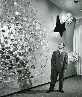
Zenith Radio Corporation Showroom Sculpture (1959)


Zenith Radio Coporation Showroom, Chicago, Illinois, c.1959

Recently, I visited the Smithsonian American Art Museum in Washington, DC for the the first time. Now I don't know why, but I had rather low expectations for this particular museum - perhaps I just did not know what to expect. And while I was certainly impressed in general, I was nearly awestruck when I rounded a corner only to find myself face-to-face with Harry Bertoia's massive Zenith Radio Corporation Showroom Sculpture


Harry Bertoia and his creation, c.1959 

I have something of an affinity for the artist and designer Harry Bertoia, whom I mentioned almost in passing a few weeks ago. He was the first 20th Century modernist designer that I knew by name, having been introduced to his iconic wire mesh chairs by a good friend and room-mate in my early-twenties. Bertoia was an Italian-American who had come to this country from Northern Italy (via Canada) at a young age, studied alongside some of the legends of modern design, and even spent a few years during the 1940s living in my hometown of San Diego, California. His first gallery show in 1945 was held at the San Francisco Museum of Art. On top of all this, I genuinely enjoy his wide-array of work, from his monotypes to his furniture and of course his sculptures.


sculpture detail, photo by author

The 1950s were a productive time for Harry. He started off the decade by accepting a job with Knoll, a company headed up by Florence Knoll, a former classmate at the Cranbrook Academy of Art. Supposedly Knoll gave him very little directive to start, but within a year Harry had designed is diamond chair, which may be his most well-known work. More gallery shows (including MOMA in New York) and art commissions, both public and private, followed in the subsequent years leading up to the piece in question. These commissions would continue into the late 1970s, although Bertoia would never again return to furniture design and became increasingly interested in his musical experiments that utilized his own sculptural creations.


sculpture detail, photo by author


According to the Smithsonian archives, Bertoia was very specific in what the elements represented in the piece he produced for the late-50s Zenith commission. From left, the largest structure represents the earth, followed by sight, sound, and what he termed electronic control. All were Bertoia's attempt to provide some physical representation of the forces behind the relatively new phenomena of television. Zenith had introduced its first television line in 1948, with color sets following in 1950, so by the end of the decade it was a major player in the ever-growing television market.


sculpture detail, photo by author

The sculpture itself has a sheer presence that photos can barely capture. The slow alternating pulsation of the lights gives the impression of some sort of bio-mechanical organism. Is the wall alive? Is it transmitting a signal from some distant satellite? For a generation immersed in science fiction pulp and soon to embrace Rod Serling's The Twilight Zone, it must have made quite an impression at the time both on the Zenith executives as well as those that were fortunate enough to see the pieces in the original showroom.

As one may expect, the piece spent a significant amount of time neglected in storage. Fortunately, the Smithsonian spent a significant amount of time restoring the work, the story of which is told here.

Tuesday, May 28, 2013

Le Sacre du printemps (1913)


The young girls of Le Sacre, original costumes and stage set, 1913 

Tomorrow, May 29th, 2013 marks the 100th anniversary of the premiere performance of Igor Stravinsky's Le Sacre du printemps, known more commonly by it's English title the Rite of Spring. There has already been much ballyhoo about the centennial and this entry may very well seem like another bit of carpetbagging (not unlike my Gatsby post of a few weeks ago), but the Rite is a fairly significant piece of music to me personally. Like many, I first heard it in a movie theater courtesy of Walt Disney's Fantasia. My Aunt Marianne took myself and my younger cousin Paul to see either the 1977 or 1982 theatrical run at the Cinema 21 in San Diego, California. Now Cinema 21 was not any run of mill movie theater: it was a single-screen 1,000-seat temple to modernity and one of the reasons I can't take today's multiplexes seriously. At the time of it's 1963 construction by Statewide Theaters it was the only movie house in the country set up to screen films in 35mm, 70mm, Cinerama, AND Cinema-scope. No small achievement. Even 15 years after it's opening it made an impression - certainly to a young boy such as myself. The experience obviously has stayed with me, reinforced over the years by countless visits to Disneyland capped off with what we called the dinosaur train: the Primeval World attraction.


Promotional postcard, Cinema 21, San Diego, California, 1963

The Rite of Spring sequence in Fantasia was of course set to visuals of the origins of the earth and the prehistoric days of the dinosaurs. And what 6 or 11-year-old boy doesn't like dinosaurs? I didn't care about the dissonance in Stravinsky's music, to my young mind it was just what the cogs of creation sounded like as fascinating creatures rose from the primordial ooze. I was captivated and I can recall the experience with some clarity to this day. I have revisited the film in recent years and am well aware that Stravinsky disowned the film upon it's 1940 release (although he cashed the check) not only for the truncated version of the score (due to time limits of the original theatrical release) but to the visual interpretation of the music. Yes it is flawed, but it served a purpose not only for my life but for so many other young ears across the United States that may have never been exposed to the savage beauty of Igor's music. Later through my development as a musician and as my interest in 20th Century modern jazz deepened, I approached Stravinsky's music from a different angle inspired at least in part by Charlie Parker's noted appreciation and admiration for the composer.


Walt Disney and Igor Stravinsky, Los Angeles, California, 1939

The performance that now intrigues me most is the Joffrey Ballet's painstaking 1987 recreation of the original 1913 Paris production. It was not only the music that ushered in the modern era of ballet, it was the angular, primitive choreography of the legendary Vaslav Nijinski and the earthy sets and costumes of Russian folklorist Nicholas Roerich combined with Stravinsky's brilliant music that made for such a revolutionary production at Sergei Diaghilev's Ballets Russes. For years, it was thought that everything buy the score was lost. After only a dozen or so performances in Paris and London, the ballet was not performed for 7 years by which time the choreography had already been forgotten by all of the principals. It's something of a modern miracle that the '80s reconstruction happened at all. But what the Joffrey most effectively did is help revive the exciting, primal nature of the piece: as Leonard Bernstein once famously exclaimed, 'it's about sex!'. And surely the Russian folk elements of the story which culminate in a virgin sacrifice thinly veils this strong subtext. But as the sacrifice of virginity can also be viewed as the creation of new life and rebirth, perhaps ol' Walt Disney wasn't so far off the mark after all!