Tuesday, November 27, 2012

Pendleton Sport Shirt (1952)

Print advertisement, 1952

Pendleton, Oregon is a small (population is currently just over 15,000 people) city located about mid-way between Portland, Oregon and Boise, Idaho. U.S. Route 30, which has stretched all the way from Atlantic City, New Jersey to Astoria, Oregon since 1926 runs directly through town. Before that it was served by the Union Pacific railway line. The Pendleton Round-Up, a Nationally-known rodeo, was started in 1910 and now draws some 50,000 cowboys, cowgirls, and assorted others to the area every September. More recently, the Eastern Oregon Correctional Facility has drawn some attention to its host city on account of its Prison Blues line of clothing. But without the shadow of a doubt, Pendleton, is most well-known for the Pendleton Woolen Mills. 

Print advertisement, 1953

The mill existed before the 20th Century, but it was the acquisition of the facility and its subsequent rejuvenation by the Bishop family of Salem, Oregon in 1909 that is the real first chapter in this story. Eastern Oregon at the turn of the last Century was sheep country and more than a little rough and tumble. The Bishops made their living manufacturing Indian blankets, selling to both to the local tribes (Utatilla, Cayuse, and Walla Walla) as well as those the Southwest. But within fifteen years they expanded their product line to include their first men's shirts, which developed into a full line of men's clothing by 1929. Both were innovative at the time, mainly due to the rich colors and patterns that the company incorporated into its clothing, an anomaly particularly in the world of outdoor and work wear of the time.


Print advertisement, 1954

Pendleton shifted all of its production during the Second World War to supply the military and contribute to the war effort at home. At the conflict's end, production of consumer goods resumed and expanded in 1949 to include its first woman's line of clothing. There was also a tremendous shift after the war, that attempted to move away from it's workwear/outdoorsman image and court the mid-century spirit of leisure that was beginning to pervade so much of the United States. This only increased after the conclusion of the Korean War in 1953, both in terms of the types of items found in the men's line as well as in the spirit of the company's advertising campaigns. 


Print advertisement, 1955

Some time during this era in the company's history, they introduced their Sport Shirt, more commonly known today as the Board Shirt in deference to West Coast surf culture's adoption of the garment in the early-1960s (more on that in a moment). I have yet to pinpoint the exact time of introduction, but the earliest print ad I have seen making mention of the Sport Shirt is 1952. This makes sense from a stylistic perspective, in that the sport shirt clearly draws is main design inspiration from the men's casual shirt of the mid-to-late-1940s style widely manufactured throughout the United States but very often so referenced as "California Style" and frequently made in gabardine. Incidentally, Pendleton's older shirt design was re-christened as its Regular Shirt to differentiate the two. A third style, the Sir Pendleton was introduced a short while later in the middle of the decade.
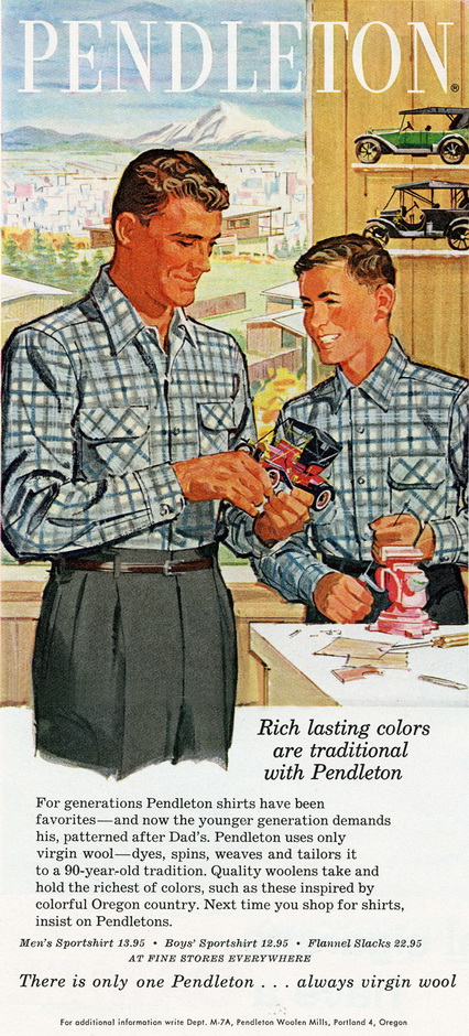

Print advertisement, 1959

What sets the Pendleton Sport Shirt apart from any other manufacturer of this style of shirt is not only its use of its trademark bold woolen plaids but the fact that the Pendleton Sport Shirt stayed in fashion long after men's casual wear moved onto to other styles and trends. In fact, the shirt has pretty much remained in production by Pendleton since the early-1950s and can be bought new today in 2012 for pretty much the same price (adjusted for inflation, of course). Perhaps even more remarkable is that it has done so with only slight concessions to the changing times. One could of course detail the differences between this year's model and the inaugural version, but in a larger scheme of things, they are remarkably similar. Another small miracle is not only how the Sport Shirt has usurped all prior versions of the same style casual shirt, so much so that many for decades have equated this style shirt with Pendleton; but also how it has become known to nearly as many as simply "a Pendleton." 


Gerry Mulligan, Los Angeles, 1953, photo by Bob Willoughby

In addition to the typical man of leisure the shirt was marketed to, the Pendleton was quickly adopted by the West Coast Bohemian set. Jazz musicians as well as the emerging Beat Generation that they influenced can be seen in the soon-to-be ubiquitous Sport Shirt throughout the 1950s. The fact that Down Beat could be running a photo of Gerry Mulligan blowing his bari roughly around the same time that Pendleton was opening a retail shop in Disneyland, also speaks to the somewhat egalitarian status the shirt was reaching. A quick side note: the Pendleton shop located in Frontierland in the original Disneyland amusement park in Anaheim, California was open for nearly 35 years (July 1955 through April 1990)!


Brew Moore LP, 1956, Fantasy Records 

That the shirt was at both ubiquitous and hip is what I suspect is behind its appropriation by Southern California surf culture in the early-1960s. Much of that youth culture was a mix of the suburban and Bohemian, drawing inspiration from equal parts Venice Beach boho and Hawthorne prefab. Of course much has been made of the early-Beach Boys moniker The Pendletones, as well as the photos of the group in Pendleton Sport Shirts on 2 of its first 3 LPs from 1962 to 1963. But it was truly part of the West Coast surfer uniform at the time. But why would a wool shirt be worn in a region known for the warmth of the sun? Well, as anyone on a coast will tell you, the ocean breeze blows cool and getting out of the water can be a bit of a shock to the system. And as noted surf culture historian, Domenic Priore, pointed out to me, surfers are up at 5 AM and in the water by 6 AM. The beach is cold that time of day! And let's not forget that good virgin wool breathes with the wearer making it fairly versatile and suitable for all but really warm days.


Disneyland, 1959

Fast forward fifty years and the Pendleton Sport Shirt (or Board Shirt) is still part of the conversation on cool. It's consistent production and relatively low cost has made it a thrift store staple for decades, ensuring its perpetual inclusion in the wardrobe of hipsters both young and old. It's egalitarian nature has been preserved and folks ranging from bearded Brooklyn youths to web-posting connoisseurs of 20th Century Classics ensure that it's legacy lives on.

Thanks to the gang over at The Roll Call on Facebook for the inspiration. For further reading, I highly recommend checking out the archival entries in Pendleton's own weblog. For vintage Disneyland photos, one can do no better than Gorillas Don't Blog.

Tuesday, November 20, 2012

Vertigo (1958)

The legacy of Alfred Hitchcock's Vertigo looms over the city of San Francisco - particularly for those of us with an interest in cinema, the 20th Century, and popular culture. For example just the other day this article ran in our local daily And, as you can see, there is no shortage of controversy over a seemingly simple matter - a facade that was preserved on celluloid for a mere few seconds. And yet, it manages to rile emotions to rival any other issue at hand. So what with that and Sascha Gervasi's Hitchcock opening in select theaters this Friday, I thought I would take another look at Hitch. More specifically, let's take another look at the opening title sequence credited to the great modern designer Saul Bass.


It's an impressive piece of film. Here is the sequence in stills, courtesy of Christian Annyas. The visual brilliance of Bass is married perfectly to the musical brilliance of Bernard Hermann.


Vertigo title sequence still, designed by Saul Bass, 1958

Or at least it is credited to Saul Bass.

One rabbit hole I recently went down led me to the Vortex concerts that took place here in San Francisco in 1957. While the concerts certainly deserve an entry of their own, in short the concerts took place at the Morrison Planetarium in Golden Gate Park, sponsored by KPFA and the California Academy of Sciences. The concerts were put together by Henry Jacobs, who I know of through his side-splittingly hip disc, The Wide Weird World of Shorty Petterstein on World Pacific Records (1958). I had re-listened to the disc on the way to a gig recently, when my interest in Jacobs was rekindled and I spent some time following what online leads there were on him.


A Chicago-native, Jacobs moved to SF in 1953. He was part sound collagist, part comic, and all hipster (in the best sense of the word). His "spoken word" recordings really deserve repeat listenings as they truly get funnier and funnier. His musique concrete works are admittedly over my head a bit, but still of interest. It is with the latter that he collaborated with visual artist Jordan Belson on the Vortex concerts. Jacobs was intrigued by the Planetarium's surround-sound which consisted of 38 speakers positioned throughout the auditorium. He saw the potential in such a system for musical performance and the visual aspect was a natural partnership. It was a successful happening and performances continued throughout 1959 (including a 1958 appearance at the World's Fair in Brussels). Folkways Records released a compilation of some of the music and remains in print. By all accounts, the performances were innovative precursors to the sound and light shows rock music would adopt in the late-1960s (not to mention "laserium" shows decades later).


Highlights of Vortex, Folkways LP, 1959

During the run of the Vortex series, Jacobs and Belson drew from the talents of several additional artists. On the musical side this included Bill Loughborough, whose shortlist of accomplishments included co-writing "Better Than Anything" (popularized by the great Bob Dorough) with room-mate and Kingston Trio bass player David "Buck" Wheat and playing percussion for Chet Baker's combo for several years in the mid-1950s. The group of contributing visual artists included two Southern California-born brothers named John and James Whitney.

John and James Whitney, c.1955

Both brothers were experimental film-makers whose abstract visual collaborations stretched back to 1939. John was born in Pasadena, California and went to college at the nearby Pomona College in Claremont (which among other things is where I wasted away a good portion of my high school years over copious amounts of Earl Grey tea!). Upon graduation he spent a year in Paris studying music with René Leibowitz. Liebowitz in turn had studied with both Maurice Ravel and Arnold Schoenberg and instructed Whitney in the latter's 12-tone system of music. But upon his return to California, Whitney shifted his focus to the visual arts often in partnership with his brother.


Variations on a Circle, John & James Whitney, 1941-1942

The imagery was linked back to music, certainly in the artists minds, but later more explicitly in the soundtracks the brothers selected for each. Early films were analogue in a true sense of the word, with the images being manipulated by hand for the camera. In this, the brothers were very successful. They continued using this method for just over a dozen years and just about as many films. Both worked on their own projects in addition to their collaborations. John even did 3 films for UPA. But some time in the early-to-mid-1950's the brothers hit upon a notion of how to use machinery to better articulate their goals. Using surplus military parts, John constructed their first "computers" which they used to make their animated features. Several years later, John explained for a documentary team:


Computers: Challenging Man's Supremacy, 1976

By now, I am pretty sure you can see where I am going. Well it turns out that one of John Whitney's side projects was a full-blown collaboration with the design firm of Saul Bass. The result of this collaboration? Why the title sequence to Vertigo of course! Several reliable sources confirm that the two produced the piece together, although Bass solely received the credit onscreen. What is perhaps most interesting when one takes another look at the sequence after ploughing through this weblog entry is how closely tied the titles are to the other work of the Whitneys. In fact, add Hermann's strikingly modern score and it is not a world away from what one may have experienced at the Morrison Planetarium in 1957 or 1958 at one of the Vortex concerts. And considering that Hitchcock was in San Francisco filming at that very time...well, let's just leave it there for now. A little suspense never hurt anyone and something tells me this is not the end of this story!


Catalog, John Whitney, 1961

Tuesday, October 2, 2012

Chelsea Bridge (1940)


Nocturne: Blue and Gold - Old Battersea Bridge by James McNeill Whistler, c.1872-1875

In 1876, American-born James McNeill Whistler was living London and had been doing so for the better part of a decade. He had left the United States in 1855 and spent the first few years living the life of a Bohemian in the Latin Quarter of Paris. It was in Paris that he was deeply influenced by the notion of modern art, not only the visual arts such as Impressionism but by other trends in literature and music, as well as the relationships between all 3. He then moved to London, back to Paris, and then briefly to Chile, before settling back into London. While in Chile that he painted the first in a series of what he called moonlights later re-cast as nocturnes, copping a musical term from one of his patrons. In 1876 that he exhibited the above Nocturne: Blue and Gold - Old Battersea Bridge (currently in the collection of the Tate in London).


                                Moonlight on Ryogoku Bridge, by Utagawa Hiroshige, c.1830

The painting is notable for a couple of reasons. First, in addition to the French influence, art critics and historians have made the case that Whistler was influenced by Japanese woodblock artists during this time and more specifically by a Hiroshige work, Moonlight on Ryogoku Bridge, created forty-some-odd years earlier. Secondly, the Whistler work was the subject of a large degree of criticism at the time including that of well-known art critic John Ruskin who ended up in a court battle with Whistler under charges of libel. Whistler won the case, although his award amounted to 1 farthing. 


                                Billy Strayhorn and Duke Ellington, photo Dave Dexter, Jr., c.1943

Seventy years later and back in the United States, bandleader Duke Ellington was posed with a repertoire problem. ASCAP had substantially increased its license fees in 1939, which resulted in the creation of BMI in 1940 by the National Association of Broadcasters. Radio was key to the success of any band of the day and Ellington quickly surmised that if the major radio stations refused to play music published by ASCAP (which was the practical upshot of the situation), he would need a whole new band book of BMI-published material. To this end he brought his son Mercer and Billy Strayhorn, to Los Angeles for a massive effort to re-build the band book. Neither were affiliated with ASCAP, so were able to provide the clean slate material. This also coincided with what many critics consider to be his finest band, the so-called Blanton-Webster band. The issue was eventually resolved by the Federal court system in 1941, but not before Ellington's Famous Orchestra went through something of a musical transition. To make this time period even more tidy for historians, it signaled Duke's return to RCA Victor Records and the end of his longtime romantic and songwriting relationships. A new day indeed.


Victor 27740-B, 1941

The results of the songwriting sessions were staggering: Passion Flower, A Flower is a Lovesome Thing, Take The A Train, to name but 3. Chelsea Bridge was another. The Billy Strayhorn composition is just beautiful, it's age-old comparisons to the work of Claude Debussy not only accurate but apt. To call it an impressionistic piece might be a bit lazy, but certainly justified particularly with the chords Strayhorn uses on the A sections. To put it in simple terms, the slight dissonance gives the song a hazy and uncertain feel, particularly at the slower tempo. Not really unsettling, just a little ambiguous - but beautiful. As it turns out, the very erudite Strayhorn's inspiration turned out to be Whistler's Nocturne: Blue and Gold - Old Battersea Bridge (that's Chelsea Church on the left far shore in the painting).


Chelsea Bridge debuted with the orchestra some time in early 1941 as evidenced by Ellington's radio broadcasts from the swing-era stalwart Casa Manana, located in the LA suburb of Culver City. The number remained in the book throughout the year, with Ellington recording it in September both at a Standard Radio Transcription session and at a commerical Victor record session (again, both in LA). He returned to the piece on December 2nd when he took his orchestra into RCA's Hollywood Studios to record it along with another Strayhorn composition, Raincheck, plus 2 others. It was this recording, featuring Ben Webster on tenor sax, that was the released master recording.


The song found favor with hip ears and was recorded several times from the 1950s onward by the likes of Gerry Mulligan, the (original) Vince Guaraldi Trio, and Ella Fitzgerald. Webster kept is as part of his featured repertoire for the remainder of his life. But perhaps the most notable post-Ellington recording of the composition was made by its creator. Billy Strayhorn, almost 6 years before his untimely death at the age of 51, recorded a solo piano version in May of 1961 during a brief stay in Paris - where it arguably all began for Whistler a century earlier.


Tuesday, September 4, 2012

An Evening with Fred Astaire (1958)


A buddy and I were recently discussing the notion that there was NO way Fred Astaire could succeed in today's entertainment world. A stylish man with that much grace? No way. I am adamant about this. And it is a real shame as Astaire was SO talented and such an amazing artist. No he wasn't just an artist, he was an absolute artistic force. Just dig this 1958 television special. 


The clips do a good job of laying out the details, so I will be brief. This was originally broadcast nationwide on NBC-TV on October 17, 1958. I was recorded, in color, on videotape (an early use color videotape, I should add) in Burbank, Calif. at NBC-TV's Color City Studios. Color TV had been in development since the late-1940s (the first color CRT patent application was dated 1947) and introduced to the consumer market in 1954. Almost needless to say, this was the early days of the medium and very few viewers were able to see this entertainment special as it was intended. It would be another 3 years before Walt Disney's Wonderful World of Color special in September 1961 would really gave the market a push. In spite of the challenges, An Evening with Fred Astaire enjoyed impressive ratings and was the recipient of several Emmy awards.

Now scroll back up to the top of this entry, sit back, and enjoy all 5 parts of the show (complete with original commercials)!

Wednesday, August 29, 2012

Charlie Parker (1920)


Charlie Parker, Oscar Peterson, Ray Brown, July 1952 at Radio Recorders, Hollywood, photo by Esther Bubley

Today, Wednesday, August 29, 2012 marks the 92nd anniversary of the birth of the great Charlie Parker. Fortunately, there continues to be a tremendous amount of interest in (perhaps) the greatest modern jazz musician of the 20th Century.


Charlie Parker, Harry Babasin, Chet Baker, Helen Carr, Donn Trenner (at the piano, obscured), at The Tiffany Club, LA, May 1952, photo by William Claxton

I had planned on using the top photo of Bird in the recording studio for what was eventually released  as the first of Norman Granz' Jam Session LPs on Mercury Records, but this post covered the photo end of the topic much better than I could. By the way 4 sides were recorded that July day (actual date unknown) at Radio Recorders - and by sides I mean sides: each tune took up the entire side of a 33 1/3 RPM 12-inch disc.


I will also direct you to the above. This excellent 60-minute BBC documentary is both a great place to start for beginning Bird watchers as well as fans like myself who have already devoured a fair amount of info on the subject matter. Thanks to Marc over at JazzWax for originally bringing this to my attention. 

Finally, WKCR in New York is in the middle of their annual 72-hour back-to-back Lester Young/Charlie Parker birthday broadcast. If you jump now, you may still catch it. Otherwise, mark your calendars for next year, browse around their programming schedule, and maybe kick down a little cash if you can afford to do so.

Tuesday, August 21, 2012

Brooks Brothers (1952)


Print advertising, 1952


Shirt label, c.1952

New Yorker magazine, October 18, 1952

This week's post features more Brooks Brothers print advertising to compliment one of my earlier entries, which can be found here. The top image is a very rare color print ad spotlighting some more casual items and is presented in stark contrast to the second image, that of a dinner jacket. The third image shows remarkably clean lines, clearly illustrating that the "Brooks Brothers Look" was well defined by 1952. 

For kicks, I've also included a cartoon from the New Yorker from the same year. It too is fairly timeless. Just ask my wife.

Addenda & Errata: in my profile of Alvin Lustig and JBL some weeks back, I mistakenly identified James B. Lansing as an Italian-American. Thanks to a very nice email that I received from one of Lansing's granddaughters, I know now that he was German-American. Thank you Ms. Quintero for your kind words and for taking the time to correct the facts.

Tuesday, August 14, 2012

Barney Kessel (1962)


Jazz Scene U.S.A. was a 1962 television series of 26 episodes hosted by the late, great vocalist/composer/performer/activist Oscar Brown, Jr. The series was produced by critic and sometime pianist/songwriter Leonard Feather. More significant was executive producer Steve Allen, a fellow who contributed greatly to promoting jazz music in the mainstream in the 1950s. Filmed in Los Angeles, at CBS ultra-modern Television City facility (at the time, only 10 years old) on Fairfax, it featured mainly West Coast-based working combos as one might expect. But due to LA's role as a major stop for touring acts, several Midwest and East Coast combos put in appearances.


CBS Television City, 1958

Some time in the mid-1990s, a handful of episodes from the series were released on videocassette. They were an absolute revelation. The performances were top notch, the set and back-drop was stylishly modern (thanks to ex-Twilight Zone art director Robert Tyler Lee) and Brown unbelievably cool. Each act would play their own version of the show's theme tune as an intro/outro and the credits were set against shots of the Sunset Strip. In many ways the show was a riff on and a refinement upon Stars of Jazz, another LA production which ran from 1956 until 1958. It both musically and visually evoked the earlier show, although to the best of my knowledge the two do not share any of the same production personnel. The latter program went almost as quickly as it came and apart from the few episodes officially released posthumously, it had seemed to have eluded the YouTube phenomenon.

So it was with great surprise that I stumbled across Barney Kessel's appearance in it's entirety on the 'Tube. As far as I know, it has not been issued since it originally aired in 1962. Yes, that is onetime Charlie Parker-sideman Stan Levey on drums, plus LA-mainstay Buddy Woodson on bass. So sit back, stream the sound through a decent pair of speakers, and (as OBJ would say) dig...