Showing posts with label California. Show all posts

Wednesday, November 19, 2014

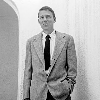
Reid Miles (1956)


Patterns in Jazz by Gil Melle, Blue Note 12" LP 1517, 1956, cover design by Reid Miles

I know. I can hear it now. The last thing the internet needs is another blog post singing the praises of Reid Miles and his 12-year stint (1955 through 1967) as the principle LP artwork designer for Blue Note Records! Right? Well, of course one cannot laud Miles enough: his work for the New York jazz label was a masterful high-water mark of mid-century modernist design. But there was certainly more to  this well-known figure whose full story has remained remarkably illusive.


Mobley's Message by Hank Mobley, Prestige 12" LP 7061, 1956, cover design by Reid Miles

Born in Chicago on the 4th of July in 1927, Miles actually grew up on the West Coast of California. After the stock market crash of '29, his family moved out west as so many other families did during the Great Depression and ended up in Long Beach. A marital split left Miles in the care of his mother who supported he and his younger sister by working in a cannery in San Pedro. Most of his youth is undocumented, although it is known that Miles joined the U.S. Navy near the end of the Second World War, serving as a chauffeur. Upon his discharge he returned to Los Angeles and, according to Wayne Adams who would later assist Miles in the 1980s, chased after a girl and wound up enrolled in the Chouinard Art Institute. Chouinard was then located in MacArthur Park and would merge with the LA Conservatory of Music to form CalArts in 1961. Other Chouinard alumni, whose names will be familiar to regular readers of this blog, include graphic designer S. Neil Fujita and pop artist Ed Ruscha. Rushca and Miles almost certainly never crossed paths that the school as the former did not enroll until the mid-1950s. However, it is very likely that Fujita and Miles met at Chouinard as both attended the school around the same time - a very interesting idea considering how Fujita would later find him on the East Coast designing LP covers for Columbia Records a few years after studying in LA.


Herbie Nichols Trio by Herbie Nichols, Blue Note 12" LP 1519, 1956, cover design by Reid Miles

The person at Chouinard with whom Miles most definitely came into contact was the eventual head of the basic design program, Bill Moore. Moore is something of a West Coast design/art/animation legend who influenced generations of students over the course of nearly 40 years at Chouinard and CalArts. He is the thread the ties together such disparate names as Reid Miles, Ed Ruscha, Tim Burton, and Brad Bird - all of whom studied with Moore. Miles apparently had very little influences in his design life, but Moore was one of them and an early one at that.


Olio by Thad Jones, Prestige 12" LP 7084, 1956, cover design by Reid Miles

Leaving Chouinard before completing the courses required for graduation, Reid Miles made a bee line for New York City, scoring a job with designer John Hermansader. The timing was certainly right as Hermansader, through his friend and fellow designer Paul Bacon, began working with Blue Note Records in 1953 not too long after Miles arrived on the scene. Here is where the story gets a little hazy. While it is known that Miles worked on the Blue Note account, it is not known how much of the early (1953-1955) work was done by Hermansader, how much was done by Miles, and how much was a collaboration. May we indulge in some speculation? Based on the collective body of work Hermansader provided for Blue Note, he quite feasibly could have been another big influence on Miles.
Blue Note historians tend to downplay Hermansader's contributions, but his other surviving examples of visual art clearly indicate a notable talent. The raw materials are there in the work which Miles would develop into an art by the end of the decade, but the question remains just how much input Miles had into the Blue Note designs early on. Unfortunately, neither man is alive today to discuss and the period is poorly documented. At any rate, Miles - who would develop a history of transience - left Hermansader in 1955 for a job with Esquire magazine doing the layout and paste-up work. However, whatever his contributions were to Hermansader's Blue Note account, they were significant enough to catch the attention of the label's owners Alfred Lion and Francis Wolff who asked him to take a lead role in the design of 12-inch Long Playing records, the format that by mid-decade had emerged as the preferred format of most jazz releases industry-wide. Esquire was apparently well-aware of this arrangement and allowed Miles to moonlight - which usually meant working on 3 or so Blue Note LP covers on his Saturday off from the magazine, being paid $50 a job/cover. Later interviews would reveal Miles to be would could be termed a workaholic, in that to him his work was his life and the absence of former made the latter unbearable at times.


J.R. Monterose, Blue Note 12" LP 1536, 1956, cover design by Reid Miles

Contributing to an even more hazy story is the fact that a year after this transition and for a time space of nearly 2 years, Miles was also contributing 12" LP jacket designs to Blue Note's de facto, if not friendly rival Prestige Records. From 1956 until 1957, his name graced the jackets of nearly a dozen discs. Interestingly, this work is seldom cited by design aficionados, although there are some excellent covers that easily rival his contemporaneous work for Blue Note. There are definitely some similarities between the covers and one can see his style developing which each subsequent release. So here is one artist, simultaneously providing the visuals for some of the important modern jazz music recorded of its time (or any time for that matter). And, of course, Miles was famously not a fan of jazz, preferring classical. But this period is interesting, mainly as it is of such high quality and yet overlooked by most design fans.


Quadrama by the Gil Melle Quartet, Prestige 12" LP 7097, 1956, cover design by Reid Miles

A third influence should be mentioned at this time. After Moore and possibly Hermansader, Miles other major influence of the time was known to be Saul Bass. Bass needs no significant introduction to readers of this weblog, but it is perhaps helpful to put him into historical perspective. At the time that Miles was accepting a job with Esquire and getting down to business in earnest with Blue Note and Prestige, Bass was gaining widespread notoriety first for his work on the posters and titles for Carmen Jones (1954) and even more so for The Man With The Golden Arm (1955). His greatest innovation was perhaps the liberation of type from the galley, finding new ways to communicate the written word that flew (sometimes, literally) in the face of convention. Of course, in the design world Bass is a true legend and this history books have been kind to the legacy he has left behind.


6 Pieces of Silver by the Horace Silver Quintet, Blue Note 12" LP 1539, 1956, cover design by Reid Miles

Reid Miles perhaps enjoyed his most lucrative years well after his run with Blue Note. Some time in the early-1960s he started focusing on photography. By mid-decade it was his main focus. Miles returned to Los Angeles in 1971 and within a few years established a style and clientele that made him quite successful by anyone's terms - although he retained a drive and passion for his work which lasted until his death in 1993. Miles occasionally returned to album covers during the second act of his career, but his style by then had changed so significantly that few people made the connection. Fortunately, his mid-'50s experiments are well documented and, hopefully, well preserved for the ages.

Tuesday, May 6, 2014

TK Smith (2014)


Desert Oasis: The Midcentury Modern Guitars of TK Smith by Nick Rossi, photos by Jacqueline Di Milia, courtesy of the Fretboard Journal

Issue number 32 of the Fretboard Journal is now available at newsstands everywhere. I am very pleased to announce that it includes an article penned by yours truly profiling guitarist and guitar-maker TK Smith. I first heard about TK in 1990 when Big Sandy & The Fly-Rite Trio released their debut LP on Dionysus Records and played in San Francisco to support the disc. I've been a fan of Smith's playing ever since. The path his life has taken is a very interesting one and it intersects with a lot of the topics covered on the pages of this weblog. I find his work to be beautiful, not only from the aesthetic perspective of someone who appreciates modernism, but also as someone who respects true craftsmanship. I also like that TK is part of a Southern California tradition - not in a convoluted way, but simple because he is both creative and curious. Plus he has great taste!

Fretboard Journal 32, Ry Cooder cover story, out now

TK Smith may be found online and you may also follow him on Instagram. And here's just a snippet of why he is one of the most interesting guitar players around…

Tuesday, November 26, 2013

Chico Hamilton (1921-2013)


Blue Sands by The Chico Hamilton Quintet from Bert Stern's Jazz on a Summer's Day, 1958

Social media delivered the news that Forestorn "Chico" Hamilton passed away at the age of 92. The words legend and great are far too often abused these days, but Hamilton was both. As an innovative percussionist and bandleader, he was a somewhat singular modern American musician. I know people that have both studied and worked with him, so I can comfortably claim that he was also a true personality. For those interested in digging deep, I highly recommend listening to and reading his contribution to the Smithsonian Jazz Oral History Project here.


Print ad, Down Beat magazine, 1962

Regular readers will no doubt be well aware of my love of (and possible obsession with) Bert Stern's 1958 film Jazz on a Summer's Day. It has managed to work it's way onto these pages several times, but most notably here and here. Bassist Bill Crow also was kind enough to answer some of my related questions here.


Down Beat magazine, August 8, 1957

I have never really tackled the Quintet's performance of Buddy Collette's Blue Sands in print, mainly because - to me - it comes close to what many people call sacred music. More so than Mahalia Jackson's unquestionably moving spiritual in the film, Chico's appearance possesses a quality that transcends both genre and time. Deeply influential upon me too was the visual impact to the impeccably dressed quintet -which also featured at the time Collette's protege Eric Dolphy on flute and Italian-American guitarist John(ny) Pisano. To find out years later that the performance was filmed in front of an empty venue after the festival had completed for the evening due to a technical issue with the shoot made the power of the music all that more miraculous. Add to this his contributions to one of my other favorite films of all time (and something that I need to devote some more virtual ink to very soon), 1957's Sweet Smell of Success, and…well…almost needless to say, I am more than a little saddened to read of his passing in spite of his living a long, rich life.

Rest in Peace, Chico.

Tuesday, June 25, 2013

Richard Diebenkorn (1953)


Berkeley #3 by Richard Diebenkorn, 1953

I was fortunate to see a preview last week of the new Richard Diebenkorn exhibit being held now through September 29, 2013 at the de Young Museum here in San Francisco. The exhibit focuses on what they term his Berkeley Years, namely 1953 through 1966 when the Portland, Oregon born artist returned to the Bay Area (he had grown up in in San Francisco) when he moved his family from Albuquerque, New Mexico to 2837 Webster Street in Southeast Berkeley, California. It was a period during which he created a remarkable number of works, especially considering the amount of time he spent teaching during much of this era. Additionally, he had almost yearly gallery shows and Life magazine profiled him both in 1954 and 1957.


Berkeley #22 by Richard Diebenkorn, 1954

What I found most remarkable about this show, in addition to the sheer volume of works collected and put on display, were his earlier paintings which represented his reaction to the New York school of abstract expressionism. Diebenkorn is most well known for his figurative work, a style he transitioned to during his years in Berkeley. But a solid third of what is on display could be termed abstract expressionist and most folks would not challenge such a claim.


Berkeley #44 by Richard Diebenkorn, 1955

Diebenkorn certainly was influenced by the 10th Street crowd for sure, particularly Rothko and de Kooning both of whom share a similar color palette with the younger West Coaster - and he had met and befriended Kline some time near the beginning of this period - but a strong argument has long been made by art critics that his greatest influence even at this stage were the landscapes that surrounded him be it in Albuquerque or Berkeley. 


Richard Diebenkorn, c.1952

It is always exciting to see an artist in transition which is a big part of the appeal of what the de Young has put together. There are also other connections for me as well. When I first moved to San Francisco in the 1989, I spent a considerable amount of my first 3 years across the Bay in Berkeley and do feel that the colors of the area had to have some influence on his work. Diebenkorn was also a dyed-in-the-wool jazz fan, albeit of the traditional New Orleans variety that had begun experiencing a revival as the unfortunately named Dixieland, parallel to the ascension of modern jazz. Almost needless to say, I highly recommend a visit to the de Young if you are in the San Francisco Bay Area or plan to be some time in the coming months.

Thursday, June 20, 2013

Harry Babasin & The Jazzpickers (1958)

I thought that I would put up a quick post this afternoon. Truth be told, I have a bit of a backlog of entries at the moment. There are quite a few in the hopper, but I've been sidelined with some minor health issues and I should really be staying away from the computer. But I hate seeing the weeks fly-by without new posts, so here is most of the February 3, 1958 episode of ABC-TV's Stars of Jazz television program hosted by singer, pianist, and songwriter Bobby Troup (yes, he of Route 66 song and Emergency TV fame). Bobby's guests that week included bandleader turned manager Charlie Barnet, vocalist Pat Morrissey, and Harry Babasin. I believe I have mentioned this TV show before, but I will take this opportunity to point the curious reader to this wonderful blog which tackles the show in great detail.

Babasin, an unsung hero of jazz music on the West Coast of California, was initially a bassist who played with everyone from Louis Armstrong to Charlie Parker. He was also one of the first experimenters with the cello in jazz music. Of course my short shrift is not doing Harry justice and for a wealth of excellent information on Babasin and some of his more interesting musical activities of note, I highly recommend this page created by his son Von.

A final note. The guitarist in these clips is another talented obscurity by the name of Dempsey Wright, a fellow whose playing I have only recently been digging into. With 2 LPs of his own to his discographical credit, plus 3 appearances as a sideman, his recorded legacy is certainly less than proportionate to his chops. It's a shame, but thankfully we have these few more minutes of music to enjoy from someone else that may have been forever lost in the cracks of time. A special thank you to Babasin's son, Pierre, for making these clips available.


Tuesday, June 4, 2013

Zenith Radio Corporation Showroom Sculpture (1959)


Zenith Radio Coporation Showroom, Chicago, Illinois, c.1959

Recently, I visited the Smithsonian American Art Museum in Washington, DC for the the first time. Now I don't know why, but I had rather low expectations for this particular museum - perhaps I just did not know what to expect. And while I was certainly impressed in general, I was nearly awestruck when I rounded a corner only to find myself face-to-face with Harry Bertoia's massive Zenith Radio Corporation Showroom Sculpture


Harry Bertoia and his creation, c.1959 

I have something of an affinity for the artist and designer Harry Bertoia, whom I mentioned almost in passing a few weeks ago. He was the first 20th Century modernist designer that I knew by name, having been introduced to his iconic wire mesh chairs by a good friend and room-mate in my early-twenties. Bertoia was an Italian-American who had come to this country from Northern Italy (via Canada) at a young age, studied alongside some of the legends of modern design, and even spent a few years during the 1940s living in my hometown of San Diego, California. His first gallery show in 1945 was held at the San Francisco Museum of Art. On top of all this, I genuinely enjoy his wide-array of work, from his monotypes to his furniture and of course his sculptures.


sculpture detail, photo by author

The 1950s were a productive time for Harry. He started off the decade by accepting a job with Knoll, a company headed up by Florence Knoll, a former classmate at the Cranbrook Academy of Art. Supposedly Knoll gave him very little directive to start, but within a year Harry had designed is diamond chair, which may be his most well-known work. More gallery shows (including MOMA in New York) and art commissions, both public and private, followed in the subsequent years leading up to the piece in question. These commissions would continue into the late 1970s, although Bertoia would never again return to furniture design and became increasingly interested in his musical experiments that utilized his own sculptural creations.


sculpture detail, photo by author


According to the Smithsonian archives, Bertoia was very specific in what the elements represented in the piece he produced for the late-50s Zenith commission. From left, the largest structure represents the earth, followed by sight, sound, and what he termed electronic control. All were Bertoia's attempt to provide some physical representation of the forces behind the relatively new phenomena of television. Zenith had introduced its first television line in 1948, with color sets following in 1950, so by the end of the decade it was a major player in the ever-growing television market.


sculpture detail, photo by author

The sculpture itself has a sheer presence that photos can barely capture. The slow alternating pulsation of the lights gives the impression of some sort of bio-mechanical organism. Is the wall alive? Is it transmitting a signal from some distant satellite? For a generation immersed in science fiction pulp and soon to embrace Rod Serling's The Twilight Zone, it must have made quite an impression at the time both on the Zenith executives as well as those that were fortunate enough to see the pieces in the original showroom.

As one may expect, the piece spent a significant amount of time neglected in storage. Fortunately, the Smithsonian spent a significant amount of time restoring the work, the story of which is told here.

Tuesday, May 28, 2013

Le Sacre du printemps (1913)


The young girls of Le Sacre, original costumes and stage set, 1913 

Tomorrow, May 29th, 2013 marks the 100th anniversary of the premiere performance of Igor Stravinsky's Le Sacre du printemps, known more commonly by it's English title the Rite of Spring. There has already been much ballyhoo about the centennial and this entry may very well seem like another bit of carpetbagging (not unlike my Gatsby post of a few weeks ago), but the Rite is a fairly significant piece of music to me personally. Like many, I first heard it in a movie theater courtesy of Walt Disney's Fantasia. My Aunt Marianne took myself and my younger cousin Paul to see either the 1977 or 1982 theatrical run at the Cinema 21 in San Diego, California. Now Cinema 21 was not any run of mill movie theater: it was a single-screen 1,000-seat temple to modernity and one of the reasons I can't take today's multiplexes seriously. At the time of it's 1963 construction by Statewide Theaters it was the only movie house in the country set up to screen films in 35mm, 70mm, Cinerama, AND Cinema-scope. No small achievement. Even 15 years after it's opening it made an impression - certainly to a young boy such as myself. The experience obviously has stayed with me, reinforced over the years by countless visits to Disneyland capped off with what we called the dinosaur train: the Primeval World attraction.


Promotional postcard, Cinema 21, San Diego, California, 1963

The Rite of Spring sequence in Fantasia was of course set to visuals of the origins of the earth and the prehistoric days of the dinosaurs. And what 6 or 11-year-old boy doesn't like dinosaurs? I didn't care about the dissonance in Stravinsky's music, to my young mind it was just what the cogs of creation sounded like as fascinating creatures rose from the primordial ooze. I was captivated and I can recall the experience with some clarity to this day. I have revisited the film in recent years and am well aware that Stravinsky disowned the film upon it's 1940 release (although he cashed the check) not only for the truncated version of the score (due to time limits of the original theatrical release) but to the visual interpretation of the music. Yes it is flawed, but it served a purpose not only for my life but for so many other young ears across the United States that may have never been exposed to the savage beauty of Igor's music. Later through my development as a musician and as my interest in 20th Century modern jazz deepened, I approached Stravinsky's music from a different angle inspired at least in part by Charlie Parker's noted appreciation and admiration for the composer.


Walt Disney and Igor Stravinsky, Los Angeles, California, 1939

The performance that now intrigues me most is the Joffrey Ballet's painstaking 1987 recreation of the original 1913 Paris production. It was not only the music that ushered in the modern era of ballet, it was the angular, primitive choreography of the legendary Vaslav Nijinski and the earthy sets and costumes of Russian folklorist Nicholas Roerich combined with Stravinsky's brilliant music that made for such a revolutionary production at Sergei Diaghilev's Ballets Russes. For years, it was thought that everything buy the score was lost. After only a dozen or so performances in Paris and London, the ballet was not performed for 7 years by which time the choreography had already been forgotten by all of the principals. It's something of a modern miracle that the '80s reconstruction happened at all. But what the Joffrey most effectively did is help revive the exciting, primal nature of the piece: as Leonard Bernstein once famously exclaimed, 'it's about sex!'. And surely the Russian folk elements of the story which culminate in a virgin sacrifice thinly veils this strong subtext. But as the sacrifice of virginity can also be viewed as the creation of new life and rebirth, perhaps ol' Walt Disney wasn't so far off the mark after all!


Saturday, April 13, 2013

The Great Gatsby (1945)

The Great Gatsby, F. Scott Fitzgerald, 1925, first edition, cover by Francis Cugat * (see note below)

88 years ago, on April 10, 1925, Charles Schribner's Sons first published F. Scott Fitzgerald's The Great Gatsby. The novel was met with mixed critical reaction upon it's release and only moderate popular success. In fact, the first edition sold a mere 24,000 copies over the course of it's initial run. By the time Fitzgerald died on December 21, 1944 at the age of 44, the book had been out of print for several years.

F. Scott Fitzgerald, 1937, photo by Carl Van Vechten

Eight years prior, a second-year Harvard undergrad by the name of James Laughlin published the first New Directions anthology. The roll call of authors New Directions published in the subsequent few years is astounding, particularly as many were being introduced to the general public for the first time: Tennessee Williams, Lawrence Ferlinghetti, William Saroyan, Wallace Stevens, to name just four. In addition to spotlighting then-contemporary modernist literature, New Directions began reprinting many authors (such as Henry James and Evelyn Waugh) whose works had never been re-printed after their initial publishing runs had ended. 


The Wisdom of the Heart, Henry Miller, 1941, jacket by Alvin Lustig

Part of the spirit of New Directions was reflected in its strikingly modern dust jackets. In 1940, Laughlin was introduced to graphic artist, designer, and ex-Frank Lloyd Wright acolyte Alvin Lustig by bookseller and literary scene-maker Jacob Zeitlin in Lustig's Brentwood, California studio. Laughlin later said that he only needed to spend an hour with the artist before he knew he was in the presence of what he called "authentic creative genius". A commission for the jacket of the New Directions 1941 editions of Henry Miller's The Wisdom of the Heart and Carl Rakosi's Selected Poems soon followed. But while these works reflected the style Lustig had developed up until that time: his next series of work for New Directions, twenty-five books in the publisher's New Classics series, came to represent an iconic style for which Lustig (and to a lesser extent New Directions) is most well-known.

Alvin Lustig, 1945

Among the titles in the New Classics series was Fitzgerald's The Great Gatsby, which was published for only the second time in 1945. A new wave of book reviews followed in the wake of the release. This time around Fitzgerald's novel was being reconsidered, not as the period piece it had been regarded as for the most part over the prior twenty years, but rather as something important and perhaps great. To the point, the New Classics edition marked the beginning of The Great Gatsby as being a true classic of modern American fiction.

The Great Gatsby, F. Scott Fitzgerald, New Classics 9 / New Directions 1945 edition, jacket by Alvin Lustig

Momentum continued on both scholarly and popular fronts through the end of the decade. Somewhat ironically, Paramount Pictures in Hollywood began a film adaptation production in 1948 directed by Elliott Nugent and starring Alan Ladd which was released in July of 1949. The irony lies in the fact that Fitzgerald spent his last booze-soaked years in Los Angeles trying to eek out a living writing for films. This first film adaptation drew from both the original novel as well as Owen Davis's 1926 short-lived adaptation for the Broadway stage. Incidentally, the screenwriters were Cyril Hume and Richard Maibaum, the latter being the very same Richard Maibaum who wrote the screenplays of the majority of James Bond films from 1962-1989. In the academic world, at least two books were published in 1951 concerning themselves with Fitzgerald's life and importance. This opened the floodgates to several scholarly works at the highest levels of academia, the sum total of which set The Great Gatsby on the pedestal upon which it still rests today.

Alan Ladd, 1948 Paramount Pictures promotional photo

For further reading, I highly recommend this excellent 1960 New York Times piece.

* An entire weblog entry could be devoted to Francis Cugat's somewhat controversial cover art for the original 1925 edition. Here is what purports to be the untouched original painting, although I cannot vouch for its authenticity. Fitzgerald (perhaps influenced by Ernest Hemingway) later claimed he hated the cover and went to great lengths to apologize for it. And yes, Cugat was the brother of the famous New York-based bandleader who popularized the rhumba: Xavier Cugat. 

Tuesday, March 12, 2013

Garry Winogrand (2013)


Garry Winogrand, New York, 1957, photo by Lee Friedlander 


Los Angeles, 1964


New York, 1968

Those of you keeping score at home may have noticed that I have been on something of a New York kick recently. Well, a good visit to the Big City can do that to a guy! Obviously, someone has been paying attention for not too long after I returned home to San Francisco, the SFMOMA launched its Garry Winogrand photography exhibition. This is the first retrospective of its kind and is segmented into 3 sections: New York 1950-1971, Everywhere else during the same time period, and LA from 1971 until Winogrand's death in 1984. I was fortunate enough to get a preview last week and was knocked out. Frankly, I knew next to nothing about Winogrand walking into the museum that night but was captivated by his work. The photographer is widely being touted for showing both the promise of and disillusionment with the American Dream of post-war Middle Class Society. Who am I to argue? There is a gritty reality to many of his photos that rivals that of his friend and contemporary Lee Friedlander. New York is a city that always looks great in monochrome regardless of the era. It has a depth and texture that is well-served by the lack of color. Winogrand shot almost exclusively in black and white and with a solid third of this exhibit dedicated to New York and its environs over the span of twenty years...well, I think you get my drift. I highly recommend this exhibit if you are going to be in or around San Francisco now through June 2, 2013.

For more information on Winogrand the photographer, Eric Kim's post from last year is positively epic.

For more information on the SFMOMA exhibit, click here.

Tuesday, January 15, 2013

The Twilight Zone (1959)


One of my lasting childhood memories, is that of staying home from school when I was sick. I would typically stay in bed through the morning, sleeping off whatever bug I had. Some time close to Noon, I would gather my blankets and migrate to the couch. It was there I would spend the next few hours, sipping 7 UP, eating soup, and watching The Twilight Zone. The television station was KTLA, a local Los Angeles area station owned by the singing cowboy Gene Autry from 1964 through 1995 (the station was also home to Autry's professional baseball team the California Angels, who were our team in those suburban days). If memory serves me correct, The Twilight Zone was aired weekdays at Noon - possibly with 2 episodes back-to-back, obviously well into syndication as this was the late-1970s and early-1980s. Between this and KTLA's annual Fourth of July Twilight Zone marathon, it was ensured that I saw nearly all 156 of the original episodes at least a couple of times. So it was with these memories at the back of my mind that I embarked upon the first season of The Twilight Zone last month when I had the flu.


Rod Serling, CBS Television Studios, New York, 1955, photo by Loomis Dean

The first season of the original series ran from October 1959 through July 1960 on CBS in the USA. It was shown on Fridays at 10:00 PM Eastern Time. All of the episodes of the first season had a running time of just under 30 minutes. According to this exhaustive listing, the first 36 episodes were pre-empted 3 times and 2 reruns were shown before its inaugural run was complete. It was, of course, the brainchild of a very peculiar figure in television history: Rod Serling. Serling, who turned 35 during the first season, had already won 3 Emmy awards for his screenwriting efforts before the series debuted. The series would earn him his fourth. Serling, who had fought for the U.S. Army and earned a Purple Heart during the Second World War in the Philippines, had his fair share of conflict with both sponsors and censors in his early television career as he was not shy about tackling controversial social and political issues. At the time in a televised interview with Mike Wallace, he called The Twilight Zone the culmination of 12 years work. Perhaps most important was Serling's attitude towards the serial. In the same interview with Wallace he referred to the episodes as "adult...extremely polished films." He was also quick to categorize them as a mix of fantasy, imagination, and science fiction. In short, it was a very serious view of the burgeoning entertainment medium and one that set him apart from many of his contemporaries.


The Twilight Zone, Season One introduction, second variation


Seeing these early episodes again, thirty years since I first experienced them, I was not only pleasantly surprised by the longevity of writing but enjoyed discovering the many Mid-century modern Easter eggs that I know understand helped shaped my young consciousness. The overall mood and style is still arresting. If modern jazz captured the psychosis of post-war years in sound (as has often been argued), I can think of no single television program that managed to do the same on dramatic terms. There is an over-arching anxiety the permeates every episode. Not the manufactured fright of the Red Scare, but the rather palatable fear of modern life in the shadow of the mushroom cloud. There is the anxiety that society is not what it thought it was. And there is the dissolution of the American Dream, an idea upon which the counterculture of the late-1960s would hinge itself. Sure, not every episode hits the mark, particularly over the course of the first few months over which principle writer Serling finds his footing. But when it is good it is good in a way the resonates in a manner of the some of the best art of our time. Did television ever really get any better?


Alfred Hitchcock and Bernard Hermann on the set of Psycho, c.1959-1960

For us Moderns, there are treats at every turn. The original theme music, used throughout the first season, was composed by no less than the maestro of suspense himself Bernard Hermann. Hermann was quite well known by this time having recently scored Alfred Hitchcock's Vertigo. In fact, he was working concurrently on the score for Psycho at the same time as he scored some of The Twilight Zone  episodes (which he did in addition to the main title) and there are some stylistic similarities between the two ventures at times. It's a moody piece, not quite as aggressively avant garde as the theme written by Marius Constant for the second season (widely known to most as the theme to the series) and played by jazz great Howard Roberts on his Fender Telecaster electric guitar. The opening titles to the first season were created by the mad genius animators over at UPA and clearly echo the abstract feel of some of their more well-known work, particularly in the realm of children's animations. In fact, one of the cool things about the show is it's clear New York - Los Angeles axis, something not always evident in productions during this era. There is a definite New York feel to much of the show's content and story lines. But much of the production was done in and around Los Angeles (Serling himself remained a New York resident for quite some time). And of course, there are the many wonderful actors and directors who make their appearances at all points of their career junctures. It is simply amazing how many familiar faces grace the small screen over the course of the 18 hours of footage from the first season alone. But rather than bore you with a laundry list of names, I will just remark how surprised and pleased I was to see jazz and fashion photographer William Claxton's name appear onscreen as the director of The Last Flight (episode 18, February 5, 1960).


In parting, above is the Mike Wallace September 22, 1959 television interview that I referenced earlier in today's weblog. Clocking in at just over 20 minutes, it provides great context to this cornerstone of popular American culture at it's birth.

Tuesday, January 1, 2013

Happy New Year (2013)


New Year's Eve, Bimbo's 365 Club, San Francisco, California, c.1955, photo by N.R. Farbman for Life magazine

Tuesday, December 11, 2012

Dave Brubeck (1920-2012)


Dave Brubeck, Cal Tjader, Ron Crotty, 1950

Last week's death of pianist, composer, and bandleader Dave Brubeck continues to be on my mind. So much so, that I have been working on a short series of weblog entries that I plan to publish these over the next few weeks. The focus will be on aspects of Brubeck that the ample coverage of his death may be overlooking in my humble estimation.

In the meantime, if you somehow missed the news, here's the New York Times obit.

For those of you that wish to dig deeper, I highly recommend this amazing interview with Brubeck conducted by Ted Panken in 2007. It focuses on his early years and is just fascinating.

May he rest in peace.

Tuesday, November 20, 2012

Vertigo (1958)

The legacy of Alfred Hitchcock's Vertigo looms over the city of San Francisco - particularly for those of us with an interest in cinema, the 20th Century, and popular culture. For example just the other day this article ran in our local daily And, as you can see, there is no shortage of controversy over a seemingly simple matter - a facade that was preserved on celluloid for a mere few seconds. And yet, it manages to rile emotions to rival any other issue at hand. So what with that and Sascha Gervasi's Hitchcock opening in select theaters this Friday, I thought I would take another look at Hitch. More specifically, let's take another look at the opening title sequence credited to the great modern designer Saul Bass.


It's an impressive piece of film. Here is the sequence in stills, courtesy of Christian Annyas. The visual brilliance of Bass is married perfectly to the musical brilliance of Bernard Hermann.


Vertigo title sequence still, designed by Saul Bass, 1958

Or at least it is credited to Saul Bass.

One rabbit hole I recently went down led me to the Vortex concerts that took place here in San Francisco in 1957. While the concerts certainly deserve an entry of their own, in short the concerts took place at the Morrison Planetarium in Golden Gate Park, sponsored by KPFA and the California Academy of Sciences. The concerts were put together by Henry Jacobs, who I know of through his side-splittingly hip disc, The Wide Weird World of Shorty Petterstein on World Pacific Records (1958). I had re-listened to the disc on the way to a gig recently, when my interest in Jacobs was rekindled and I spent some time following what online leads there were on him.


A Chicago-native, Jacobs moved to SF in 1953. He was part sound collagist, part comic, and all hipster (in the best sense of the word). His "spoken word" recordings really deserve repeat listenings as they truly get funnier and funnier. His musique concrete works are admittedly over my head a bit, but still of interest. It is with the latter that he collaborated with visual artist Jordan Belson on the Vortex concerts. Jacobs was intrigued by the Planetarium's surround-sound which consisted of 38 speakers positioned throughout the auditorium. He saw the potential in such a system for musical performance and the visual aspect was a natural partnership. It was a successful happening and performances continued throughout 1959 (including a 1958 appearance at the World's Fair in Brussels). Folkways Records released a compilation of some of the music and remains in print. By all accounts, the performances were innovative precursors to the sound and light shows rock music would adopt in the late-1960s (not to mention "laserium" shows decades later).


Highlights of Vortex, Folkways LP, 1959

During the run of the Vortex series, Jacobs and Belson drew from the talents of several additional artists. On the musical side this included Bill Loughborough, whose shortlist of accomplishments included co-writing "Better Than Anything" (popularized by the great Bob Dorough) with room-mate and Kingston Trio bass player David "Buck" Wheat and playing percussion for Chet Baker's combo for several years in the mid-1950s. The group of contributing visual artists included two Southern California-born brothers named John and James Whitney.

John and James Whitney, c.1955

Both brothers were experimental film-makers whose abstract visual collaborations stretched back to 1939. John was born in Pasadena, California and went to college at the nearby Pomona College in Claremont (which among other things is where I wasted away a good portion of my high school years over copious amounts of Earl Grey tea!). Upon graduation he spent a year in Paris studying music with René Leibowitz. Liebowitz in turn had studied with both Maurice Ravel and Arnold Schoenberg and instructed Whitney in the latter's 12-tone system of music. But upon his return to California, Whitney shifted his focus to the visual arts often in partnership with his brother.


Variations on a Circle, John & James Whitney, 1941-1942

The imagery was linked back to music, certainly in the artists minds, but later more explicitly in the soundtracks the brothers selected for each. Early films were analogue in a true sense of the word, with the images being manipulated by hand for the camera. In this, the brothers were very successful. They continued using this method for just over a dozen years and just about as many films. Both worked on their own projects in addition to their collaborations. John even did 3 films for UPA. But some time in the early-to-mid-1950's the brothers hit upon a notion of how to use machinery to better articulate their goals. Using surplus military parts, John constructed their first "computers" which they used to make their animated features. Several years later, John explained for a documentary team:


Computers: Challenging Man's Supremacy, 1976

By now, I am pretty sure you can see where I am going. Well it turns out that one of John Whitney's side projects was a full-blown collaboration with the design firm of Saul Bass. The result of this collaboration? Why the title sequence to Vertigo of course! Several reliable sources confirm that the two produced the piece together, although Bass solely received the credit onscreen. What is perhaps most interesting when one takes another look at the sequence after ploughing through this weblog entry is how closely tied the titles are to the other work of the Whitneys. In fact, add Hermann's strikingly modern score and it is not a world away from what one may have experienced at the Morrison Planetarium in 1957 or 1958 at one of the Vortex concerts. And considering that Hitchcock was in San Francisco filming at that very time...well, let's just leave it there for now. A little suspense never hurt anyone and something tells me this is not the end of this story!


Catalog, John Whitney, 1961

Tuesday, October 2, 2012

Chelsea Bridge (1940)


Nocturne: Blue and Gold - Old Battersea Bridge by James McNeill Whistler, c.1872-1875

In 1876, American-born James McNeill Whistler was living London and had been doing so for the better part of a decade. He had left the United States in 1855 and spent the first few years living the life of a Bohemian in the Latin Quarter of Paris. It was in Paris that he was deeply influenced by the notion of modern art, not only the visual arts such as Impressionism but by other trends in literature and music, as well as the relationships between all 3. He then moved to London, back to Paris, and then briefly to Chile, before settling back into London. While in Chile that he painted the first in a series of what he called moonlights later re-cast as nocturnes, copping a musical term from one of his patrons. In 1876 that he exhibited the above Nocturne: Blue and Gold - Old Battersea Bridge (currently in the collection of the Tate in London).


                                Moonlight on Ryogoku Bridge, by Utagawa Hiroshige, c.1830

The painting is notable for a couple of reasons. First, in addition to the French influence, art critics and historians have made the case that Whistler was influenced by Japanese woodblock artists during this time and more specifically by a Hiroshige work, Moonlight on Ryogoku Bridge, created forty-some-odd years earlier. Secondly, the Whistler work was the subject of a large degree of criticism at the time including that of well-known art critic John Ruskin who ended up in a court battle with Whistler under charges of libel. Whistler won the case, although his award amounted to 1 farthing. 


                                Billy Strayhorn and Duke Ellington, photo Dave Dexter, Jr., c.1943

Seventy years later and back in the United States, bandleader Duke Ellington was posed with a repertoire problem. ASCAP had substantially increased its license fees in 1939, which resulted in the creation of BMI in 1940 by the National Association of Broadcasters. Radio was key to the success of any band of the day and Ellington quickly surmised that if the major radio stations refused to play music published by ASCAP (which was the practical upshot of the situation), he would need a whole new band book of BMI-published material. To this end he brought his son Mercer and Billy Strayhorn, to Los Angeles for a massive effort to re-build the band book. Neither were affiliated with ASCAP, so were able to provide the clean slate material. This also coincided with what many critics consider to be his finest band, the so-called Blanton-Webster band. The issue was eventually resolved by the Federal court system in 1941, but not before Ellington's Famous Orchestra went through something of a musical transition. To make this time period even more tidy for historians, it signaled Duke's return to RCA Victor Records and the end of his longtime romantic and songwriting relationships. A new day indeed.


Victor 27740-B, 1941

The results of the songwriting sessions were staggering: Passion Flower, A Flower is a Lovesome Thing, Take The A Train, to name but 3. Chelsea Bridge was another. The Billy Strayhorn composition is just beautiful, it's age-old comparisons to the work of Claude Debussy not only accurate but apt. To call it an impressionistic piece might be a bit lazy, but certainly justified particularly with the chords Strayhorn uses on the A sections. To put it in simple terms, the slight dissonance gives the song a hazy and uncertain feel, particularly at the slower tempo. Not really unsettling, just a little ambiguous - but beautiful. As it turns out, the very erudite Strayhorn's inspiration turned out to be Whistler's Nocturne: Blue and Gold - Old Battersea Bridge (that's Chelsea Church on the left far shore in the painting).


Chelsea Bridge debuted with the orchestra some time in early 1941 as evidenced by Ellington's radio broadcasts from the swing-era stalwart Casa Manana, located in the LA suburb of Culver City. The number remained in the book throughout the year, with Ellington recording it in September both at a Standard Radio Transcription session and at a commerical Victor record session (again, both in LA). He returned to the piece on December 2nd when he took his orchestra into RCA's Hollywood Studios to record it along with another Strayhorn composition, Raincheck, plus 2 others. It was this recording, featuring Ben Webster on tenor sax, that was the released master recording.


The song found favor with hip ears and was recorded several times from the 1950s onward by the likes of Gerry Mulligan, the (original) Vince Guaraldi Trio, and Ella Fitzgerald. Webster kept is as part of his featured repertoire for the remainder of his life. But perhaps the most notable post-Ellington recording of the composition was made by its creator. Billy Strayhorn, almost 6 years before his untimely death at the age of 51, recorded a solo piano version in May of 1961 during a brief stay in Paris - where it arguably all began for Whistler a century earlier.