Showing posts with label industrial design. Show all posts

Tuesday, August 20, 2013

Irving Harper (2013)


George Nelson Clock reproduction by Verichron, 2013

Every so often it is good to have the rug pulled out from under you. The experience sharpens your senses, wakes you up, and makes you question the firm ground that all too often is taken for granted.


Online ad, Modernica, 2013

My Mid-20th Century Design Road to Damascus was a flight to Spain with a long layover in JFK. It was 1998, Trans World Airlines was still operating, and the fates conspired to leave me with a few hours on my hands in Terminal 5. Almost needless to say, I was floored by the building. My appreciation of modernism as a design aesthetic became a primary interest and the name Eero Saarinen was elevated to hero status in my estimation. Move forward 5 years and I am now sharing the flat where I currently live in San Francisco with the now Missus. We purchase a pair of pendant lamps for our living room spaces from a local favorite, Inside. Our choice? Modernica's reproduction of the Howard Miller cigar bubble lamps designed by George Nelson. So here was my first legitimate design purchase. An iconic item by a name designer. So all things being equal, Nelson's stature is elevated in my little black Moleskine.


Print ads, Howard Miller Clock Company, 1956

And it grows. And it grows. My wife buys me a Vitra-produced Nelson reproduction clock as a gift. I find an oversize jack for my bookshelf. Our flatware is replaced with a set of vintage Hall Leisure designed by the Nelson and Associates. George Nelson becomes a touchstone in my mind's eye as I become more and more engrossed in this aspect of living.


Debut of the Herman Miller logo, 1947, logo by Irving Harper for George Nelson Design

Perhaps the only thing worse than being late to the party is being late to the party as well as being oblivious. The latter is how I felt when I first read about Irving Harper a few weeks ago. Who is Irving Harper? Only the most significant Mid-Century Modernist that you have (perhaps likely) never heard of! As it turns out Harper was THE man at George Nelson and Associates responsible for everything from the iconic Herman Miller logo to the now legendary Howard Miller "Nelson" clocks which hang on the wall of nearly every discerning modernist worth their salt. And, yes, even those lamps hanging in my living room are now attributed to Harper. Sure, I knew that George often took credit for the work of this firm. Of course he did, that is the way it had been done for decades if not centuries with the name on the masthead usually taking credit for the entire output. What is astonishing is just how many of these iconic works sprung from Irving Harper's obviously fertile, creative mind. The wonderful coda to this story is that Harper is still alive and finally getting the attention and notoriety he so clearly deserves.

For further reading, I highly recommend this article as well as this one

Tuesday, June 4, 2013

Zenith Radio Corporation Showroom Sculpture (1959)


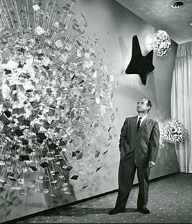
Zenith Radio Coporation Showroom, Chicago, Illinois, c.1959

Recently, I visited the Smithsonian American Art Museum in Washington, DC for the the first time. Now I don't know why, but I had rather low expectations for this particular museum - perhaps I just did not know what to expect. And while I was certainly impressed in general, I was nearly awestruck when I rounded a corner only to find myself face-to-face with Harry Bertoia's massive Zenith Radio Corporation Showroom Sculpture


Harry Bertoia and his creation, c.1959 

I have something of an affinity for the artist and designer Harry Bertoia, whom I mentioned almost in passing a few weeks ago. He was the first 20th Century modernist designer that I knew by name, having been introduced to his iconic wire mesh chairs by a good friend and room-mate in my early-twenties. Bertoia was an Italian-American who had come to this country from Northern Italy (via Canada) at a young age, studied alongside some of the legends of modern design, and even spent a few years during the 1940s living in my hometown of San Diego, California. His first gallery show in 1945 was held at the San Francisco Museum of Art. On top of all this, I genuinely enjoy his wide-array of work, from his monotypes to his furniture and of course his sculptures.


sculpture detail, photo by author

The 1950s were a productive time for Harry. He started off the decade by accepting a job with Knoll, a company headed up by Florence Knoll, a former classmate at the Cranbrook Academy of Art. Supposedly Knoll gave him very little directive to start, but within a year Harry had designed is diamond chair, which may be his most well-known work. More gallery shows (including MOMA in New York) and art commissions, both public and private, followed in the subsequent years leading up to the piece in question. These commissions would continue into the late 1970s, although Bertoia would never again return to furniture design and became increasingly interested in his musical experiments that utilized his own sculptural creations.


sculpture detail, photo by author


According to the Smithsonian archives, Bertoia was very specific in what the elements represented in the piece he produced for the late-50s Zenith commission. From left, the largest structure represents the earth, followed by sight, sound, and what he termed electronic control. All were Bertoia's attempt to provide some physical representation of the forces behind the relatively new phenomena of television. Zenith had introduced its first television line in 1948, with color sets following in 1950, so by the end of the decade it was a major player in the ever-growing television market.


sculpture detail, photo by author

The sculpture itself has a sheer presence that photos can barely capture. The slow alternating pulsation of the lights gives the impression of some sort of bio-mechanical organism. Is the wall alive? Is it transmitting a signal from some distant satellite? For a generation immersed in science fiction pulp and soon to embrace Rod Serling's The Twilight Zone, it must have made quite an impression at the time both on the Zenith executives as well as those that were fortunate enough to see the pieces in the original showroom.

As one may expect, the piece spent a significant amount of time neglected in storage. Fortunately, the Smithsonian spent a significant amount of time restoring the work, the story of which is told here.

Tuesday, July 31, 2012

Alvin Lustig for JBL (1950)


Alvin Lustig, 1949

In a previous weblog entry, I quoted Charles Eames in saying "Eventually, everything connects." The concept is a favorite of mine and if you are a regular reader here, you will have seen that I often have been able to weave my various interests into the some sort of over-arching narrative. Today's entry is no exception, but designer Alvin Lustig makes such pursuits easy. Over the course of his brief 40 years on this planet, he was involved with books, magazines, interiors, architecture, furniture, industrial design, and company branding/identity. Born in Denver, Colorado he spent much of his early career in Los Angeles (with the exception of a brief spell as a student of Frank Lloyd Wright at Taliesin) before moving to New York City at age 29 to work as the Director of Visual Research for Look magazine, then in its ascension. A year later he began teaching. By the end of 1946 he returned to Los Angeles and opened up his own studio where he tried to eek out a living until he was forced to move back to New York in 1951. As a result of diabetes, Lustig lost his sight in 1954 and he died a year later due to complications around that disease.

Jim Lansing Signature Speakers brochure by Alvin Lustig, 1950 (front)

One of Lustig's clients during his second tenure in Los Angeles was the fledgling James B. Lansing Sound. The story of legendary amplified sound pioneer James Bullough Lansing (born James Martini, making him a suspected Italian-American. Cough.) is rather complicated, but in short he began to manufacture loudspeaker in LA in 1927 as the Lansing Manufacturing Company. After his business partner was killed in a plan crash, Lansing's company floundered was was purchased by Altec in 1941. Lansing was contracted with the company through 1946, but parted ways before that contract expired. James B. Lansing Sound, Inc. was founded in 1946, although Lansing again struggled to keep the company afloat and took his own life on his ranch in San Marcos, California just north of San Diego in the Autumn of 1949. Control of the company reverted to Vice President Bill Thomas who was able to parlay the company's sound innovations into a successful business. The company changed it's brand name to JBL in 1955 to settle its ongoing disputes with Altec Lansing. Fast forward fifty-seven years later and the name JBL is known the world-over.


Jim Lansing Model 375 label detail, early-1950s

As part of this chaotic transition, Thomas and James Lansing Sound, Inc. engaged Lustig to assist them with re-branding their company. Unfortunately, there is very little documented information about when Lustig was contracted for the work, but one may assume that it may very well have happened after Lansing's death. Similarly, little is known about the depth of his engagement and how much it increased in scope after his association. What is known, is that by mid-1950 Lustig had overhauled the company's brand identity. That year's brochure was a beautiful example of postwar California modernist graphic design and is a unique item in Lustig's portfolio. It also introduced a logo hallmark (the "Jim Lansing" sans serif font contrasted with the "L" script) that would grace most of Lansing's speakers through the 1955. 


Jim Lansing D-175 speaker driver decal detail, early-1950s


Jim Lansing by Ampex logo variation, early-1950s

In additional to the graphic design work, Lustig's scope of services included design consulting with their speaker enclosures, namely the C34 through C39 series. Again, details are illusive in terms of his exact contributions and the Internet is teeming with vintage-JBL enthusiasts who are more than happy to share their knowledge and educated guesses. But after taking one look at the speaker enclosures from this time period, it is easy to speculate about Lustig's input.


JBL C39 Harlan speaker enclosure, 1956

Lustig's association with the soon-to-be-JBL was obviously brief. The company introduced very little to  it's branding until the mid-1950s transition and Lustig's move to New York, followed by his death meant that there was little future for the partnership. What he did do is very successfully transition the branding of the company to something very cutting-edge and modern: a graphic representation of the products the company was becoming known for. By mid-decade, JBL was being mentioned in Life magazine and the rest, as it's been said, is history.


Jim Lansing Signature Speakers brochure by Alvin Lustig, 1950 (rear)

Tuesday, June 26, 2012

Fender Telecaster (1951)


2011 Fender 1951 reissue "Nocaster", made in Corona, California 

To say much has been written about the Fender Telecaster, would indeed be an understatement. Officially introduced in 1951 by Leo Fender's then small Los Angeles County-based musical instrument operation, it arguably the most-popular electric guitar ever, transcending genres and generations. There are plenty of excellent online resources from a musician's and guitar geek's perspective, including a message forum dedicated entirely to the guitar. But what interests me most from the perspective of this weblog is the Fender Telecaster as an icon of modern California design.


2011 LACMA Exhibit Book, available here

A few weeks ago, I caught the tail-end of the LACMA's California Design, 1930-1965 "Living in a Modern Way". It was an excellent exhibit that did a great job of not only presenting the classics, but also making a good case for the zeitgeist modern California design. For example, just a few feet from an amazing recreation of the living room of Charles and Ray Eames was a pair of surfboards designed by Hobart "Hobie" Alter and Greg Noll. This sparked an interesting conversation between my brother and I about the validity of presenting two disparate design pieces that socially, if not culturally, may or may not have little to do with one another. It also successfully got my brain thinking more about how cultural trends did influence various industries. And this, in turn, got me to thinking a bit more about Leo Fender's Telecaster.


Eames living room re-creation (left), Hobie and Noll surfboards (right), LACMA, 2012

While conspicuously absent in the LACMA exhibit, the first commercially successful solid-body electric Spanish or standard (as opposed to Hawaiian or lap steel) guitar meets much of the criteria of California modernism. It can trace it's design heritage back to 1948 with the first prototype being produced in 1949. Leo Fender had a small operation at the time based in Santa Ana, California (40 miles West of the Eames home in the Pacific Palisades and the Coast). The big band era was in its last few bars and small combos were becoming the new economic reality in modern jazz, rhythm and blues, and western swing music. As the standard guitar gained became more prevalent as a front-line instrument (not just a part of the rhythm section), so the need arose for a cost-effective amplified instrument. Leo was keenly aware of this. 


 Leo Fender, early-1950s

Fender's axiom was that this new guitar had to be cost-effective to both make and sell. It also had to be simple and easy to service. Furthermore it needed to address the musical concerns of being easy to play as a lead instrument and able to be amplified at loud volumes without causing the loud, offensive sound known as "feedback" - that howling sound everyone panics about that you've heard come from the PA system at street fairs. You know the sound.


1951 advertising insert

What follows next is a textbook example of "form follows function", the modern design principle introduced by Louis Sullivan at the end of the 19th Century. The guitar Fender created addressed all of those needs remarkably well and was soon available commercially for $189 (approximately $1,500 in today's dollars). This was an affordable, versatile tool that reflected the times and has since proven to be timeless. From a strict design perspective the Telecaster sits comfortably alongside the wooden Eames Lounge Chair (1946) and molded plastic Side Chair (1948), as well as the surfboard designs mentioned earlier. One could almost believe that they all came from the same design firm. Well, almost. Fender was being self-consciously modern to some extent. He did desire to break from the traditional guitar shape, again very much following the functional needs of the burgeoning lead guitarist. Early advertising was very much aware of this and, in fact, used the term "modern" freely.


Heywood-Wakefield M308 Side Table(s), c.1950

Lines and shapes aside, the color and finish was meant to emulate contemporary "blonde" furniture, still a relatively new trend in the early-1950s. More than any other single firm, this was popularized by Massachusetts-based Heywood-Wakefield starting with their mid-1930s "Modern Series", itself influenced heavily by European (primarily French) Deco designs and styles. The look was particularly popular in affluent Southern California and did reflect some degree of the aspiration of the time. Long-before collectors started talking about butterscotch finishes, Fender Telecasters were blondes. 


1952 magazine advertisement


After a rocky start which saw 2 name changes, some minor legal squabbles, and a bit of tweaking; the Fender Telecaster as we pretty much know it today was available for purchase in local music stores in 1951. Fender was smart in that he got it the hands of everyone from Jimmy Bryant to Les Paul to Barney Kessel. Not only did it become tremendously popular with the working-class western swing and country bands playing throughout the State, but with the rise of rock & roll, it became standard Hollywood studio issue. By the end of the decade it was everywhere, from TV (NBC's legendary Peter Gunn theme featuring Bob Bain) to radio (James Burton on nearly every Ricky Nelson hit from 1958 onwards to name just one player) and beyond.


Barney Kessel, Fender Telecaster, c.1958

Was Leo Fender a modernist? Of course, although I doubt very highly he thought of himself as such or even would care about being mentioned in the same breath as Charles Eames. As proud of his achievements as he was over the years, I am sure he thought of himself as a pragmatist first and foremost. But for our discussion's sake, he was a modern man, to be sure.

Postscript - Although Fender sold the company a long time ago, you can still buy a brand new made in California Fender Telecaster today which has truly changed very little in the past 61 years.

Friday, June 24, 2011

D'Andrea Guitar Plectrum 351 (2011)


Near the end of last year, I was in Gryphon Stringed Instruments in Palo Alto trying to sort out a few spare parts for my recently purchased 1947 Epiphone Broadway guitar. It just so happened that the fellow helping me was luthier Steve Saperstein - something completely unbeknownst to me at the time. I had just recently gone down the rabbit hole of guitar picks and after spending far too much time on the Internet had decided the take the plunge and purchase a very expensive imitation tortoise shell plectrum.

Aren't they all tortoise shell, you ask? Well, interestingly no. Guitarists started using plectrums (similar to what pluck the strings in a harpsichord) some time in the 1800s and one of the early substrates that found favor was actual tortoise shell. But this material was expensive, somewhat fragile and eventually became illegal to use in 1973. At the same time that guitar players started picking the strings with things other than feathers or fingers, what later became known celluloid was first invented in England. In the spirit of the Industrial Age, it was soon being used for every item imaginable and by 1872 was known as celluloid in the USA.

Anyhow back to Palo Alto last year. Being somewhat insecure, I asked Steve what he thought of this expensive imitation tortoise shell pick. In fact, the older generation of jazz guitar men (or so I had read), swore by their old tortoise shell picks for its tone, feel, and durability. Well, Steve kind of blew the picks off and handed me a D'Andrea Pro Plec saying, "I've always been able to get a good sound out of these." Well, at less that $10 for a dozen it was a fraction of the cost of the other pick and frankly it had substance and both felt AND looked good. Sure, why not? I figured I would give it a try. I liked Steve, he seemed knowledgeable, and it was just a minimum risk.

I've been using the picks ever since. I just love them. Steve was right, one can get a really nice sound out of them. Not one to gush, but they might be the best pick I have ever used. And, yes, I have tried quite a few.

But there is something else about this item that would appeal to folks on a broader level. The picks are manufactured by D'Andrea in New York. You can (and should) read about their history here, but I will summarize. 1922, Luigi D'Andrea is credited with the first use of celluloid for guitar picks. Yes indeed, what became the predominant guitar pick material can be traced back to this company, not too long ago. The company developed scores of different shapes over the years, but is also credited with developing the most common shape used, their number 351 (see the photo above). Unfortunately, I could not find a date associated with this shape, but it surely was early on as nearly every pick maker had adopted the shape by late-1950s. Perhaps most surprisingly in this day and age, the company is still owned by the D'Andrea family and still make the picks here in the USA of celluloid material imported from Italy.

Saturday, August 29, 2009

Charlie Parker (1920-1955)


Charles Parker, Jr.
Born August 29, 1920
Kansas City, Kansas

On today, the 89th anniversary of Bird's birthday, there are so many Parker-related topics I could riff on, but I wanted to talk a little bit about Dial Records - a record label that inexorably linked with the great musician.

Dial Records was founded in Hollywood in 1946 by UCLA alumn, jazz enthusiast, ex-Merchant Marine, pulp fiction writer, and Tempo Music Shop proprietor Ross Russell. Much has been written in praise and critical of Russell - but the simple fact remains that he was responsible for recording some of the most well-known Charlie Parker performances on disc. Tempo was located at 5946 Hollywood Boulevard, between Gower and Bronson right in the heart of Hollywood (don't go looking for the building now, it's a car lot). After witnessing the now legendary Dizzy Gillespie-Charlie Parker performances at Billy Berg's in December 1945 and inspired in part by Milt Gabler's Commodore Records/Record Shop, Russell began the label in early 1946 with what was supposed to be a session from the Gillespie-Parker combo. 16 jazz sessions, nearly all focusing on modern sounds, were recorded through 1948. After that time Russell focused on 20th Century Classical music. Several years later (1953) he even released a few folk and calypso discs. In 1954 the label folded and he sold the jazz masters which have since been reissued countless times. Parker died the following year.

The label was financially backed by Marvin Freeman, an attorney Russell had befriended while both were students at UCLA. Freeman was also responsible for the label's name, taking it from The Dial literary review, an influential transcendentalist journal published from 1840 to 1929. His law expertise was instrumental in seeing that Bird ended up in Camarillo State Hospital rather than harsher incarceration after his notorious 1946 breakdown. Freeman sold his share of the label to Russell sometime in late 1946.

Proto-beat artist, Wally Berman, was responsible for the record label's distinct and remarkably modern design - although it did clearly echo the journal which gave the label it's name. Berman was a Tempo Music customer and designed company letterhead as well as the canary and sepia label. In addition to credits for all of the performers on the disc (not standard practice on 78 records), the label bore the legend "Contemporary American Music" which was a bold (albeit true) statement for a jazz record company in the mid-20th Century.