Zenith Radio Coporation Showroom, Chicago, Illinois, c.1959
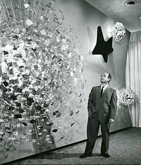
Recently, I visited the Smithsonian American Art Museum in Washington, DC for the the first time. Now I don't know why, but I had rather low expectations for this particular museum - perhaps I just did not know what to expect. And while I was certainly impressed in general, I was nearly awestruck when I rounded a corner only to find myself face-to-face with Harry Bertoia's massive Zenith Radio Corporation Showroom Sculpture.
Harry Bertoia and his creation, c.1959
I have something of an affinity for the artist and designer Harry Bertoia, whom I mentioned almost in passing a few weeks ago. He was the first 20th Century modernist designer that I knew by name, having been introduced to his iconic wire mesh chairs by a good friend and room-mate in my early-twenties. Bertoia was an Italian-American who had come to this country from Northern Italy (via Canada) at a young age, studied alongside some of the legends of modern design, and even spent a few years during the 1940s living in my hometown of San Diego, California. His first gallery show in 1945 was held at the San Francisco Museum of Art. On top of all this, I genuinely enjoy his wide-array of work, from his monotypes to his furniture and of course his sculptures.
sculpture detail, photo by author
The 1950s were a productive time for Harry. He started off the decade by accepting a job with Knoll, a company headed up by Florence Knoll, a former classmate at the Cranbrook Academy of Art. Supposedly Knoll gave him very little directive to start, but within a year Harry had designed is diamond chair, which may be his most well-known work. More gallery shows (including MOMA in New York) and art commissions, both public and private, followed in the subsequent years leading up to the piece in question. These commissions would continue into the late 1970s, although Bertoia would never again return to furniture design and became increasingly interested in his musical experiments that utilized his own sculptural creations.
sculpture detail, photo by author
According to the Smithsonian archives, Bertoia was very specific in what the elements represented in the piece he produced for the late-50s Zenith commission. From left, the largest structure represents the earth, followed by sight, sound, and what he termed electronic control. All were Bertoia's attempt to provide some physical representation of the forces behind the relatively new phenomena of television. Zenith had introduced its first television line in 1948, with color sets following in 1950, so by the end of the decade it was a major player in the ever-growing television market.
sculpture detail, photo by author
The sculpture itself has a sheer presence that photos can barely capture. The slow alternating pulsation of the lights gives the impression of some sort of bio-mechanical organism. Is the wall alive? Is it transmitting a signal from some distant satellite? For a generation immersed in science fiction pulp and soon to embrace Rod Serling's The Twilight Zone, it must have made quite an impression at the time both on the Zenith executives as well as those that were fortunate enough to see the pieces in the original showroom.
As one may expect, the piece spent a significant amount of time neglected in storage. Fortunately, the Smithsonian spent a significant amount of time restoring the work, the story of which is told here.
The young girls of Le Sacre, original costumes and stage set, 1913
Tomorrow, May 29th, 2013 marks the 100th anniversary of the premiere performance of Igor Stravinsky's Le Sacre du printemps, known more commonly by it's English title the Rite of Spring. There has already been much ballyhoo about the centennial and this entry may very well seem like another bit of carpetbagging (not unlike my Gatsby post of a few weeks ago), but the Rite is a fairly significant piece of music to me personally. Like many, I first heard it in a movie theater courtesy of Walt Disney's Fantasia. My Aunt Marianne took myself and my younger cousin Paul to see either the 1977 or 1982 theatrical run at the Cinema 21 in San Diego, California. Now Cinema 21 was not any run of mill movie theater: it was a single-screen 1,000-seat temple to modernity and one of the reasons I can't take today's multiplexes seriously. At the time of it's 1963 construction by Statewide Theaters it was the only movie house in the country set up to screen films in 35mm, 70mm, Cinerama, AND Cinema-scope. No small achievement. Even 15 years after it's opening it made an impression - certainly to a young boy such as myself. The experience obviously has stayed with me, reinforced over the years by countless visits to Disneyland capped off with what we called the dinosaur train: the Primeval World attraction.
Promotional postcard, Cinema 21, San Diego, California, 1963
The Rite of Springsequence in Fantasia was of course set to visuals of the origins of the earth and the prehistoric days of the dinosaurs. And what 6 or 11-year-old boy doesn't like dinosaurs? I didn't care about the dissonance in Stravinsky's music, to my young mind it was just what the cogs of creation sounded like as fascinating creatures rose from the primordial ooze. I was captivated and I can recall the experience with some clarity to this day. I have revisited the film in recent years and am well aware that Stravinsky disowned the film upon it's 1940 release (although he cashed the check) not only for the truncated version of the score (due to time limits of the original theatrical release) but to the visual interpretation of the music. Yes it is flawed, but it served a purpose not only for my life but for so many other young ears across the United States that may have never been exposed to the savage beauty of Igor's music. Later through my development as a musician and as my interest in 20th Century modern jazz deepened, I approached Stravinsky's music from a different angle inspired at least in part by Charlie Parker's noted appreciation and admiration for the composer.
Walt Disney and Igor Stravinsky, Los Angeles, California, 1939
The performance that now intrigues me most is the Joffrey Ballet's painstaking 1987 recreation of the original 1913 Paris production. It was not only the music that ushered in the modern era of ballet, it was the angular, primitive choreography of the legendary Vaslav Nijinski and the earthy sets and costumes of Russian folklorist Nicholas Roerich combined with Stravinsky's brilliant music that made for such a revolutionary production at Sergei Diaghilev's Ballets Russes. For years, it was thought that everything buy the score was lost. After only a dozen or so performances in Paris and London, the ballet was not performed for 7 years by which time the choreography had already been forgotten by all of the principals. It's something of a modern miracle that the '80s reconstruction happened at all. But what the Joffrey most effectively did is help revive the exciting, primal nature of the piece: as Leonard Bernstein once famously exclaimed, 'it's about sex!'. And surely the Russian folk elements of the story which culminate in a virgin sacrifice thinly veils this strong subtext. But as the sacrifice of virginity can also be viewed as the creation of new life and rebirth, perhaps ol' Walt Disney wasn't so far off the mark after all!
Four years after Pendleton Woolen Mills introduced their iconic Sport Shirt to the American male, the Sir Pendleton made it's debut. And while lesser known, it is an important part of the clothier's canon. Like it's predecessor it was made of virgin wool, but new addition was of an extremely lightweight worsted variety intended for yearlong use.
1959 print ad
The expansion of the garment line had deep roots. In 1912, the Pendleton company acquired additional woolen mills in Washougal, Washington nearly 200 miles West of it's Pendleton, Oregon location. Washougal sits on the Columbia River, just a few miles and across the border from Portland. The facilities allowed production of lighter-weight woolens, such as those used in men's suiting. Worsted wool, while stretching back several hundred years, made tremendous advances in the late-1800s due to industrialization in both England and the United States. By the early 20th Century it had started to gain the upper hand in men's suiting.
1961 print ad
Much like the Sport Shirt, the Sir Pendleton had a distinctive style that changed very little for quite a few years perhaps most notably it's classic open collar with a loop for the top button and a single breast pocket with a button rather than a flap. And like the Sport Shirt it was available in a variety of colors and plaids.
By the early-1960s the Sir Pendleton shirt gave way to an expanded Sir Pendleton full line which included everything from button-down collar shirts to blazers and jackets. And again like the Sport Shirt (nee Board Shirt), it has a presence in the current Pendleton clothing line. And the Washougal mill? It recently celebrated 100 years of operations and can be visited most days of the week.
Tal Farlow Quartet, Blue Note 5042, 1954, photo by Francis Wolff, design by Bill Hughes
In previous entries on this weblog, I have detailed the early contributions of both John Hermansader and Gil Mellé to the design canon of Blue Note Records. Both preceded the deservedly legendary Reid Miles and were featured prominently during the 10-inch long playing record era. Our subject today is another name from that same time period, one that crops up only on a very rare few discs and one whose story remains open-ended. The name Hughes first caught my eye as a credit on Tal Farlow's stylistically striking debut disc sleeve from 1954. Contrasting a Francis Wolff session photo of one of the most remarkable bop electric guitarist to emerge from that era, is a pair of geometric images not to far off from the Bass/Whitney opening sequence to Alfred Hitchcock's Vertigo (although that was to come a few more years down the road).
Julius Watkins Sextet, Blue Note 5053, 1954
The The Farlow sleeve is the first of only 3 Blue Note LPs whose design credit is given to Hughes...Bill Hughes to be correct. All 3 are 10-inchers and share a certainly level of minimalism that provide a contrast to the other design ideas utilized by Alfred Lion during his label's adolescence. The discs in question were all released within the same calendar year, which of course begs more questions. Unfortunately in this case, there are not a lot of answers.
The Gil Mellé Quartet featuring Lou Mecca, Blue Note 5054, 1954
Another clue lies in the third disc design credited to Hughes. Thanks to the subsequent anothology of Mellé's Blue Note output, we have learned that Hughes was also (or perhaps primarily?) a photographer and that he was responsible for taking the photo that graces BN 5054's sleeve. Shot in the same year of 1954 at a Town Hall concert, it remains one of the few photos of Mellé much more so one of few photos of him performing live.
Miles Davis, Vol. 3, Blue Note 5040, 1954
But I propose that perhaps Hughes contributions to the label did not end there. There are a few releases around this time that lack contemporaneous credits of any sort. The first example is third 10-inch volume by Miles Davis, cut and released near the beginning of his first "rebirth" of sorts. Only 2 releases earlier than the Farlow disc, it bears some notable similarities to the latter - particularly with the Wolff session photo contrasted to a geometric-based background. I suspect (and this is pure speculation, of course) that Hughes was responsible for the design in this case as well.
Elmo Hope quintet with Frank Foster and Freeman Lee, Blue Note 5044, 1954
Another Hughes-design candidate comes a couple issues after the Farlow disc in the catalog. New York-born pianist Elmo Hope's second Blue Note LP features another stark, minimalistic design not too far off from Hughes second and third credited contributions to the label. It's a further stretch than the Davis disc, but should at least be a suspect in this case. Regardless, Blue Note Records was clearly a growing enterprise at this stage. Not only were they experimenting with their roster of musicians and where the music was recorded, but they were working from an impressive pool of graphic designers. All of this contributed to an exciting flash in time. While perhaps less stylistically unified as the "classic" late-'50 through mid-'60s time span that many (if not most) think of when they hear the phrase Blue Note, this time period showed a high degree of experimentation both aurally and visually.
Jumpin' at the Woodside, A Buck Clayton Jam Session, CL 701, 1955, photo by Bill Hughes
But the Hughes story ends there for the most part. Unfortunately, in this overly-informed age the Hughes story seems to have slipped through the cracks...for now, at least. His name does crop back up a year later on a sleeve photo credit for Columbia Records, but there is very little evidence elsewhere that gives much plot to the Bill Hughes graphic designer and photographer story. It is my sincere hope that today's entry changes that and I look forward to reader contributions that pick up this thread.
The MIT Chapel, design by Eero Saarinen 1953-1956, photo by editor 2013
When one speaks of mid-century modern, I suppose one could not get any more mid than the year 1950. And it was in that year that the Massachusetts Institute of Technology (MIT), engaged Finnish-Amerian architect and industrial designer Eero Saarinen to design a chapel and auditorium on the grounds its campus located in Cambridge just across the Charles River from Boston. The Boston area is rarely thought of as a haven for modernism in the design sense: it is a North American city with deep and significant historical roots stretching back long before the American Revolution and much of the urban renewal that brought about New Boston occurred long-after the modernist ideal had been supplanted by later notions. But MIT was progressive in this sense, the legacy of which can still be seen on its campus today.
Eero Saarinen, 1950
Saarinen at mid-century had a string of notable achievements and was a known quantity within the design community. His collaboration with Charles Eames resulted in recognition by the MOMA in New York City as well as their participation in the Case Study House program in California (Number 9 to be exact). Eero had spent a good portion of the 1940s working in his father's architecture firm but after the death of the elder Saarinen in July of 1950, the younger launched a shop of his own. At just 85 years old in that same year, MIT was something of a young university - particular compared to its many esteemed and much longer in the tooth neighbors. In some ways, it lacked the traditions that a school such as Harvard had by that time, which may account for it's more forward-thinking artistic engagements.
Interior, The MIT Chapel, photo by editor 2013
The Saarinen MIT commission spanned a period of approximately 6 years. After his selection by the university, Eero shifted his focus on a similar commission for Brandeis University in neighboring Waltham. The Saarinen chapel at Brandeis was eventually scrapped by the planning board as they could not come to an agreement on some of the basic details with the architect. Their loss was certainly MIT's gain, as Eero infused his next project with many of the more interesting and innovation design ideas that he had proposed for the larger structure at Brandeis. He also drew upon his travels in the mid-1930s through the ancient world, particularly Greece and specifically Sparta, which directly influenced his skylight design. Construction began in 1953 and was for the most part completed by 1955, although the roof sculpture was not added until the following year.
Podium sculpture, Harry Bertoia, The MIT Chapel, photo by editor 2013
The resulting building remains as stunning today as I expect it was on it's dedication day. Saarinen created a haven: a place of remarkable peace and tranquility. The brick, wood, and marble evokes the pre-Christian world refashioned into something modern yet timeless. His use of light - both natural and artificial - is masterful. The final touches are both contributions from other artists. Harry Bertoia, who like Eames had first met Eero at Cranbrook University, provided the metal sculpture which descends from the ceiling to the base of the podium/altar. Other writers have focused on the speculative literal meaning of the piece, but it is simply a beautiful accent that deflects the incoming light in a hundred different direction. Interpret it as you wish. Theodore Roszak designed the abstract bell tower or spire which was added to the building in 1956. The MIT Chapel is a singular structure: devoid of any denomination, yet vibrantly spiritual and a shrine to solace. I would expect - if not hope - that its chairs have been full these past couple of weeks.
The Great Gatsby, F. Scott Fitzgerald, 1925, first edition, cover by Francis Cugat * (see note below)
88 years ago, on April 10, 1925, Charles Schribner's Sons first published F. Scott Fitzgerald's The Great Gatsby. The novel was met with mixed critical reaction upon it's release and only moderate popular success. In fact, the first edition sold a mere 24,000 copies over the course of it's initial run. By the time Fitzgerald died on December 21, 1944 at the age of 44, the book had been out of print for several years.
Eight years prior, a second-year Harvard undergrad by the name of James Laughlin published the first New Directions anthology. The roll call of authors New Directions published in the subsequent few years is astounding, particularly as many were being introduced to the general public for the first time: Tennessee Williams, Lawrence Ferlinghetti, William Saroyan, Wallace Stevens, to name just four. In addition to spotlighting then-contemporary modernist literature, New Directions began reprinting many authors (such as Henry James and Evelyn Waugh) whose works had never been re-printed after their initial publishing runs had ended.
The Wisdom of the Heart, Henry Miller, 1941, jacket by Alvin Lustig
Part of the spirit of New Directions was reflected in its strikingly modern dust jackets. In 1940, Laughlin was introduced to graphic artist, designer, and ex-Frank Lloyd Wright acolyte Alvin Lustig by bookseller and literary scene-maker Jacob Zeitlin in Lustig's Brentwood, California studio. Laughlin later said that he only needed to spend an hour with the artist before he knew he was in the presence of what he called "authentic creative genius". A commission for the jacket of the New Directions 1941 editions of Henry Miller's The Wisdom of the Heart and Carl Rakosi's Selected Poems soon followed. But while these works reflected the style Lustig had developed up until that time: his next series of work for New Directions, twenty-five books in the publisher's New Classics series, came to represent an iconic style for which Lustig (and to a lesser extent New Directions) is most well-known.
Alvin Lustig, 1945
Among the titles in the New Classics series was Fitzgerald's The Great Gatsby, which was published for only the second time in 1945. A new wave of book reviews followed in the wake of the release. This time around Fitzgerald's novel was being reconsidered, not as the period piece it had been regarded as for the most part over the prior twenty years, but rather as something important and perhaps great. To the point, the New Classics edition marked the beginning of The Great Gatsby as being a true classic of modern American fiction.
The Great Gatsby, F. Scott Fitzgerald, New Classics 9 / New Directions 1945 edition, jacket by Alvin Lustig
Momentum continued on both scholarly and popular fronts through the end of the decade. Somewhat ironically, Paramount Pictures in Hollywood began a film adaptation production in 1948 directed by Elliott Nugent and starring Alan Ladd which was released in July of 1949. The irony lies in the fact that Fitzgerald spent his last booze-soaked years in Los Angeles trying to eek out a living writing for films. This first film adaptation drew from both the original novel as well as Owen Davis's 1926 short-lived adaptation for the Broadway stage. Incidentally, the screenwriters were Cyril Hume and Richard Maibaum, the latter being the very same Richard Maibaum who wrote the screenplays of the majority of James Bond films from 1962-1989. In the academic world, at least two books were published in 1951 concerning themselves with Fitzgerald's life and importance. This opened the floodgates to several scholarly works at the highest levels of academia, the sum total of which set The Great Gatsby on the pedestal upon which it still rests today.
Alan Ladd, 1948 Paramount Pictures promotional photo
For further reading, I highly recommend this excellent 1960 New York Times piece. * An entire weblog entry could be devoted to Francis Cugat's somewhat controversial cover art for the original 1925 edition. Here is what purports to be the untouched original painting, although I cannot vouch for its authenticity. Fitzgerald (perhaps influenced by Ernest Hemingway) later claimed he hated the cover and went to great lengths to apologize for it. And yes, Cugat was the brother of the famous New York-based bandleader who popularized the rhumba: Xavier Cugat.
While your faithful editor spends the week back in Boston, our man in London, Jimmy Mellor, reports in with and exciting development for us Ivy enthusiasts who don't make it across the Atlantic nearly as often as we would like to... Last month saw the launch of the long-awaited John Simons online shop: a brave new venture for John and his son Paul, as they have built their reputation on personal service and a personal relationship with their customers. You pop in for a shirt, a conversation develops, before you know it you are invited for a drink! The personal touch has always been the hallmark of shopping at 'John's' in each of his many shops over the years and so translating that same level of attention to detail has been the challenge in setting up the new online shop. Hence it being long awaited. Unless it could be done really well the feeling was why let down the customer with anything less?
The new website is still in development and growing daily - probably that will always be the case as there will always be new stock to showcase, new designs from John to debut, an dnew additions to the nature of the shop. Last time I was in, John showed me some vintage thermos flasks he'd acquired purely for the perfection of their design.
Being an independent retailer the London shop is a one-off and that has been the main reason for the move into online. Unless you could visit the shop or were happy to mail order over the telephone (a service John has always supplied) then the frustration for many was in wanting to see and get their hands on the clothes that kept on being discussed. Facebook helped to an extent in spreading the ethos and culture of the shop and Twitter provided updates on the latest, but in the computer-centric world we now all live in (for good or ill) the move to adding an online shop to what John has been doing since 1955 had to come.
And I think it's been well worth the wait. What I would have given for a service like this when I first started out as a 13 year old kid in 1978 with an instant obsession for the clothes I'd seen on my Uncle's old Modern Jazz LP sleeves. In England, unless you knew about John Simons (and I didn't back then), you simply could not get the clothes. You'd get something that came kind of close if you really hunted around but it never would be quite right. Trust me, before encountering John Simons I spent 8 years and wasted a lot of money on trying to get The Look. Now it's all there at the click of a mouse.
Already online from John you can equip yourself with an Ivy League wardrobe from head to toe. Especially of interest is the John Simons Apparel company range of John's own designs informed by his encyclopedic knowledge of menswear. All unique products that you just won't find anywhere else. The shirts due to their production runs have already attracted a 'stamp collector' mentality with John's earlier designs now changing hands for the sort of prices rare records attract. Again, trust me on this as I am putting together a John Simons archive of items from his earlier shops to date. Beyond the very generous donations from long time loyal customers there can be much haggling over all the rest - which is all great good natured fun.
Amongst the various rarities I've collected so far from The Ivy Shop, The Squire Shop, The Village Gate, J. Simons, and now John Simons Est.1955 (all the brain child of John), a Lion of Troy buttondown from The Ivy Shop purchased in 1969 by Mr. Ian Hingle especially stands out as he also enclosed a photograph of himself wearing the very same shirt from that year. So timeless is the style that it could have been taken yesterday. Ultimately the collection will be offered to the Victoria and Albert Museum, London.
For Ivy style fans in England things have rarely been so accessible and now also for the world due to the Internet. Which is just how the style should be. - Jimmy Frost Mellor, Ivy League Menswear Consultant and Archivist Editor's Note: all of the items pictured are from John's current online inventory. Be sure to follow one of the links to see the full online selection.








 Posts

