Monday, September 9, 2013

September Song (1938)


September Song, sheet music, 1938

It is quite easy to see why Kurt Weill and Maxwell Anderson's "September Song" from the 1938 Broadway production Knickerbocker Holiday has been front of mind as of late. While Summer still lingers (particularly for those experiencing Indian Summers), the days truly grow shorter and it is only a matter of weeks before Autumn will begin to show its colors.


Kurt Weill and Fritz Lang in Hollywood, April 1938

German-born Jewish composer Kurt Weill had been living in New York City for 3 years in 1938. His residence in the most American of American cities marked the end of the first phase of his career in which he contributed greatly to the Weimar Republic soundtrack thanks to his rightfully celebrated collaborations with Bertholt Brecht. While in Germany, Weill was not only an active in populist left-wing politics but his music was celebrated the world over by avant-garde modernist composers such as Stravinsky, Berg, and Milhaud. Fleeing the Nazi regime, Weill and his wife settled in New York after short stays in both London and Paris. Weill soon began to self-consciously reshape his music to fit the mold of his adopted country. To show just how far he had come, 1938 saw him not only his collaboration with Anderson premiering on Broadway, but he spent some time in Hollywood scoring a movie for the Austrian-expatriate, Fritz Lang.


Maxwell Anderson, Time, December 10, 1934

Maxwell Anderson was a somewhat odd pairing for Lang. Born in Pennsylvania in 1888, he was twelve years Weill's senior. A scholar and writer, Anderson was also an outspoken pacifist - something that jeopardized his professional career on more than one occasion. Bouncing between writing and teaching jobs from North Dakota to San Francisco, he eventually ended up in New York in 1918 working as a journalist and playwright. Before meeting Weill and working with the composer on Knickerbocker Holiday, Anderson had experienced several Broadway hits. But what was perhaps most interesting about this particular stage production was the sub-text of the play. With the memory of the executions of Sacco and Vanzetti only 11 years old in 1938, Anderson had more than a passing interest in leftist-influenced anarchism. In fact, Knickerbocker Holiday is most often characterized by critics as a thinly veiled attack on then-President Franklin Delano Roosevelt's New Deal, something Anderson felt veered to close to the fascism that was dominating Europe at the time. 


September Song, Walter Huston, Brunswick Records, 1938

One of the stars of Knickerbocker Holiday was 55-year old Walter Huston, who requested a song be written for his character of advanced age to help woo a younger love interest. Weill and Anderson obliged with 'September Song' reportedly written start-to-finish within the span of a day. With it's roots going back at least as far Geoffrey Chaucer's 14th Century 'Canterbury Tales' (see The Merchant's Tale), the symbolic use of months of the year to represent differing ages was certainly nothing new in the late-1930s. But Weill and Anderson managed to breathe some new life into a well-worn device as well as come up with a rather touching plea for love. It's not terribly sentimental, but rather sweet lyrically and the music manages to hint just enough at the inevitability of the protagonist's demise without being morbid. 
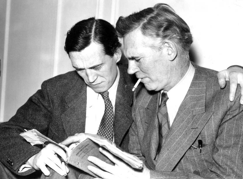

John Huston and his father Walter Huston, 1940

Irish-American Huston, the father of maverick film director and actor John Huston, and the grandfather of actors Angelica Huston and Danny Huston, had a minor chart hit with his original 1938 recording of 'September Song'. Huston's version was allegedly President John Kennedy's favorite song, with JFK performing the number for private affairs, intoning Huston's croon. Whether or not Jack was aware of the politic undercurrents of the song's source it not something that is documented. In addition to their other post-1938 achievements, all of the principals eventually found varying degrees of success in Hollywood: Huston won an Academy Award in 1948 for his supporting role in The Treasure of the Sierra Madre; Anderson wrote the screenplay to Alfred Hitchcock's The Wrong Man in 1956; and Weill scored a select few films. When Kurt Weill died in 1950, Maxwell Anderson delivered the eulogy. At the time of Weill's death 'September Song' experienced a resurgence of popularity, thanks in no small part to its use in that year's September Affair motion picture and by the end of the decade it was firmly established as a standard in what is now called the Great American Songbook.

Further reading: follow this link for a more musical look at the song.

Further listening: give this great 1946 version a listen by pianist/vibraharpist Dardanelle featuring Joe Sinacore on guitar which makes for an interesting comparison to Teddy Wilson's 1944 version featuring Sarah Vaughan on vocals, Remo Palmieri on guitar, and Charlie Ventura on tenor saxophone.

Tuesday, August 20, 2013

Irving Harper (2013)


George Nelson Clock reproduction by Verichron, 2013

Every so often it is good to have the rug pulled out from under you. The experience sharpens your senses, wakes you up, and makes you question the firm ground that all too often is taken for granted.


Online ad, Modernica, 2013

My Mid-20th Century Design Road to Damascus was a flight to Spain with a long layover in JFK. It was 1998, Trans World Airlines was still operating, and the fates conspired to leave me with a few hours on my hands in Terminal 5. Almost needless to say, I was floored by the building. My appreciation of modernism as a design aesthetic became a primary interest and the name Eero Saarinen was elevated to hero status in my estimation. Move forward 5 years and I am now sharing the flat where I currently live in San Francisco with the now Missus. We purchase a pair of pendant lamps for our living room spaces from a local favorite, Inside. Our choice? Modernica's reproduction of the Howard Miller cigar bubble lamps designed by George Nelson. So here was my first legitimate design purchase. An iconic item by a name designer. So all things being equal, Nelson's stature is elevated in my little black Moleskine.


Print ads, Howard Miller Clock Company, 1956

And it grows. And it grows. My wife buys me a Vitra-produced Nelson reproduction clock as a gift. I find an oversize jack for my bookshelf. Our flatware is replaced with a set of vintage Hall Leisure designed by the Nelson and Associates. George Nelson becomes a touchstone in my mind's eye as I become more and more engrossed in this aspect of living.


Debut of the Herman Miller logo, 1947, logo by Irving Harper for George Nelson Design

Perhaps the only thing worse than being late to the party is being late to the party as well as being oblivious. The latter is how I felt when I first read about Irving Harper a few weeks ago. Who is Irving Harper? Only the most significant Mid-Century Modernist that you have (perhaps likely) never heard of! As it turns out Harper was THE man at George Nelson and Associates responsible for everything from the iconic Herman Miller logo to the now legendary Howard Miller "Nelson" clocks which hang on the wall of nearly every discerning modernist worth their salt. And, yes, even those lamps hanging in my living room are now attributed to Harper. Sure, I knew that George often took credit for the work of this firm. Of course he did, that is the way it had been done for decades if not centuries with the name on the masthead usually taking credit for the entire output. What is astonishing is just how many of these iconic works sprung from Irving Harper's obviously fertile, creative mind. The wonderful coda to this story is that Harper is still alive and finally getting the attention and notoriety he so clearly deserves.

For further reading, I highly recommend this article as well as this one

Monday, August 5, 2013

The Tune is Red (1960)


The Tune is Red, oil on canvas, Hassel Smith, 1960 (full painting) 

I have often been asked why I like 20th Century abstract art. The phrasing of the questions have ranged from speculation on whether or not the questioner's child or grandchild could have easily done the same thing to something along the lines of I just don't get it. In truth, I cannot simply explain my attraction to abstract art both of and influenced by this period, so I thought I would muse on that notion a bit. 

My first art appreciation course was not until my second or third semester of college here in San Francisco. It was a fairly pedestrian course, one which covered all of the hits and a handful of misses. As a side note: I recall the end of term project that I created for this class: a piece of assemblage, which I white-washed with tempura paint, so I was already showing my colors so to speak. By this time, I had already been exposed to a few minor abstract works via 12-inch LP covers, having got hip to jazz records in high school. Another influence, no doubt, was psychedelic art of the 1960s, something that I spent no meager amount of time digging deep into during my high school and college years. The sum total was that abstract works just captured my interest and imagination more than any other form of visual art - save perhaps architecture and design. So I did which I so often do when something piques my interest, I dug deeper and deeper until I found the good stuff. 


The Tune is Red, oil on canvas, Hassel Smith, 1960 (detail 1)

Of course, no exploration of abstract art tunnels too far away from the New York School of the 1940s and 1950s, but living here in San Francisco, I am fortunate to have access to many of the fruits of the Bay Area School from roughly the same time period. Between the local works and visit to the Guggenheim and MOMA on East Coast trips, I have managed to see a fairly broad survey of modernist art from the last Century. I have my favorites, such as Franz Kline, but it's always exciting to be exposed to an exhibition such as the recent Richard Diebenkorn exhibit that I mentioned a few weeks ago.


The Tune is Red, oil on canvas, Hassel Smith, 1960 (detail 2) 

Back to the question of why. From an intellectual point of view, I have come to the opinion that figurative painting - for the most part - became less and less relevant as media such as photography, film, and video gained more and more traction. Surely the skill of the great masters is something to still admire, but I think it is important to note that those paintings are often the only visual records of those times. As the means to visually document the world around us have become more and more accessible and prevalent, it seems only natural to me that and older medium such as painting be used in a different manner. Of course that I have long been interested in some many other aspects of post-World War II culture certainly has resulted in a certain predisposition. Most certainly. But I think this has been a case where bias has been a virtue, in that I don't seem to have the aversion to this style of art that a lot of people exhibit.


The Tune is Red, oil on canvas, Hassel Smith, 1960 (detail 3) 

From a emotional point of view, I find abstract art captivating on a many levels - particularly when I am able to see a painting in person. In the works that have captivated me most, I have typically found a depth - in the colors, in the textures, in the movement - that just stimulates something in my brain and emotions. I don't look at them as Rorschach tests. I've ceased to look at them for meaning. But rather I have come to just experience them for what they are. And, yes, a good abstract painting can be similar in some ways to a good jazz performance in that it is a mix of skilled tradition and personal improvisation. So as my life as a jazz musician has been become more and more important, perhaps my affinity to abstract art and abstract expressionism in particular has achieved parallel importance.

Note: the painting featured on this page is currently residing at the Cantor Arts Center on the Stanford University campus. Admission is free, so all you need to do it get your self there to see this one. The artist, Hassel Smith, is one of the many of that era whose love for jazz music was reflected in his work. Smith spent a significant amount of time in the San Francisco-Bay Area and was also an important early part of the Ferus Gallery scene in Los Angeles. His remarkable timeline can be found here.

Tuesday, July 23, 2013

Brooks Brothers (1939)


Brooks Brothers print advertisements from the archive, all dated 1939. It is truly remarkable how little changed with the clothier for many, many years. Small concessions to contemporary conventions aside, there is a lot of recognizable aspects to all four of these ads. So much so, that it is easy to see why what many know today as Ivy League style or The Look, was widely known as the Brooks Brothers look for quite some time. I recall reading Graham Marsh's written introduction to the 1991 compendium of Blue Note cover art not long after it was released, where he made mention of still being able to get a Brooks button down with an air of assurance that some things had not changed. As I was just starting to get into that aspect of style at the time and still preoccupied with looking '60s, I did not get it. But over the years those written words became a little touchstone and looking at the above images from nearly 75 years ago when the world was a strikingly differently place - I do take some comfort that one can still stroll down Madison Avenue in New York City, pop into number 346, and buy a Brooks Brothers button-down shirt.

Tuesday, July 16, 2013

Walk, Don't Run! (1954)


In a Sentimental Mood, Johnny Smith, Roost LP 424, 1954, photo/design by Burt Goldblatt

A few days shy of his 91st birthday, master guitarist Johnny Smith died on June 12, 2013 in Colorado Springs, Colorado. He was born in Birmingham, Alabama in 1922 and made his fame (if not his fortune) in New York City during the 1940s and 1950s. In spite of well-publicized endorsements of namesake guitars made by both Gibson and Guild, he died something of an obscure figure as far as the general public is concerned. But he was a true musician's musician and remains an absolute legend among guitarists. Not surprisingly, nearly every online obituary gives prominence to Smith's biggest claim to popular fame: Walk, Don't Run! Written and recorded by Smith in 1954, the song was taken to number 2 in the pop charts in 1960 by The Ventures from Tacoma, Washington giving them their first hit and launching their long career. But as one might expect, there is a little more to the story.


The New Moon at The Imperial Theater, New York, advertising postcard, 1929

Sigmund Romberg and Oscar Hammerstein wrote the music and words (respectively) to the 1929 operetta New Moon. Two of the songs written were later to become jazz standards: Lover, Come Back to Me and Softly, As in a Morning Sunrise. The former was immediately the more popular tune with 3 recordings charting in 1929 alone. The latter had to wait a full decade before seeing any success, thanks to Artie Shaw's 1938 revival of the song. On the jazz scene, the tune really got legs in the 1950s - for example the Modern Jazz Quartet featured it as a regular part of their repertoire as early as 1952. Arguably, Sonny Rollins recorded the definitive version of the song in 1957 at the Village Vanguard for Blue Note Records during the peak of the song's popularity among modern jazz musicians. But, as usual, I digress.


Johnny Smith Quintet featuring Stan Getz, Royal Roost 78 1152, 1952

Johnny Smith was well aware of the song in the early 1950s. By day he earning a living as a staff musician at NBC in New York City and by night he was often leading his own combos in jazz clubs such as Birdland. Smith was to later claim that he came to appreciate songs such as Softly... due to his day job, were he was often called upon to back light-opera and pop singers. A few items from these singers repertoire worked themselves into Johnny's own massive library of songs and due to an association with Teddy Reig's Roost Records that began in 1952 and lasted until 1960, thanks in no part to his initial hit record of Moonlight in Vermont featuring Stan Getz.


Johnny Smith, circa 1954, photo by William "PoPsie" Randolf

Smith had over half a dozen sessions for Roost under his belt by the time he entered the recording studio in late September 1954. The additional musicians on the session consisted of guitarist Perry Lopez, who had backed Smith before and whose other most well known sessions were conducted earlier in the month with Julius Watkins for Blue Note Records and the following March with Benny Goodman at Basin Street; bassist Arnold Fishkind, who was in between his long association with Lennie Tristano and his second act as a studio musician; and Don Lamond, most famous at that time for his drumming with Woody Herman's orchestra. All had recorded with Smith previously and Lopez in particular had a certainly level of musical empathy that only comes from playing together. One of the songs the bandleader brought to the session was a contrafact he had written over the chord changes of Softly, As in a Morning Sunrise. In jazz-speak, a contrafact is new melody line played over a standard set of chords, although these are often re-harmonized. This practice was particularly popular during the 1940s and 1950s as modern jazz was pushing the boundaries of tradition. A fringe benefit for record label owners is that they did not need to pay publishing royalties on the source material. Smith's line on Softly... was transposed up a whole step from the original and titled Opus by the composer. The title didn't stick as producer and label boss renamed it Walk, Don't Run! by the time it was released on Roost's 10-inch LP disc, In a Sentimental Mood, later that same year.


Walk, Don't Run!, Johnny Smith, 1954

Unlike Moonlight in Vermont, Walk, Don't Run! was neither a critical nor popular success for Johnny. But as mentioned, Smith was a musician's musician and his 1950s releases were ardently admired by guitarists everywhere. One avowed fan was the ultimate Tennessee guitar picker: Chet Atkins. Atkins own recording career for RCA Victor was well underway by the time he got his hands on Smith's '54 Roost release. And due to his A&R position with his record label, by the mid-1950s he was making regular business trips to New York City where he check out Johnny Smith if he was gigging. One such night Atkins approached Smith at the bar at Birdland and asked Johnny's permission to record one his tunes. The story goes that Chet insisted on playing his arrangement for Johnny on the spot and if there was ever a fly-on-the-wall moment of choice for guitar geeks, this certainly has to be a top contender.


Walk, Don't Run, Chet Atkins, 1957

The Chet Atkins recording of Walk, Don't Run (note the dropped exclamation point) was released in October 1957 on RCA Victor LP Hi-Fi in Focus. How this release fits within the context of Chet's full discography is not for this entry to tackle, but it is interesting to take note of the LP sleeve. Although very much a countrypolitan recording that the record buying public had come to expect from Atkins, RCA Victor obviously aimed this particular disc at the burgeoning HiFi market. The music (and recording artist for that matter) is given only a paragraph's worth of ink on back cover, while the remainder of the 12-inches is given to the details of the RCA Victor/Canon Camera album contest. The winning image by A.M Baunach of Bethlehem, Pennsylvania is a great exercise in modernist photography, predating a the strikingly similar John Whitney/Saul Bass collaboration on the title sequence for Alfred Hitchcock's Vertigo by nearly 9 months. From where did Baunach draw his inspiration? I fear this is lost to the ages, for Baunach (later known as Barney and who had a long career as a corporate photographer for the Bethlehem Steel Corporation) passed away in 1991 and this will most likely remain a footnote.


Hi-Fi in Focus, Chet Atkins, RCA Victor LPM-1577, 1957, cover photo by A.M. Baunach

What is known, is that guitarist Bob Bogle was hip to the Atkins disc and the song entered the repertoire of the nascent Ventures, who began plying their instrumental trade throughout the Pacific Northwest in 1958. As guitarist, writer, and fellow guitar geek Deke Dickerson explained to the Washington Post's Matt Schudel in this interview, the success of Walk-Don't Run and The Ventures signaled a very significant shift in popular music prefiguring the California surf music, Pacific-Northwest frat rock, and British beat group phenomenas of the 1960s. But theirs is a story that has been much better tackled elsewhere than here on these pages.


Walk-Don't Run, The Ventures, Blue Horizon 45 101-1, 1959

By the time The Ventures were hitting the charts with his song, Johnny Smith had left New York for Colorado to raise his daughter after the death of his wife. He occasionally returned to the East Coast for recording sessions and live appearances, but increasingly he spent more time focused on his family, his music store, and mentoring a younger generation of guitarists. When the royalty checks started appearing for Walk, Don't Run! he was unaware of The Ventures and their success. But it turned out to be a fortunate turn of events that would help Johnny through some of the leaner times in his life. The few words on this page only begin to hint at how important Smith was to 20th Century American guitar playing. He has been called everything from the "greatest plectrum guitarist" to "America's own Django". His humility was almost as legendary as his technical facility on the fretboard. His strong, but articulate opinions on everything from guitar-making to amplifier electronics both challenged and inspired some of the greatest musical instrument companies in the United States. He will be missed, not only by those who were fortunate to know him during his lifetime, but by those like myself who have simply known him through his music. May he rest in peace.

Further reading: I highly recommend this excellent interview that fellow jazz guitarist Bart Stringham conducted with Smith on the topic. Many of the details of this saga were drawn from this particular interview. The more musicianly-minded (and you gearheads) are well advised to check out Chip Stern's  in-depth homage here.

Tuesday, July 9, 2013

McGregor T.T. Convertible Sport Shirt (1954)


Magazine print advertisement, 1954

You may have noticed that one of the links I spotlight to the right of this column in the Blogroll is Shorpy. Their scope goes far beyond the somewhat narrow-minded confines of this particular space, so it is always refreshing to meander through their archives for glimpses of worlds other than this nebulous concept of modernism that I have. And yet, occasionally worlds do collide and, as I like to quote Charles Eames, eventually everything connects. Today's photo is a great example.


Mike Wallace and Buff Cobb, photo by John Vachon for Look magazine, 1952
Photo courtesy of Shorpy

Be sure to click through here for the full size photo. It is certainly something to take in. The Mike Wallace of 1952 was a far cry from the Mike Wallace of today. He had already made the transition to television from radio, but was not yet known as an investigative journalist. In fact, he spent a good deal of time hosting game shows and serving as an announcer both for regular shows and commercial breaks. But one achievement worth noting was the groundbreaking TV talk show Mike and Buff that ran on CBS from 1951 until 1953 and was based in New York. His co-host was actress Buff Cobb who he married in 1949. According to Shorpy the photograph is from a 1952 spread for Look magazine with the intent of showing off Italian style. Interesting. 


Magazine print advertisement, 1954

I wrote about the early origins of Continental (a.k.a. the Italian influence) style in the USA a few years ago on these very pages. However, what is interesting about the Wallace photo is that it predates by 2 years the general consensus about its emergence on these shores. This brought to mind some recent eBay finds of mine. A couple of print ads dated 1954 show McGregor Sportswear offering their original TT Shirt styled in Italy. Now those of you that know McGregor know that while they were a solid American brand, they could seldom be accused of being ahead of any fashion curves. So what got me scratching my head was how did McGregor jump on this trend so quickly? Perhaps they did not. Perhaps the stylistic developments of 1954 were much more of a gradual process that I had previously found. Well, it looks like someone needs to get back to their research. There is obviously a little more to story.

Tuesday, July 2, 2013

Tom Hannan (1957)


Paul Chambers Quintet, Blue Note Records LP 1564, 1957, design by Tom Hannan

I've mused rhapsodic on these pages previously about the early design legacy of New York's Blue Note Records, focusing mainly on the 10-inch LP era and such artists as Bill Hughes, John Hermansader, and Gil Melle. Recently, I saw a Japanese reissue of an early 12-inch and was struck by the abstract art design of the sleeve. With a little knuckle-grease and 'net digging, I learned that the cover was the work of a slightly obscure and now deceased artist named Tom Hannan whose story has some very interesting modernist intersections. 


Bone & Bari, Curtis Fuller, Blue Note Records LP 1572, 1957, design by Tom Hannan

The Blue Note 1500 series of LPs reflect a time period (1955-1958) where the independent jazz record label was both in transition and starting to find its rhythm. These were the first releases in the new and soon to be dominant 12-inch format. Somewhere in the middle of the run (1562 to be exact) the discs started being released in both monaural and the popular new stereo format. It is when both the label and the medium came of age, if you will pardon the phrase. From a design perspective, it is during this series the Reid Miles began to come to prominence and by the end of the decade would be synonymous with the look of the label.


Hank Mobley, Blue Note Records LP 1560, 1957, design by Tom Hannan

But Reid Miles had yet to establish his monopoly in 1957. Another artist, Tom Hannan, contributed several striking designs that mixed abstract imagery with striking typography. In some ways the balance of form and expression more accurately reflected the partially improvised music contained within the cardboard sleeves. At any rate, Hannan's contributions are definitely a glimpse of what could have been had Blue Note owners continued to experiment with a pool of designers throughout the end of the decade and into the 1960s.


Thelonious Monk and Sonny Rollins, Prestige Records LP 7075, 1956, design by Tom Hannan

The Blue Note work was neither the first nor the last record jacket design work that Hannan did. The year prior he had contributed a number of excellent designs to the Prestige Records catalog and he continue to freelance through the end of the decade to a number of other labels. Taken as a whole, the LPs show a consistency in concept if not execution. Hannan's original abstract work was set against linear typography (another specialty of his) and often his own photography that was as sharp as a freshly pressed Brooks Brothers button-down shirt.


Tom Hannan, c.1960, source unknown

So what about the artist? Tom Hannan was born in Michigan in 1927. He was a jazz fan early on, spending some time playing the drums before shifting his focus on the visual arts. He attended both Wayne State University as well as the Cleveland School of Art before moving to New York in 1950 to attend the Hans Hofmann School on a painting scholarship. The Hans Hofmann? Yes indeed. Hofmann was one of more explicit links between early European abstract art and the New York School that most people know as abstract expressionism. Hannan not only studied with Hofmann, but ended up working as his assistant for 3 years until 1953.


Magenta and Blue, Hans Hofmann, 1950, Whitney Museum of Art collection

History has been kind to Hofmann and there is ample information both online and in books on this important icon, so I will stick to the salient points. Born in Germany in 1880, Hofmann was in Europe the moment art took an abrupt turn towards the abstract near the beginning of the 20th Century. He studied in Paris prior to World War I and taught two Summer courses in Berkeley, California (1930, 1931), before finally leaving Germany for good in 1933. His teaching career lasted nearly four decades and his more well known students included Frank Stella and Lee Krasner, to name but two. He continued to paint, teach, and write up until his death in 1966.


Back Table at the Five Spot, photo by Burt Glinn, 1957

Following his years with Hofmann, Hannan immediately began to make a name of his own. He was one of the founding members of the James Gallery, which opened up in the Fall of 1954 at 70 East 12th Street. The James Gallery was one of the artist-owned cooperative exhibition spaces that later came to be known as the 10th Street Galleries (something else that I have written about on these pages). The same year he married a Parson's School of Design student named Allison Smith and the two lived the almost stereotypical existence of 1950s New York artists: a cold-water flat in SoHo, jazz at The Five Spot, and commercial work such as those for Prestige and Blue Note to keep food on the table. Although initially a way to fund his more creative endeavors, Hannan eventually shifted his focus on graphic design in the 1960s. He and Allison eventually left the City for Vermont and became successful dealers in American furniture some time around 1970, a pursuit he continued until his death in 2000.


Cu-Bop, Art Blakey and his Jazz Messengers with Sabu and a Bongo, Jubilee Records 1049, 1958, design by Tom Hannan