Showing posts with label new york. Show all posts

Friday, May 1, 2015

Chipp (1953)

Every so often an item pops up on eBay that somehow needs to be preserved. I am not necessarily talking about museum pieces, but rather curios that folks cut from a certain cloth just are interested in - or rather should be interested in.


Print ad, Gentry magazine, late-1952
purloined from The Ivy League Look

This wool odd jacket is one such item. Bearing the label of custom tailor Chipp, the item has the added bonus of a genuine date: September 11, 1953. What a garment like this represents is an actual connection to the past beyond the grip of latter-day Internet-based theoreticians and speculators. It is a glimpse of what actually was. These types of items help put things into perspective; they help answer a few questions - and perhaps prompt one to ask other questions.


The Chipp story is well documented elsewhere, particularly in this Ivy Style piece. In short, the operation was started in 1947 by Sidney Winston and Lou Praeger, two J. Press refugees keen to break out on their own. Their New York address was within curling distance of the mighty 346 Madison Avenue address of Brooks Brothers and were, at their peak, certainly vying for the same clientele if not a true competitor. Peter Lawford was a client and it was the Brother-in-Lawford himself that introduced Senator John F. Kennedy to the joys of Chipp. Kennedy was perhaps the company's most famous patron who continued having his suits made by Chipp into his presidency. Almost needless to say, it is one of those Ivy League legends often mentioned in the same breath as The Andover Shop, et al.


So what should be said about this particular example of Chipp's handiwork? Well, let's take into consideration the year first: 1953. One would expect much wider lapels based on contemporaneous photos and movies. In fact, it is remarkable how narrow the lapels are even with the button on center stance (yes, I am still trying to get in the habit of using that one over 3/2 button).


The cut, in general, looks more 1963 than 1953 - but again, that can be chalked up to the slight of hand tricks of history books. The shoulders? As natural as can be. The wool check pattern itself certainly smacks of the 1950s - walking the line between a classic Northeast country tweed and something Lanksy Brothers in Memphis would sell to a Beale Streeter or their world-be imitators.


A couple of final shots in the spirit of preservation for the ages, such as it would be...


Friday, March 20, 2015

Spring is Here (1938)


The first chart hit version of Richard Rodgers and Lorenz Hart's 1938 composition "Spring is Here", as adapted from the Broadway production of I Married an Angel. Reisman was an extremely popular bandleader during the 1930s who enjoyed success with his recordings of several songs that were to become jazz standards including "Yesterdays" and "Alone Together". The vocal refrain on his version of "Spring is Here" was by Felix Knight, known by most Statesiders of a certain age and older as Tom-Tom in Laurel and Hardy's Babes in Toyland.


4 years later, the song reached a wider audience courtesy of Jeanette McDonald and Nelson Eddy's performance of the song in the drastically tamer film version of I Married an Angel. The movie was a box-office and critical failure, known in the history books more for what it might have been rather than what audiences saw in the theaters. One can thank the Hays Code and its neutering effect on a lot of film adaptations of contemporaneous Broadway source material.


The first jazz version of song is a matter that is in dispute. The 1954 10" LP (and 7" EP) Interpretations by the Stan Getz Quintet featured a stand-out early adoption of the tune by younger modernists. Recorded in the Summer of 1953 in Los Angeles for Norman Granz's Norgran label, Getz was joined by Bob Brookmeyer on valve trombone, Johnny Williams (as in, yes, that John Williams) at the piano, Teddy Kotick playing the bass, and Frank Isola behind the drums.

For more details about this composition and its history, I heartily recommend the JazzStandards.com entry here.

Wednesday, December 31, 2014

Happy New Year (1953)


Elaine Johannsen models a hat design by Mr. John of New York City, 1953
Photo courtesy of The Powerhouse Museum
Thanks to Karen Finlay

Wednesday, November 19, 2014

Reid Miles (1956)


Patterns in Jazz by Gil Melle, Blue Note 12" LP 1517, 1956, cover design by Reid Miles

I know. I can hear it now. The last thing the internet needs is another blog post singing the praises of Reid Miles and his 12-year stint (1955 through 1967) as the principle LP artwork designer for Blue Note Records! Right? Well, of course one cannot laud Miles enough: his work for the New York jazz label was a masterful high-water mark of mid-century modernist design. But there was certainly more to  this well-known figure whose full story has remained remarkably illusive.


Mobley's Message by Hank Mobley, Prestige 12" LP 7061, 1956, cover design by Reid Miles

Born in Chicago on the 4th of July in 1927, Miles actually grew up on the West Coast of California. After the stock market crash of '29, his family moved out west as so many other families did during the Great Depression and ended up in Long Beach. A marital split left Miles in the care of his mother who supported he and his younger sister by working in a cannery in San Pedro. Most of his youth is undocumented, although it is known that Miles joined the U.S. Navy near the end of the Second World War, serving as a chauffeur. Upon his discharge he returned to Los Angeles and, according to Wayne Adams who would later assist Miles in the 1980s, chased after a girl and wound up enrolled in the Chouinard Art Institute. Chouinard was then located in MacArthur Park and would merge with the LA Conservatory of Music to form CalArts in 1961. Other Chouinard alumni, whose names will be familiar to regular readers of this blog, include graphic designer S. Neil Fujita and pop artist Ed Ruscha. Rushca and Miles almost certainly never crossed paths that the school as the former did not enroll until the mid-1950s. However, it is very likely that Fujita and Miles met at Chouinard as both attended the school around the same time - a very interesting idea considering how Fujita would later find him on the East Coast designing LP covers for Columbia Records a few years after studying in LA.


Herbie Nichols Trio by Herbie Nichols, Blue Note 12" LP 1519, 1956, cover design by Reid Miles

The person at Chouinard with whom Miles most definitely came into contact was the eventual head of the basic design program, Bill Moore. Moore is something of a West Coast design/art/animation legend who influenced generations of students over the course of nearly 40 years at Chouinard and CalArts. He is the thread the ties together such disparate names as Reid Miles, Ed Ruscha, Tim Burton, and Brad Bird - all of whom studied with Moore. Miles apparently had very little influences in his design life, but Moore was one of them and an early one at that.


Olio by Thad Jones, Prestige 12" LP 7084, 1956, cover design by Reid Miles

Leaving Chouinard before completing the courses required for graduation, Reid Miles made a bee line for New York City, scoring a job with designer John Hermansader. The timing was certainly right as Hermansader, through his friend and fellow designer Paul Bacon, began working with Blue Note Records in 1953 not too long after Miles arrived on the scene. Here is where the story gets a little hazy. While it is known that Miles worked on the Blue Note account, it is not known how much of the early (1953-1955) work was done by Hermansader, how much was done by Miles, and how much was a collaboration. May we indulge in some speculation? Based on the collective body of work Hermansader provided for Blue Note, he quite feasibly could have been another big influence on Miles.
Blue Note historians tend to downplay Hermansader's contributions, but his other surviving examples of visual art clearly indicate a notable talent. The raw materials are there in the work which Miles would develop into an art by the end of the decade, but the question remains just how much input Miles had into the Blue Note designs early on. Unfortunately, neither man is alive today to discuss and the period is poorly documented. At any rate, Miles - who would develop a history of transience - left Hermansader in 1955 for a job with Esquire magazine doing the layout and paste-up work. However, whatever his contributions were to Hermansader's Blue Note account, they were significant enough to catch the attention of the label's owners Alfred Lion and Francis Wolff who asked him to take a lead role in the design of 12-inch Long Playing records, the format that by mid-decade had emerged as the preferred format of most jazz releases industry-wide. Esquire was apparently well-aware of this arrangement and allowed Miles to moonlight - which usually meant working on 3 or so Blue Note LP covers on his Saturday off from the magazine, being paid $50 a job/cover. Later interviews would reveal Miles to be would could be termed a workaholic, in that to him his work was his life and the absence of former made the latter unbearable at times.


J.R. Monterose, Blue Note 12" LP 1536, 1956, cover design by Reid Miles

Contributing to an even more hazy story is the fact that a year after this transition and for a time space of nearly 2 years, Miles was also contributing 12" LP jacket designs to Blue Note's de facto, if not friendly rival Prestige Records. From 1956 until 1957, his name graced the jackets of nearly a dozen discs. Interestingly, this work is seldom cited by design aficionados, although there are some excellent covers that easily rival his contemporaneous work for Blue Note. There are definitely some similarities between the covers and one can see his style developing which each subsequent release. So here is one artist, simultaneously providing the visuals for some of the important modern jazz music recorded of its time (or any time for that matter). And, of course, Miles was famously not a fan of jazz, preferring classical. But this period is interesting, mainly as it is of such high quality and yet overlooked by most design fans.


Quadrama by the Gil Melle Quartet, Prestige 12" LP 7097, 1956, cover design by Reid Miles

A third influence should be mentioned at this time. After Moore and possibly Hermansader, Miles other major influence of the time was known to be Saul Bass. Bass needs no significant introduction to readers of this weblog, but it is perhaps helpful to put him into historical perspective. At the time that Miles was accepting a job with Esquire and getting down to business in earnest with Blue Note and Prestige, Bass was gaining widespread notoriety first for his work on the posters and titles for Carmen Jones (1954) and even more so for The Man With The Golden Arm (1955). His greatest innovation was perhaps the liberation of type from the galley, finding new ways to communicate the written word that flew (sometimes, literally) in the face of convention. Of course, in the design world Bass is a true legend and this history books have been kind to the legacy he has left behind.


6 Pieces of Silver by the Horace Silver Quintet, Blue Note 12" LP 1539, 1956, cover design by Reid Miles

Reid Miles perhaps enjoyed his most lucrative years well after his run with Blue Note. Some time in the early-1960s he started focusing on photography. By mid-decade it was his main focus. Miles returned to Los Angeles in 1971 and within a few years established a style and clientele that made him quite successful by anyone's terms - although he retained a drive and passion for his work which lasted until his death in 1993. Miles occasionally returned to album covers during the second act of his career, but his style by then had changed so significantly that few people made the connection. Fortunately, his mid-'50s experiments are well documented and, hopefully, well preserved for the ages.

Thursday, November 13, 2014

Wednesday, August 13, 2014

Brooks Brothers (1940)

Print ad, Brooks Brothers Clothing, New Yorker magazine, 1940

The Internet is a funny thing. No earth-shattering statement there for sure, but it is very interesting how much our culture and society has changed over the past 2 decades and how much of that has to do with technology in general and the Internet in particular. Scholarship, research, and eduction are only 3 areas which have been drastically effected by the way we all communicate and share information. What does this have to do with Brooks Brothers in 1940? The emergence/re-emergence/codification of what is now know as Ivy League Style has increased significantly over the past decade due in a great part to the Internet. Online forums and blogs have become clearing houses of information, shared experiences, core knowledge, and (sometimes) interesting discourse. It has also become the breeding ground for a lot of misconceptions due to poor research habits. 

There was a time when primary resources were arguably the only resources that held water. Everything else - such as faint (or vivid for the matters) memories of events fifty years in the past - was secondary in every sense of the word. There were also standards of citation which the Internet has perhaps most effectively done away with. Is all of this bad? No, not necessarily. But it has helped create an increasingly hyper-informed and under-educated society. 

But again you ask, what does this have to do with Brooks Brothers circa 1940? OK, I will answer the questions. The above scan from a primary source shows the classic Brooks Brothers OCBD (Google those initials for a good time) in 1940. Now what is interesting to me is not that only 2 colors (white, blue) were available. Nor is it that a US-made Brooks Brothers shirt cost the equivalent of around $30 in 2014 dollars. No. What strikes me most is that it features a breast pocket! Why is that so important? Well, general internet knowledge ™holds that Brooks Brothers did not add breast pockets to their shirts until 1965 or so. Much has been written and discussed around that. I bought into it wholesale for sure, taking it as fact and being uncharacteristically ambivalent about digging deeper. Certainly - or at least as far as I know - the Brooks OCBD lost its pocket some time between 1940 and 1965, but when? Why? 

My challenge to all of us that are interested, if not fascinated in these slowly vanishing traces of 20th Century culture is to dig deeper. Do your homework. Know your sources. Quote your sources. Edit your work. I suspect these words I type right now may very well last longer than the fingers that type them. 

Monday, March 10, 2014

Bill Crow (1958)

Bill Crow, double bass, Lambretta motor-scooter, West 4th Street, Greenwich Village, New York City, 1958

Jazz legend Bill Crow is a generous man. Not only was he kind enough to grant me permission to reproduce the above photo on today's post, but he spent some time answering a few questions that I thought would be of interest. Rarely on this blog do I explore the Italian motor-scooter aspect of the 20th Century modernist dispora, but this wonderful photo deserves some extra attention.

Bill starts off the story of his 1953 Lambretta 125 LD series 1 in 1954:

"I was living at 22 Cornelia Street in Manhattan in those days on the second floor. Cornelia Street only had parking on the east side and when the city went to alternate side parking, that street was only park-able on Tuesdays and Thursdays. I was driving an old Ford and was having so much trouble parking it that I sold it. I knew the writer Arnold Perl, who had a Lambretta over in the East Village. It may have been the first one in Manhattan. I realized that I could wheel it through my building and park it in the back yard so I bought one, their smallest model, from an agency in the west 50s that was selling them and figured out a way to carry the bass on it. I carried a small board with me that I could use to help me wheel the scooter up the three steps on my stoop at 22 Cornelia and I would chain it to a tree in the back yard."

The one-time blacklisted writer Perl has a fascinating tale of his own that certainly should be told in full some day. But back to our story. Crow was fortunate at the time to have a steady gig 3 miles uptown as part of pianist Marian McPartland's trio. He continues:

"At that time I was working six nights a week at the Hickory House on West 52nd Street and I left my bass there every night unless I had a record date or something. It was nice to ride the scooter midtown from my Village apartment and I could park it easily at the curb. I only carried the bass on it when I had a different job. While I was still living on Cornelia Street, the movie photographer Aram Avakian (George Avakian’s brother) shot a lot of footage of me carrying the bass on the scooter, which he intended to use in a documentary that he was planning about New York jazz clubs, but the film was sent to some funding organization in an appeal for a grant and I never heard any more about it."

Bill and I have discussed Avakian and film-making on these pages before (see link above), as that latter had an important role in the making of Jazz on a Summer's Day. Bill eventually found out that there was more to scootering than commuting for work:

"I took it camping one autumn, when Marian McPartland took 3 weeks off from the Hickory House to go home to England for a visit. I packed a pup tent and a sleeping bag on the luggage rack and drove up through the Adirondacks, up into Montreal, down along Lake Champlain, up to Baxter State Park in Maine, down to Acadia National Park, and on down the coast to Boston, where I met Marian who came back from England via Boston to visit some friends. We had lunch together and then I headed back to NYC. I stayed on the smallest roads I could find which still had a hard surface and really enjoyed seeing the northeast that way."

In 1956, Crow began a musical association with baritone saxophonist, composer, arranger, and bandleader Gerry Mulligan that would continue intermittently for several years. Mulligan was a bona fide international jazz star at the time which afforded Bill some unique opportunities:

"When I went to Italy around 1959 with Gerry Mulligan, I went to the Lambretta factory in Milano and bought a new scooter and had it shipped to New York. I sold the old one and I kept the new one in a garage on 7th Avenue next to Nick's. In the early 1960s I moved to West 20th Street in Chelsea and found another garage nearby where I kept the scooter chained to a water pipe."  


I asked Bill what finally signaled the end of this relationship with Lambrettas:


"When I returned from a later trip to Europe with Mulligan, I went to pick up the scooter and found that it had been smashed against the wall of the garage by a car or truck. The garage men claimed to not have noticed the damage. Their insurance company finally paid for the repairs, but I had already decided to buy a Volkswagen and I sold the scooter."

Thanks once again to Bill Crow for his time and consideration. It is truly an honor to have made his acquaintance via the internet.

**A footnote: according to Lambretta's official history; founded in 1947, the Milan, Italy motor-scooter manufacturing company did not start its USA division until 1955. Lambrettas were only available in a few American cities and in very limited quantities before that time.

Tuesday, March 4, 2014

Bird Lives! (1958)

Bird Lives! oil on canvas board painting by Ted Joans, 1958, courtesy of the de Young Museum, currently on exhibit through January 2015

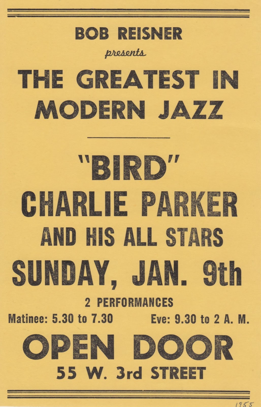
The death of Charlie Parker on March 12, 1955 had both an immediate and lasting impact on the New York art community. It wasn't just the musicians who grieved and grappled with the truth that Bird was dead, the painters and poets too strongly felt the loss of one of their idols. He was a hero made flesh: many of them knew Parker as much from seeing him around their Greenwich Village and Lower East Side (there wasn't an East Village yet) neighborhoods as much as they did from his stage appearances. Of course, they knew his records and would check him out at The Open Door on West 3rd Street when they could afford to do so, but the notion of the starving artist wasn't a punchline once upon a time.

Poster, The Open Door, Greenwich Village, New York City, 1955

According to the somewhat controversial record producer and writer Ross Russell, who owned Dial Records and who recorded some of Parker's most critically acclaimed music, within "a few days of the alto player's death there appeared among the graffiti on the walls in the Village and in subways, scrawled in black crayon or squirted out of pressurized paint canisters, the legend 'Bird Lives!" (Bird Lives: The High Life and Hard Times of Charlie (Yardbird) Parker by Ross Russell, New York; Charterhouse, 1973). Years later it was poet Ted Joans who was credited as the instigator of the graffiti. 

1955 newspaper obituary, source unknown

Ted Joans knew Charlie Parker and knew him somewhat well. Not too long after Joans arrival on the scene, he become known for his elaborate parties often costumed affairs. Author and promoter of the 1950s jazz sessions Robert Reisner claims that Bird turned up for one of these parties dressed as a Mau Mau and supposedly the January 1955 issue of John Preston Davis' groundbreaking African-American journal Our World featured one such party with Parker visible in the background. After returning from an extended engagement in Chicago in that same month, Bird was more or less a transient who relied upon the goodwill and couch space of others for shelter. At the time Joans shared a small apartment at 4 Barrow Street in the Village (don't go looking for it, it has been razed) just off of Sheridan Square and across the street from the Cafe Bohemia (that building is still there, occupied by the Barrow Street Ale House) and his roommate Ahmed Basheer brought a sick Parker home one night after finding Bird sprawled out on the sidewalk near their front door. As a result, Parker and Joans were de facto roommates off and on during last 2 months of the saxophonist's life.

Ted Joans at the Cafe Bizarre, Greenwich Village, New York, 1958

But just calling Ted Joans a poet is doing his legacy a disservice. Yes he was indeed a poet. In fact, he is now often referred to as one of of the original beat poets. Joans moved to Greenwich Village in 1951 around the age of 23 having moved to the big city from Illinois by way of Indiana University. Sadly, the history of the Beat Generation seems to have suffered from some degree of whitewashing as Joans seldom appears as more than a mere footnote. But he was clearly one of the first on the scene, connecting Gregory Corso not long after his arrival. He would later cite his biggest influences as Langston Hughes and André Breton. For his part, he thought himself as much as surrealist as he did a beatnik, although he certainly took advantage of the public interest in the latter as a way to have a forum for his art. By the time of his death in 2003, Joans had authored well over 30 books a remarkable body of work for any poet by anyone's standards.


The Hipsters by Ted Joans, Corinth Books, 1959

Joans creativity did not end with the printed word. At one point of time he was a trumpeter, although he reportedly threw his horn off a bridge as he felt the need to focus on other aspects of his life (this again according to Russell). He was a visual artist as well. Although largely known as a recluse, Joans befriended the Jackson Pollock and got to know the painter before Pollock died in the Summer of 1956. Joans most certainly was a painter, although examples of his work are relatively scarce both online and in the real world. However, one of his surviving works is from 1958 and is fittingly (for our story at least) titled Bird Lives!

The is only the tip of the iceberg that is the fascinating story of Ted Joans. I highly recommend digging deeper. 

Bird Lives! the painting is featured in San Francisco's de Young Museum Shaping Abstraction exhibit now through January 4, 2015.

As a teaser, here are a couple of short films that feature Joans a few years after the death of Charlie Parker. Bird Lives indeed!


Village Sunday by Stewart Wilensky, USA, 1960
(click on image above for fullscreen view)


Jazz and Poetry by Louis van Gasteren, Holland, 1964
(click through for a better screen view)

Tuesday, January 28, 2014

Forcillo Archtop Guitar (1953)


Forcillo archtop guitar, New Jersey, circa 1953

This week, I am going to indulge myself even more than usual. The guitar featured in this entry was recently sold on a well-known auction site with very little pomp and even less circumstance. It is a Forcillo Guitar. If that means nothing to you, even if you are a guitar geek like this writer, don't worry. The name Forcillo, as in Frank Forcillo, is one that lingers in a netherworld of footnotes and asides. That said, the few facts that we do know about Forcillo are interesting enough to make it worth documenting here, at least until what is left of the story is rescued from obscurity.

Here is what we do know. In 1932, first generation Italian-American guitar, violin, and mandolin maker John D'Angelico started his own shop in the Little Italy neighborhood of New York City. He had apprenticed under his Uncle, Raphael Ciani, for over a dozen years before Ciani's death. When he opened his own shop among his employees were Jimmy DeSerio, who stayed with D'Angelico until 1959, and Frank Forcillo whose tenure with the legend was a brief few years.

Frank Forcillo's name next turns up in the Blue Book of Guitars as the head of United Guitars out of Elizabeth, New Jersey, started presumably some time in the 1940s. The next concrete piece of info around Forcillo is courtesy of the United States Patent Office. On April 29, 1948, Forcillo filed a patent listed as an Attachment for Fretted, Stringed Instruments. This design is topped of by a finial that is remarkably similar to the same detail that D'Angelico used almost exclusively during the same time period. Could it be that this was, in truth, a Forcillo design that dated back to the Frank's time in John's shop?
Update: luthier Todd Cambio of Fraulini Guitars has confirmed that the finial on the headstock is a very old Neapolitan design used not only by instrument makers in Italy long before mid-century, but also used by John D'Angelico's uncle, Sr. Ciani, on several mandolins and guitars. 


United States Patent 2,510,775 filed by Frank Forcillo, 1948

1948 was also the year that Gibson, who had recently emerged from the industrial chaos of World War II as the guitar industry leader, introduced a 2-pickup version of their ES-350 guitar. This guitar was the first mass-produced 2-pickup cutaway guitar created solely for use as an electric instrument and re-set the standard for what an electric guitar was. Gibson's one-time biggest rival, the Manhattan-based Epiphone, introduced a competing but ultimately unsuccessful model within a year. B League champs Gretsch over in Brooklyn introduced their similarly-styled Electro II by 1951 and by decade's end parlayed the configuration into several fairly successful models.

At this point of time (or very close to it at least) the Forcillo Guitar enters into the picture. An educated guess would put this particular guitar in right around this time period. Some of the details in addition to the aforementioned finial include Waverly open-back tuners and matching tailpiece, as well as a headstock shape and neck design that is very similar to contemporaneous D'Angelicos. The pickups are something of a mystery. Perhaps they are manufactured by Franz/Fransch/Fransche, another small New York are shop that provided pickups most notably for Guild guitars while that guitar-maker was in New York and later New Jersey.

Beyond the above, very little is currently known about Forcillo and United and even less than the instrument. The seller shared that it was purchased by his father in New York some time around 1953 and continued to use it for years in jazz and society bands. There was some vague memory of it being a fairly expensive purchase at the time, but the other details are long lost. Of course I would love to hear from anyone who knows more about any of these topics. Please use the comments section below or email me direct. I will update this post as I discover and verify more information.

Footnote: both D'Angelico and Guild continued to have connections to Forcillo's United Guitars throughout the 1950s. When John D'Angelico finally caved into pressure to make "electric" guitars he chose not to make the bodies, but rather purchased laminate-top bodies from Forcillo's United company. John would then make the neck and complete the guitars - again using Franz pickups for the most part. Obviously they remained on good terms. According to Hans Moust's excellent and highly recommended The Guild Guitar Book, in the early years Guild used craftsmen from Code Guitars in New Jersey to finish their instruments. Many references to United Guitars make reference to Code in the same breath. The connection has yet to be fully explained but it is worth mentioning here. It should also be noted that the finish on this Forcillo guitar looks very similar to the finishes Guild used during it's first year or so (1953-1954).


Forcillo archtop guitar, New Jersey, circa 1953

Wednesday, January 22, 2014

Nicholas Ray (1932)

A full two decades before film director Nicholas Ray was in his celluloid ascent - reaching a peak with 1955's Rebel Without a Cause - and long before Jean-Luc Godard declared that Ray indeed was cinema, the latter-day legend was just embarking on an artistic journey that eventually would lead him to the modern medium of film. This journey had some unlikely twists and turns, not the least of which was a year spent as an apprentice to famed architect Frank Lloyd Wright.


James Dean and Nicholas Ray, Los Angeles, California, 1955

Ray, later known as Nick to most of his West Coast friends and acquaintances, was born on August 7, 1911 in Galesville, Wisconsin with the given name of Raymond Nicholas Kienzle. 3 months earlier in Spring Green, 100 miles southwest of Ray's birthplace, the maestro Frank Lloyd Wright began work on his own personal residence and workplace. This came to be known as Taliesin, a Welsh word which in rough translation means shining brow and refers to Wright placing the structure on the top or brow of a hill. Wright was in transition, having recently returned from nearly a year in Europe which had marked the end of what was later called his Prairie Period.

Frank Lloyd Wright, 1930, around the time he first met Ray, photo by Price Studios

As a youth, Ray was an uneven student seemingly distracted by the big city delights of Chicago, where he spent much of his formative years. He returned to Wisconsin for his senior year in high school and showed a strong affinity for and ability in public speaking, English, and drama. Two years in a state college was followed by a tumultuous semester at the University of Chicago in the fall of 1931, after which he left for New York City to study theater. However the connections made in Chicago precipitated Ray joining the inaugural fellowship of Frank Lloyd Wright at Taliesin in 1932, some time after the two crossed paths again during an event at Columbia University.

Design Sketch, Capital Journal Building, Salem, Oregon by Frank Lloyd Wright, 1931-1932

Contrary to many claims and by his own account, Ray spent a year under Wright's tutelage. The concept of the Fellowship was that Wright felt only by living and working with apprentices around the clock could the understand his concepts and ideas. As a social experiment, it was quite interesting. Members of the Fellowship not only actively executed ideas on Taliesin itself (the buildings there in a state of constant change), but worked as draughtsmen, farmhands, and domestics on the property. Living was for the most part communal. One suspects that the strict rigors of life at Taliesin did not sit well with the restless Ray, but many have commented that a political rift between Wright, a strong believer in the power of democracy, and his more radical-leaning protege was the cause of the latter's return to New York, which would eventually lead him to Hollywood and the world of film-making.

Nicholas Ray, Hollywood, c.1945

However, the year spent with Frank Lloyd Wright would prove to have a tremendous impact on the artistic eye of Nicholas Ray. 34 years after his death, Ray's widow Susan stressed the importance of the period in an interview, citing the nature of the Fellowship as shaping Ray's ideal work methods, as well as the very idea that architecture (and film in Ray's) provided a framework for the arts. Ray himself professed that his love of what he called the vertical line was due to his time with Wright and attributed his fondness for Cinescope to an extension of that love.

Storyboard, Rebel Without a Cause, Nicholas Ray, 1955

An interesting footnote: the 2003 DVD release of Ray's masterful In a Lonely Place, made for Humphrey Bogart's Santana Productions, features a short film extra in which director Curtis Hanson sings Ray's praises and calls out some of the architectural elements in the film - citing the Frank Lloyd Wright period. Hanson, of course, directed 1997's L.A. Confidential a neo-noir film based on James Ellroy's novel. One of the buildings prominently featured in the film is the Lovell House designed around 1927 by Richard Neutra. Neutra had only recently moved the United States and one of his first employers before moving to California was Frank Lloyd Wright. The Lovell House is just 2 miles down the hill from the Griffith Park Observatory which is perhaps the most well-know location used in Ray's Rebel Without a Cause.

Tuesday, November 5, 2013

Deux Hommes Dans Manhattan (1959)


Released in France in October of 1959, Deux Hommes Dans Manhattan was director Jean-Pierre Melville's fifth feature film. A life-long Americanophile, the movie was one of only two that Melville shot in the United States. 


Cinema scholars and historians don't usually place Melville alongside the directors of what is now known as the French New Wave. Stylistically and thematically he was never entirely in sync with Godard, et. al. and he was several years older than many of the marquee names of that generation. That said, he was a mentor and inspiration to many of those film-makers. He also shared their love of American films, although he unashamedly loved big name productions rather than the more obscure favorites of the youngsters he inspired.


Deux Hommes Dans Manhattan treads some interesting ground between the "crime story" films that Melville would spend much of the remainder of his career pursuing and American film noir. The notion of film noir, of course, was something of a French construct in first place, it's moniker having been coined by French film critic Nino Frank in the mid-1940s. Melville's film comes at the end of the noir era and perhaps can be viewed as something of an homage to some of his inspirations that loosely fit stylistically into that genre.


There are also elements of what many consider French New Wave in the film: the film's pace and its moral ambiguity come immediately to mind. Interestingly enough, the location shots show this side of the film most explicitly, perhaps due to budget constraints and Melville's preferences when the camera was actually in his hand. New York is beautifully filmed and mostly done so at night, something very few American directors had done successfully up until that point. That said, the film sits very comfortably alongside - if not in between - Alexander Mackendrick's Sweet Smell of Success (1957) and John Cassavetes Shadows (1957-1959). I mention the former for its shared DNA of probing the somewhat sordid layer that exists just beneath the surface of Gotham society. The latter has the same feel of guerrilla film-making at times, although Melville's work shows no signs of improvisation.


All 3 films also share a driving jazz soundtrack, which by 1959 had become a signifier of sorts and almost requisite if one wanted to make a gritty film about big city living. In the case of Melville's film the bulk of the "jazz score" was provided by pianist Martial Solal making his debut as a film composer. Solal went on to compose the score to Jean-Luc Godard's groundbreaking À bout de souffle (aka Breathless) the year after this film, something he is perhaps best known for in spite of a career spent on the bandstand with some of the top names in French and American jazz. Incidentally, thanks to all of the interiors being shot by Melville in Paris, Solal may be seen briefly in a cameo as the pianist in the Pike Slip Inn scene.


As Deux Hommes Dans Manhattan went unreleased Stateside in 1959, it has been relegated to rep houses and film festivals for years, taking on an almost mythic quality due to its content, subject matter, and place in Melville's own film-making history. It was a box office flop, which seemingly did have some influence on Melville's subsequent career direction. It is a welcome surprise to see it now available on DVD and Blu-Ray from the Cohen Media Group (no relation to the contemporary American fraternal film-makers). Fans of noir, new wave, or just the crime jazz zeitgeist of the late-1950s will no doubt appreciate it at least one time around, while dyed-in-the-wool Melville fans (such as yours truly) look forward to being view another one of his films repeatedly with a critical eye.

Tuesday, October 29, 2013

René Gruau for McGregor Sportswear (1954)

At the beginning of the summer, mention was made of USA-based McGregor Sportswear's introduction of the continental style into its product line. As I promised some further details on the matter, let's take another look now. 


McGregor Sportswear print ad, 1955, illustration by René Gruau

McGregor's roots reach back to New York, 1921 and Scottish immigrant David Doniger's establishment of a men's clothier. Doniger introduced the McGregor brand 2 years later and by mid-century was arguably the most well-known purveyor of what was be known as casual wear. Doniger was obviously just ahead of the curve. The concept of casual clothing did not really exist (much) before  the end of the Second World War. But with the wartime economy boom the reached through much of the 1940s and the cultural shift towards suburban pursuits, McGregor was positioned to take full advantage of the situation. 


McGregor Sportswear print ad, 1948, illustrator unknown


By the mid-1950s, the brand was firmly established but began to feel the heat of competition as regional favorites such as Pendleton began to utilize the quickly-maturing advertising industry to increase its nationwide presence. McGregor had always specialized in imports as much of its early offerings were truly from Scotland, but to keep pace it looked even further afield to Italy and the en vogue continental look. In 1954, what would be called continental style was most commonly referred to as Italian style and McGregor referenced the latter liberally in its advertisements for its new line of distinctly international and modern casual wear. 


McGregor Sportswear print ad, 1954, illustrator unknown


McGregor Sportswear print ad, 1954, illustration by René Gruau


To help sell this new look to a fairly staid and traditional market, McGregor (or most likely McGregor's advertising agency who I suspect, but cannot yet prove, was Y&R at the time) enlisted the services of one of the most talented fashion illustrators of the day, René Gruau. Italian-born Gruau, whose birth name was Renato Zavagli Ricciardelli delle Caminate, was 45 at the time his first print adverstisements for McGregor were published. He had only been living in New York for 9 years, having immigrated from Paris where he gained notoriety and no small amount of fame for his work with nearly every single important fashion magazine up until that time. A cursory look at his early work lends strong credence to the notion that his style completely changed the art of fashion illustration. And it certainly had a lasting impact on McGregor's approach to advertising. Gone were the flat, cartoon-like figures used early on (and still used by the competition at the time) to be replaced by impressionistic verging on abstract figures of intriguing looking gentlemen wearing garments with strange cuts and details. The Gruau commission was short-lived and only was run in magazines for a couple of years, but subsequent McGregor print ads unmistakably bore his influence. Mad Men could not have provided a better storyline!


McGregor Sportswear print ad, 1955, illustration by René Gruau


McGregor Sportswear print ad, 1956, illustration by René Gruau


McGregor Sportswear print ad, 1956, illustration by René Gruau


Post-Gruau era McGregor Sportswear print ad, 1962, illustrator unknown